As brand owners seek to increase consumer engagement and build loyalty, they are turning to some novel approaches that leverage packaging as a marketing tool. Metal closures offer a prime opportunity to achieve this goal. While representing a small percentage of the overall package, they are also the component that gets interacted with the most. As a result, an increasing number of brands are taking advantage of the real estate on the interior side of metal closures and printing special messages or graphics that arm consumers with facts or nutrition info, or engage them in special promotions or contests.
LiDestri: Supporting a national promotion to drive sales
The partnership between LiDestri Foods andCROWN Closures Americas, a business unit of Crown Holdings, Inc. (www.crowncork.com), spans more than a quarter of a century. In addition to providing metal closures for LiDestri’s various pasta sauce brands, Crown has offered a range of technical services and support for unique marketing initiatives. The most recent promotion that the two companies worked together to implement was developed to drive sales for the Traditional and ToBe Healthy varieties of LiDestri’s flagship Francesco Rinaldi brand.
In this case, the promotion centered on ‘MANGIA,’ the Italian word for ‘eat.’ Individual letters were printed inside caps. Consumers collecting all six letters to spell out the word qualified for the grand prize: $250,000. Other prizes, including gift certificates, free jars of sauce, eco-friendly shopping bags or an all-expense paid trip for four to Italy, were also given away as part of the promotion. A simple message announcing these smaller prizes was printed on a limited number of caps, which consumers would turn in to win their prize.
While the promotion was fairly straightforward, designing the closure itself was not without its challenges. To attract consumer attention, the contest had to be promoted on the outside of the closure. However, it was critical to maintain the identity that LiDestri had built with its packaging to ensure consumers recognized the Francesco Rinaldi brand on shelf. Crown worked closely with LiDestri’s design agency, be* marketing (Bay Shore, NY), from early in the design phase, allowing for multiple iterations of concept graphics.
Then there was the printing on the inside of the closure itself. Although this marked the first time that Crown had been asked to undertake a promotional under the cap campaign on a wide mouth closure, the company was able to draw from past experience printing recipes and detailed text on smaller diameter closures to optimize visual impact. For the promotion to work as planned, LiDestri needed to limit the number of winners who would be eligible for the grand prize. It was decided that the letters “G” and “I” would be printed in low volumes and monitored closely to ensure fair competition and that the winning caps were not tampered with. Crown, LiDestri’s technical team and external auditors implemented a methodical system to account for all closures as they were manufactured and to make sure that both the grand prize and second-tier promotions were printed. From there, mass production of the letters “M,” “N” and “A” began.
Timing for the project was vital. Work began on the initiative in the summer of 2010, with all caps delivered to LiDestri by January 2011. Large quantities of the sauce varieties were shipped to grocery outlets across the United States beginning in April 2011. The contest closed in August 2011.
“Our experience with Crown has always been top-notch in terms of printing capabilities, technical support and turnaround time, so we knew they would be the perfect partner for this complex initiative,” says Edward Salzano, Executive Vice President/Chief Operating Officer of LiDestri Foods. “Things worked seamlessly from beginning to end, which was critical to meet our delivery targets and help ensure the competition’s success.”
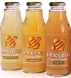
Honeydrop: An all-natural approach to building brand loyalty
Under the cap projects are also suitable for less complex promotional campaigns. A project that Crown worked on with Honeydrop, makers of a healthy, low-calories line of teas and juices featuring a spoonful of honey in every bottle, offers a powerful example.
Honeydrop was in the process of redesigning its packaging to amp up shelf appeal and wanted to use the closure as a platform to keep the brand top of mind with consumers. The redesign included an embossed glass bottle with a custom printed 38mm Press Twist closure with a similarly clean and modern design. The real estate of the gold hued closure is fully maximized, with a black bee imprinted on its top and the company’s logo and the message “From Bee to Bottle” appearing on its skirt. To educate consumers about the benefits of honey, and increase engagement with the brand, Crown also printed a series of messages on the interior side of the closure such as “Get Stung,” “Bee the Change” or quotations such as “Life is the flower for which love is the honey – Victor Hugo” “If you want to gather honey, don’t kick over the beehive – Abraham Lincoln.”
Finished closures were delivered within three months of project initiation. “Crown’s advanced printing capabilities and flexibility were the primary reasons we wanted to work with them on this project,” says Andrew Lorig, Regional Sales Manager, Honeydrop. “We were blown away by the exceptional support we received throughout the entire process. The end result is a package that attracts consumer attention on the shelf and stands out from other health drinks on the market.”