Kallo has chosenPearlfisher(www.pearlfisher.com) to design the company’s new corn and rice snacks, available in four flavors. The designs follow Pearlfisher’s new brand identity and packaging design for Kallo that debuted in October 2011.
The design for Kallo’s corn and rice snacks compliments Kallo’s new brand positioning: that Kallo provides simple natural pleasurable food for people who want to enjoy life and eat well.
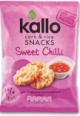
The design uses shapes to stylishly interpret the products and the nutritional information is displayed clearly on the pack. Food photography and vibrant colors are used to depict the different flavor variants.
Sarah Butler, deputy creative director at Pearlfisher says, “The design for Kallo snacks sits in line with the re-design of the new range. We bring to life the tasty and fun nature of Kallo snacks, through warm, sophisticated and friendly colors and shapes.”
Naomi Cosgrove, brand controller from Kallo comments, “We are very excited to be launching this new snack range, both the packaging and product tested exceptionally well with consumers and they loved the fact that they had all the great taste you would expect from a snack, but with only 1% fat and made using only natural ingredients.”