Nestlé’s premium tea capsule system SPECIAL.T relaunched with an iconic, disruptive new design by B&B studio (bandb-studio.co.uk), which brings the brand’s magical and fantastical world to life for consumers.
The design takes inspiration from the enchanting SPECIAL.T world, originally created for online and advertising channels, and communicates it through packaging.
B&B studio was also tasked with creating a new look for the brand’s capsules and the machine packaging, to deliver SPECIAL.T tea expertise direct to the consumer with just the touch of a button.
Distilling a brand
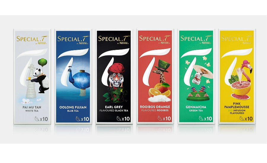
Taking the cues from the expansive magical world created to support the brand online and on advertising channels, the capsule packs each feature a distillation of the individual tea’s assets to express the flavour, provenance or benefit of each drink. The range is now cohesive and easy to navigate, yet each tea has its own distinct and bold personality.
Images range from a tiger wearing a turban on the Earl Grey pack, to a flamingo-grapefruit hybrid for the Pink Pamplemousse infusion. The other-worldly imagery dramatises the concept behind each tea variant, enhances tea expertise and values, and offers clear differentiation within an extensive range.
To increase brand standout and recognition, as well as to create a strong icon for the brand, an enlarged and isolated T from the logo is positioned on the front of pack. The T overlaps the enchanting imagery, illustrating the connection with the brand.
The T also appears on the top of pack, replicating the machine’s tea-making button, as well as on the opening mechanism to echo its one touch system.
Communicating luxury
Foiling on the logo and an embossed texture reinforce the premium look. Colour coded backgrounds differentiate the ranges into types of tea: black, tea, green, white, blue, rooibos and fruit and herb infusions, promoting simple navigation, while premium finishes add a touch of luxury.
Tea leaves and flowers communicate the products’ natural qualities, tea values and premium feel. Opening up the packs reveals further details from the magical world and provides a sense of discovery. The packaging also communicates the ease of use and drives consumers to the website, where a total of 35 SPECIAL.T varieties are available.
“The wonderful world of SPECIAL.T was ready to be captured and transformed by us into distinctive and beautiful packaging. We were able to communicate the intrinsic premium qualities of the tea brand and also bring some consistency across the various teas to express the full SPECIAL.T experience," says Shaun Bowen, creative partner at B&B studio.
Marie-Pierre Ambroggi from Nestlé says: “B&B has helped evolve SPECIAL.T towards a more perfect and simple tea experience. Clear segmentation, easier navigation and more compact and creative boxes come together to take the brand to the next level.”