Carex Washes Away Old Packaging Design
U.K. handwash brand Carex is celebrating its 25th anniversary with a portfolio refresh by brand and packaging design agency PB Creative (pb-creative.com). The agency worked on defining a core brand message and bringing balance and unity to the packaging portfolio.
To achieve this, PB Creative developed an iconic droplet device to reflect Carex’s USP as the leading antibacterial handwash brand, and create synergy across the Core, Fun Editions and new Advanced ranges. The new design encapsulates the core brand message — ‘Cleaning, Caring & Protecting’ — and also allows future growth.
The brandmark was given a subtle refresh, moving to a more single-minded, solid background colour, delivering iconicity and standout at shelf. It was essential that the new 2D droplet execution complemented the established 3D equity.
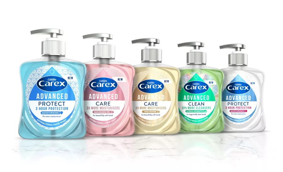
The new Advanced range further leverages the droplet, employing a pearlescent, semi-transparent bottle finish, silver pumps and a metallic label substrate to deliver a more premium proposition. Contemporary graphic textures reinforce each product’s efficacy — a floral design denotes ‘Care’; diamond geometrics, ‘Clean’; and the structured hexagonal backdrop, ‘Protect’.
The droplet core asset remains consistent across the Fun Editions tier also, but with the playfulness of each variant dialed up to reflect the enticing ‘flavors’, including Bubble Gum, Strawberry Laces and Love Hearts.
Looking for a reprint of this article?
From high-res PDFs to custom plaques, order your copy today!


