Australia > Mainland cheese
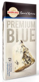
For better product differentiation and taste appeal, the Mainland brand underwent a redesign, putting the focus on…its cheeses. Unlike the previous packaging, the front of the new package features a large image of cheese with big, easy-to-read typography labeling the variety. When the packs are opened, the interior of the packaging is revealed, featuring gray lettering of the cheese’s name. The paperboard packages feature perforated sleeves, making them easy to open. (Package design: The Grain, www.thegrain.com.au; Packaging format: Fonterra Brands, www.fonterra.com)
Looking for a reprint of this article?
From high-res PDFs to custom plaques, order your copy today!


