USA > Tums
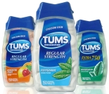
The rise of private label resulted in Tums losing volume, so the brand looked to new packaging to increase shelf impact, create differentiation and make up the loss. The brand started off with a new logo that retained its sans-serif typeface, but added a bright, oval graphic to emphasize the brandmark. It also retained its signature blue color in its closures and labels, but enhanced each variety’s taste appeal with larger, more detailed images of the flavors. (Package design: Anthem Worldwide, www.anthemww.com)
Looking for a reprint of this article?
From high-res PDFs to custom plaques, order your copy today!


