Cuvaison is one of the wineries that helped shape Napa Valley. Since 1969, they’ve steadfastly crafted Chardonnay, Pinot Noir, and select varietals grown on their Los Carneros estate vineyard. Their mission remains true to their roots. And so does their wine. FINE was tasked to find new ways to differentiate, engage, and cultivate emotional connection with the historic brand’s customers, partners, and distributors.
The ground-up initiative spanned brand strategy and messaging, identity design, packaging, and a new website. Part of the approach is to challenge traditional wine brand thinking. Great wine will always be the core, but the ways we connect consumers to it invited us to think of Cuvaison more like a hospitality brand, a technology brand, or just a whole new kind of brand for the next wave in Napa Valley.
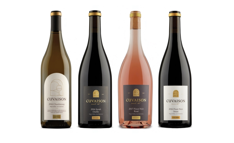
Taking inspiration from the brand’s 1970s wine labels, original letterforms and a stained glass illustration were brought forward and modernized to reflect the brand as it is today, while maintaining the legacy and brand equity of the past.
The icon can live on its own or pair with the refined, serif type. The color palette speaks to an independent spirit, the gold an unwavering quality, the natural tones for Cuvaison’s Los Carneros estate. Printed, premium materials rich and textured further elevate the visual system.
Design for the family of wine labels and club packaging is nuanced to balance craft and sophistication. The Estate series uses an arched label shape to maintain brand equity from its beginnings — easily recognized on the shelf. To call attention to the brand’s history, the 1969 established date is proudly displayed. Hand-drawn script and painted beads add an artful, human element to the Small and Micro lot tiers — a holistic design system that’s both high-end and approachable.
Evolving a Napa Valley Legacy