Printing: Color Management
Expecting Perfection

Color is complex, nuanced, ubiquitous, and potentially one of the most powerful tools marketers have to communicate all the way from a global brand level down to subtle differences of product features and benefits.
Simply put, color is important to people. For centuries, cultures have used color to express the way they relate to the world. Basic principles of the hunt, religion, status, and life activities have been utilized in color and form as a basic covenant of social communication and historic record.
Over the past two to four decades, color has moved from nature, objects, temples, canvas, and decoration to the more virtual world of television screens and computer monitors. More people have more access to more things, and the practice of representing those things is as much a science as it is an art.
Graphic designers have become the visual communicators responsible for developing the visual language that connects the world’s consumers to both tangible and intangible goods. In graphic design, branding and packaging, this has resulted in a largely yet-to-be-reconciled relationship between additive and subtractive color models.
Visual identity practitioners are skilled and passionate about employing color to elicit specific responses from targeted audiences. They are aware that specific colors connect with and represent complex psychological and cultural nuances that influence how consumers feel about a brand and its performance, position and potentially its role in their lives.
In a world of paint, pigment and ink, designers as well as printers worked from similar pallets. Consider that all primary school children are taught that mixing red and blue make purple and mixing yellow and blue make green, etc. This is a basic relationship with color theory that all of us – designers, printers and consumers – share and accept as the truth at a very fundamental level.
As it turns out, mixing colors get more complicated as time goes on. Indeed, as cultures and societies become more mature, and languages within those cultures become more defined, the names for colors increase in number and meaning. That reality is age old with no cultural boundaries.
Now, with the advent of the computer age and an increasingly global society, there are not only more names for colors, there are more ways to represent and reproduce color across an increasing array of substrates and media.
Without aligning on some Rosetta Stone of color communication and management, unproductive rifts of miscommunication naturally exist between the concepts that are typically realized on the designer’s computer monitor (subtractive color) and the coatings, inks and pigments (additive color) used by printers to bring the design intent to life.
Fortunately, there are tools that exist to help manage color across production environments, output devices, printing presses, and cultural bias.
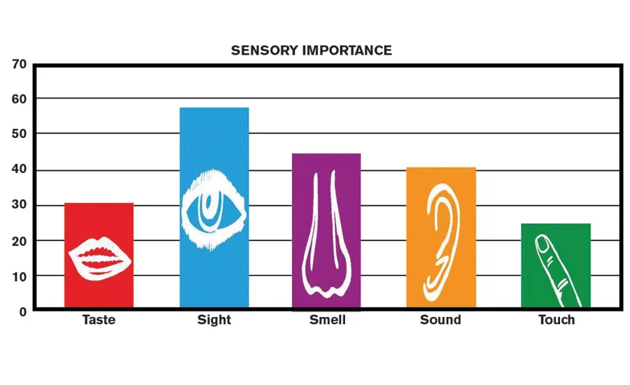
According to Martin Lindstrom in his book Brand Sense, approximately 60 percent of shoppers make purchase decisions based on color, and color alone can increase brand recognition by 80-90 percent for repurchasing. (See Figure 1)
With statistics like that, there is good reason for brand owners to care about color perfection on packaging to build brand equity. When consumers can detect a noticeable difference in color, they are confused and assume this is a different product or something else is not up to the quality expectations they have been led to believe. Consumer mistrust begins.
If packaging in the supermarket was all printed in black and white, it would take hours to shop for food. Nothing would standout on the shelves. The color on packaging exists today partly to simplify a consumer’s life when they shop. Brand color drives shelf awareness and appeal, while connecting the brand to the consumer building brand equity.
Color is the brand essence of a package. It is what pulls at the heart strings. It is the most important key to a purchase. That’s why it is important to achieve color matching perfection.
Common Challenges in Achieving Color Matching Perfection
Rework with prepress and printing of the package a second time will drive up costs while missing launches for a brand owner. Companies that take color seriously tend to do better on the back end and save a lot on costs by having all partners get together early and often well before the printing begins. Loss of market share is a much more serious issue due to poor packaging and color management on shelf.
Substrates, application chemistry of printing inks and coatings, functional requirements, and implementation framework are major challenges for brand owners and their value chains. Logistics, regulatory compliance and economics can be barriers to entry for moving pigments around the world, creating variation with regional supply.
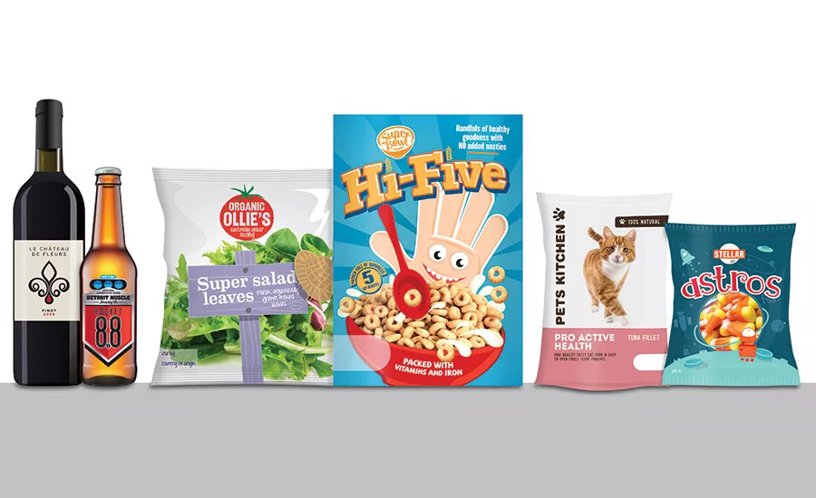
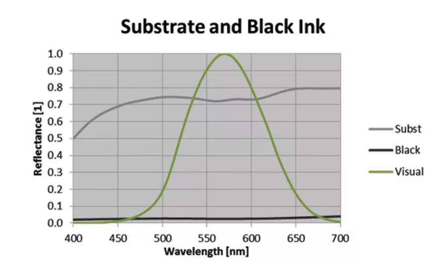
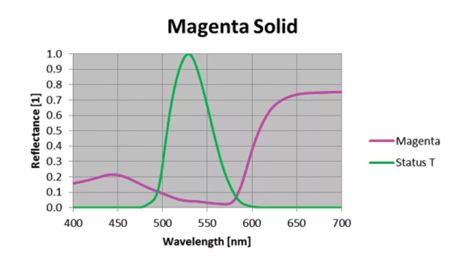
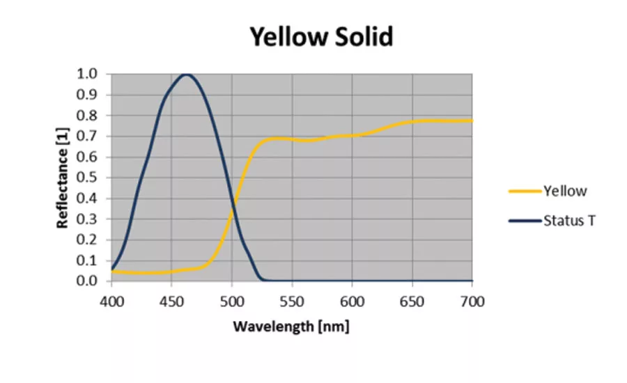
Color is not subjective – every color that can be printed can also be measured, and its characteristics stored as a spectral curve that acts as the DNA of the color serves as an exact specification for further reproduction. (Figure 2)
The key to managing color measurement properly is a standardized equipment and software choice, as well as color equation used in the software and backing material behind the package/color being measured. If these are not managed properly, then the spectral data will differ, creating error stack within the process.
That being said, when those brand colors are printed on a variety of presses (different ink film thicknesses being delivered) on different substrates (surface, reverse printed, laminations, and overcoats), from paper, board and film to plastic or aluminum, they can look entirely different based on printing ink chemistry and ink film thickness deposited.
Printing ink pigments have different performance from hue, chroma to lightfastness and product resistance. Coatings must be applied a specific coat weight to accomplish the aesthetic or functional performance desired – gloss, matte, barrier, rub/scuff, and slip.
Any tool that can enable a converter to print color accurately on a variety of substrates is a major development. In-line process controls are being developed for color control and coating weight application, allowing converters to have more predictable outputs. These improvements have a cost to them, however a couple of rejected print runs cost more than the equipment most of the time.
Functional requirements are focused on holding the product throughout the lifecycle, including recycling. Safety of the packaging components, transportation and storage, and labeling regulations also must be adhered to while delivering the desired color on the printed package. This is referenced as fitness for use criteria.
Implementing a color management program for a brand owner is very difficult. There is a need to pull together the various departments involved – technical, regulatory, design, and procurement – to document the program.
The existing value chain has defined capabilities that could delay innovative packaging that requires a capital investment for converting in a different application or curing of the printing inks and coatings in-line, as compared to a secondary process.
There are supporting systems that exist now that help printers reproduce any color as faithfully and efficiently as possible, whether on paper, board, film, plastic, or any other substrate that can be thought of.
The key for such a system is to develop multiple libraries of colors that cover the majority of substrates and applications used in the packaging industry, including corrugated kraft, transparent and white films, laminated films, carton board, paper and labels.
This profile of printing ink on various substrates with various applications can help the brand owner visualize the color with design intent prior to reproduction. It also provides the printer a better color standard to reduce error stack. The color target is more relative to their discipline.
These libraries can capture the spectral curves of any color on the relevant substrate – from a physical print – and hold it in a database on the cloud, which can be referenced at each step of the packaging workflow when a brand owner needs to reproduce that color.
The additional key enabler is a digital color communication tool that can link every part of the packaging workflow and share this color DNA with every participant.
Different Types of Products within a Brand and Cultural Bias
One of the challenges that comes with branding includes didactic communications on the packaging itself. Designers and brand owners frequently have to determine key graphic elements that help the brand communicate quickly by using color.
For example, a commonly known beer brand has its well-known color DNA, but what needs to be developed graphically to both maintain brand integrity while sharing that this is a light beer or a specially flavored beer?
The challenges are heightened when cultural bias is added to the mix. Color is cultural and regional. The western side of the world sees things very differently than the eastern side of the globe.
Not only that, but brand owners need to work with their partners to ensure that the final results come through a logistics, regulatory and economics (LRE) standpoint.
Brand owners and their global printing partners and their suppliers, like ink companies, can make informed decisions early in the process when determining colors that can be matched properly in all parts of the world. By connecting together to align all parties involved on color, prototypes can be developed in various regions for comparison to ensure that in the end, the same brand color is printed.
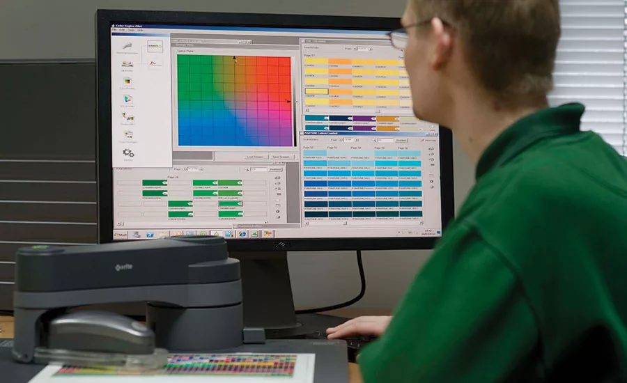
A lot of research goes into preparing prototypes (Figure 3) and it involves a great deal of experimentation to get it right, but being objective and working together closely with all partners will help overcome the challenge of cultural bias and didactic communications.
Cost of Printing
Brand owners set the expectations for a print job, but they also must determine what is realistic. Tools that are available now can be set to parameters that allow brand colors to maintain consistency from one country to another. Not only that, but they can add special effects and other neat tools that enhance visibility on shelves. Brand owners can have whatever they want when they work closely with their global partners.
The Challenge is That it Costs a Lot of Money
Brand owners frequently have to evaluate their product to determine how the printing will be done: good, better, best. There are tools for special effects, process controls, web registration, and more. These tools make printing simpler and help packaging stand out, but they add on costs.
Brand owners are savvy. They must determine how good is good enough and what is it worth in the market. They all know what is best, but does it make sense for this particular product?
Tips to Help Achieve Perfection
Use Digital Tools that Allow Teams to Work Together Early and Often
Brand owners, printers and their suppliers that get together early and often in the process can achieve amazing results. The more information that is shared upstream at the conceptual stage of a new project, the less likely the need for reprinting or rework. It is economically feasible to take this approach because there are no changes during the printing stage.
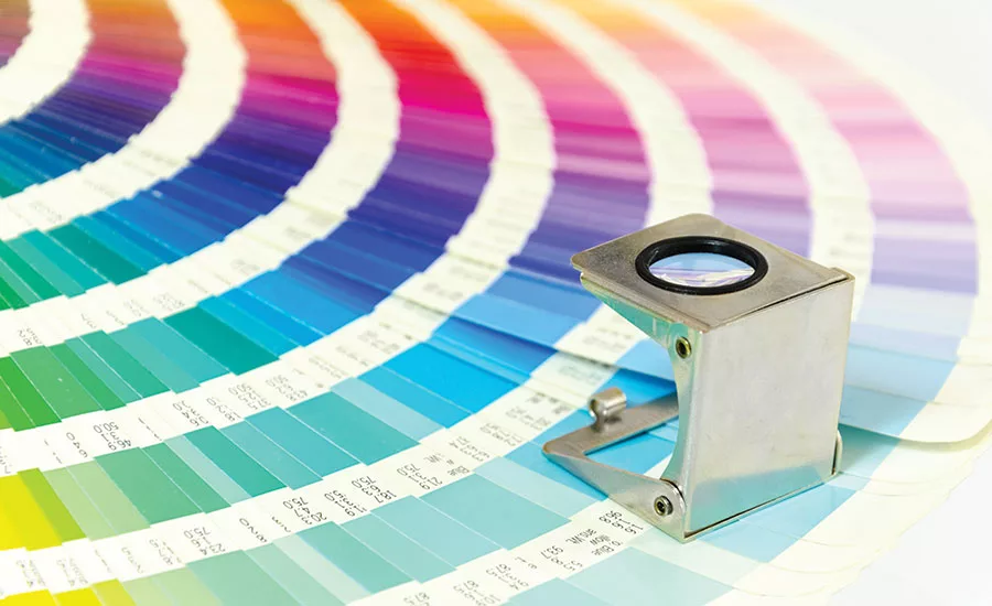
Utilizing digital software tools can help brand owners specify the right color digitally (See Figure 4). The designer creates the design file using that exact same color signature. Prepress adapts the file to the specific printer configuration based on that same color spectral curve. The ink manufacturer matches spectrally the right ink to that digital color specification. The printer ultimately reproduces the color on the final product and controls color quality by comparing directly to the original color spectral curves, as specified by the brand owner and close the loop for a seamless color approval.
This type of system allows everyone to work from the precise and unique color definition stored on the cloud, and enables users to operate seamlessly in a fully digital workflow to produce colors that will match the original specifications established from real colors on real substrates.
This tool has the scope to remove the margin for error in color reproduction from one packaging material to another, and to bring about far greater consistency through brand families and across multiple territories where substrates are often inconsistent.
In addition to color-matching software, there are other tools in the kit that can enhance the final product: high-definition plate technology, thin-gauged films and inks designed to handle webs, to name a few.
Advancements in software and technology are very exciting right now and are all helping to make color more precise and predictable on the final printed product.
Break the Rules
Don’t be afraid to break the rules. It is easy for designers to get comfortable in what they are doing, but challenging conventions helps lead to innovation. It is important not to be afraid to invite experts who can help them figure out how to get to where they need to be. By inviting an innovator in, they can get excited about the possibilities as well and break the rules with you.
This allows for design to happen naturally in unique and different ways that have never been done before.
Challenge Absolutes
Color theories are constantly evolving over time. There are some absolutes in color that have stood the test of time, but now with today’s advanced technologies, it is good to challenge those absolutes.
One absolute, for example, is never to use the color green with meats. That doesn’t really hold true anymore because the cultural norms have changed.
There is always going to be the next technology of the future. Big innovations are regularly occurring. Retailers are saying that this particular packaging isn’t interesting anymore. Brand owners want packaging that pops off the shelf, but they want it to be affordable and they want it to stay ahead of potential counterfeiters who could hurt their reputation.
When brand owners and converters both take color seriously and work together upfront, they tend to accomplish amazing things and avoid the serious costly errors of rework and reprinting. By working closely with all global partners and suppliers, challenges can be overcome and conventional thinking can be overturned. In the end, color perfection can indeed be achieved.
Sun Chemical
(973) 404-6172
www.sunchemical.com
Haney
(513) 561-1441
www.haneyprc.com
Looking for a reprint of this article?
From high-res PDFs to custom plaques, order your copy today!


