Celebrating the Power of Peanuts in New Snack Bar Package Design
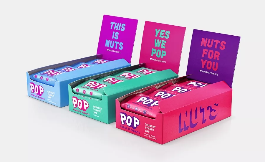
Snack bar POP launched in the U.K. with a product strategy, visual and verbal identity that stays true to a single core ingredient — peanuts. The new brand creation was developed by branding agency B&B studio.
After identifying an opportunity for a brand that stays true to a single core ingredient, B&B studio created a product strategy, visual and verbal identity for POP that celebrates the 'Power of Peanuts.'
At the core of the brand is a mission to shake up the snacking category, championing the humble peanut and its power to do good – for the body, the planet and for people in need.
B&B incorporated this mission into every touch point of the brand’s visual and verbal identity, with brightly colored packaging to highlight the nutritional benefits of the core ingredients within each bar.
“We spotted an opportunity for POP to focus on a single concept – peanut-based products – that would carve out a unique platform in a very competitive category. This enables POP to really celebrate and elevate the modest peanut, championing its superpowers,” said Shaun Bowen, Creative Partner at B&B studio.
Every element of the visual and verbal identity showcases the core product attributes and brand values in a way that feels celebratory. The vibrant visual identity has been designed with a three-dimensional impact, representative of the abundance of the peanut and the small but mighty POP bars.
Looking for a reprint of this article?
From high-res PDFs to custom plaques, order your copy today!