Fruit Snack Packaging Redesigned with Nostalgic Look
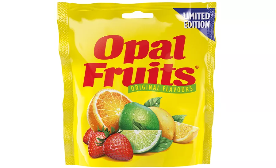
Opal Fruits was first launched in the U.K. in 1960, but were aligned with the global brand name Starburst in 1998. Since then there has been an increasing appetite for retro sweets — and a growing campaign on social media to bring back the popular fruity chews. Now, 22 years later Opal Fruits will be hitting the shelves again, thanks to a nostalgic redesign by London-based brand and packaging design agency Straight Forward Design.
Straight Forward Design’s work shows how brands can successfully use nostalgia to draw on consumer emotions and reconnect by being completely authentic. Not only does the latest brand and packaging identity take consumers back to yesteryear, but the flavors are returning to sweeter times, too, with just the original four in the line-up: strawberry, orange, lemon and lime.
Opal Fruits went through several iterations in its 38-year history, including the years when it transitioned to Starburst, so different people remember different things.
Straight Forward Design collaborated with typographer David Bateman and illustrator Simon Critchley, who have both worked with the world’s top FMCG brands for over 35 years.
Looking for a reprint of this article?
From high-res PDFs to custom plaques, order your copy today!