

DESIGN GALLERY: Paperboard
View the Paperboard Packaging Products
HOVER & CLICK TO VIEW MORE ABOUT THE PRODUCTS
mayfield creamery
brand owner | DEAN FOODS
View more
Mayfield Creamery
brand owner | DEAN FOODS
credits
HUGHES DESIGN GROUP
PETER PIOPPO PHOTOGRAPHY
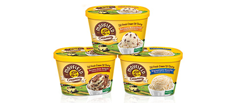
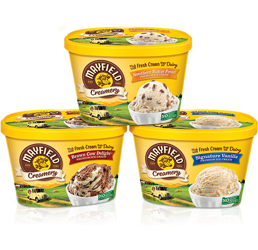
Since its debut in 1923, Mayfield Creamery has become an iconic brand across the Southeast.
Looking to expand its ice cream business, Dean Foods did research which revealed that its
packaging appeared dated and failed to create an emotional connection to the brand. The
redesigned packaging honors Mayfield’s core values, such as the brand’s storied heritage and
signature flavors. The structure is a standard ice cream scround tub that was maintained for
equity and category relevance. The yellow brand color evolved to a golden yellow to make the
brand appear more indulgent and premium. Product photography was shot with a single scoop
to increase taste appeal.

lifeproof
brand owner | THE HOME DEPOT
View more
Lifeproof
brand owner | THE HOME DEPOT
credits
THE HOME DEPOT
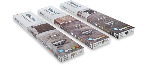
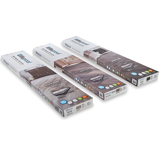
Vinyl is now a premium flooring option. The brand’s purpose is to highlight a line of extremely durable and beautiful flooring while changing negative perceptions of vinyl flooring. The goal is to showcase the beauty of the product with the look of wood and the durability of vinyl. The packaging shows the product in environments where people typically would have concerns installing wood or laminate flooring. Also, the packaging was designed to enable customers to fi nd their preferred color easily and to peel away a portion of the box to see and touch the product.
snoqualmie organic ice cream
brand owner | SNOQUALMIE ICE CREAM
View more
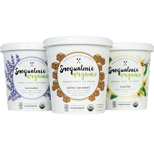
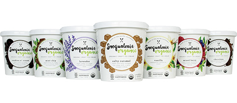
Snoqualmie Organic Ice Cream
brand owner | SNOQUALMIE ICE CREAM
credits
SNOQUALMIE ICE CREAM
Snoqualmie Ice Cream is a family-owned company that makes premium organic ice cream in Snohomish, Wash. Snoqualmie's culture is centered around its mission and values, and the design and copy for Snoqualmie Organic aligns perfectly, proudly including the B-Corp logo on the front and conveying clean, premium ice cream. The packaging uses a Stanpac 16-oz. container with tamper-evident lid. Art was hand-painted and digitized by the in-house design team.
yumami go-dip
brand owner | YUMAMI
View more
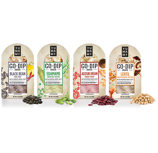
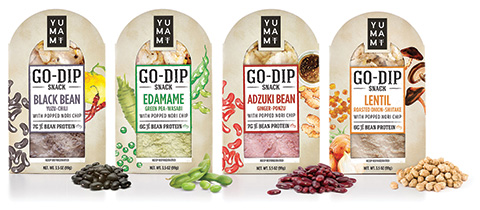
Yumami Go-Dip
brand owner | YUMAMI
credits
QNY CREATIVE
Yumami’s bean-based dips influence our earthy palette with hints of bright yellow and orange, while the logo and ingredient illustrations allude to traditional Japanese art. In designing the packaging, it was crucial to incorporate the nutritious simplicity of the product and its Japanese roots. Millennials also are interested in transparency regarding snack ingredients. Consequently, Yumami’s packaging employs custom die-cut paperboard sleeves with an acetate window that allows shoppers to see the product.
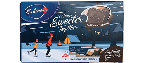
leibniz choco
brand owner | BAHLSEN USA
View more
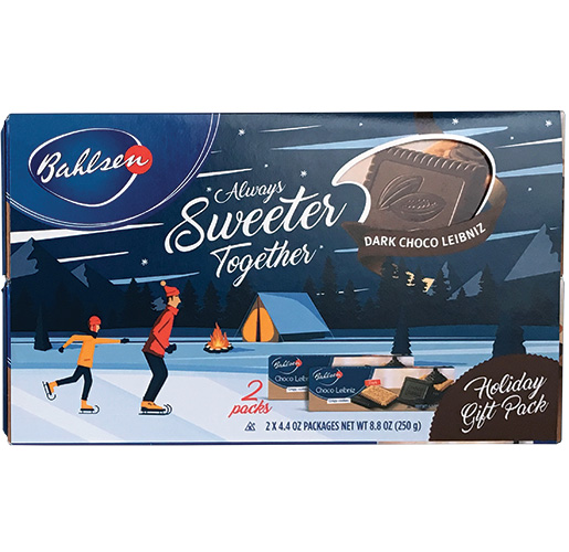
Leibniz Choco
brand owner | BAHLSEN USA
credits
QNY CREATIVE
BAHLSEN USA
Bahlsen USA tasked QNY Creative to create the design for its 2017 holiday packaging for 2017, with a line extension for its Leibniz Choco product holiday gift two-pack. The cookie brand is known for its rich European heritage and a brand message of being together for the holidays. Consequently, illustrations to the label depicting family winter outdoor activities with the message, “Always Sweeter Together,” were added. The design includes a close-up of the chocolate covered biscuits to show shape and texture. Each color was carefully chosen to reflect winter scenes and create a pleasant color harmony.
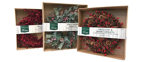
celebrations home
brand owner | ACE HARDWARE CORP.
View more
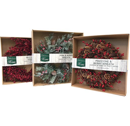
Celebrations Home
brand owner | ACE HARDWARE CORP.
credits
ACE HARDWARE
RR DONNELLEY
For many years, Celebrations has been an Ace Hardware brand of lightingfocused holiday decorations. A majority of the packaging in Celebrations Home will be hang tags, wraps and color boxes with clear windows. As a result, the product is visible and the packaging was designed to have basic descriptions, lending a rustic appearance. Consumer research helped Ace understand that brand awareness of holiday décor is very low, and consumers want to focus on the product and not the packaging.

Old Fashioned Copper
brand owner | BUFFALO TRACE DISTILLERY
View more
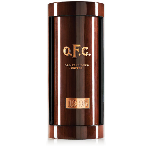
Old Fashioned Copper
brand owner | BUFFALO TRACE DISTILLERY
credits
BERGE FARRELL
IPL PACKAGING
GARETH HUBBARD PHOTOGRAPHY
Buffalo Trace Distillery has been making bourbon whiskey for more than 200 years. The client’s brief was to create a premium box that would house the first vintages of the Old Fashioned Copper Bourbon. It uses a cylindrical woodgrain paper-wrapped structure finished with a high-gloss lacquer. The pack uses a unique swivel closure, and the spinning mechanism inside allows for the bottle to be displayed when on shelf. This wooden box prominently bears the O.F.C. name with a copper logo and a magnetic copper plaque depicting the year the bourbon was distilled.
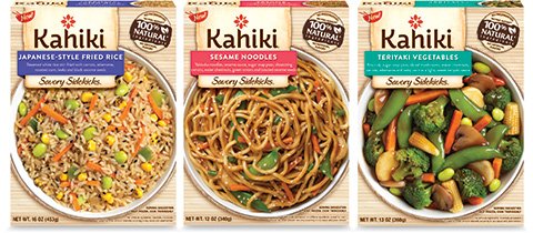
savory sidekicks
brand owner | KAHIKI FOODS
View more
Savory Sidekicks
brand owner | KAHIKI FOODS
credits
KAHIKI FOODS
JUSTIN PARIS, FLASHLIGHT STUDIO
COBURN CARTON SOLUTIONS
Kahiki Foods makes natural Asian foods with no MSG added and no artificial flavors, colors or preservatives. Kahiki Savory Sidekicks were developed to complement a variety of Asian meals. The packaging is designed to catch consumers’ eyes with noticeable imagery, unique flavor banner colors and overall layout while sharing some meaningful fun facts on the back. Each Savory Sidekicks carton perfectly houses the product inside a rectangular food tray and easily sits upright on the freezer shelf.
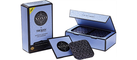
xoxo by trojan
brand owner | CHURCH & DWIGHT
View more
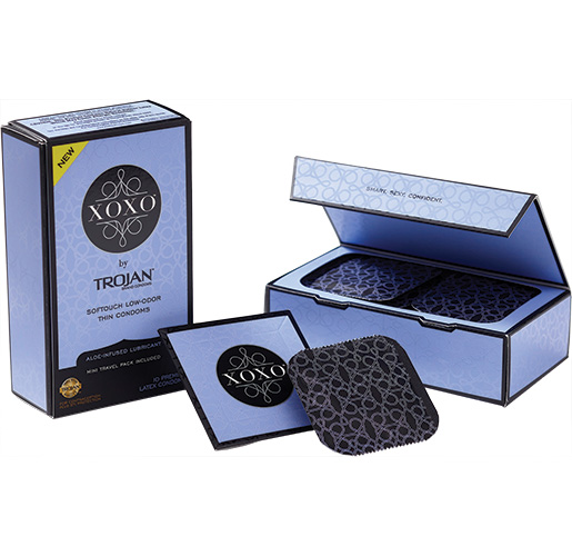
XOXO by Trojan
brand owner | CHURCH & DWIGHT
credits
INVOK BRANDS
XOXO is a completely new condom brand from Trojan. This new brand responds to consumers’ requests for discreet packaging. The Trojan brand has deep consumer loyalty and trust, but this project needed to redefine the way users interact with and respond to the product. The integrated package structure emphasizes discretion and includes an outer sleeve that allows for the removal of the retail graphics, a reusable storage carton with no retail graphics, a travel pack for one or two condoms and a condom foil without an overt brand message.
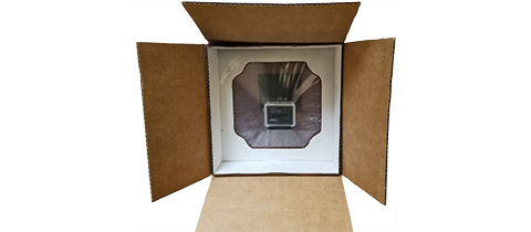
lrc sustainable suspension packaging
brand owner | LRC PRODUCTS, INC.
View more
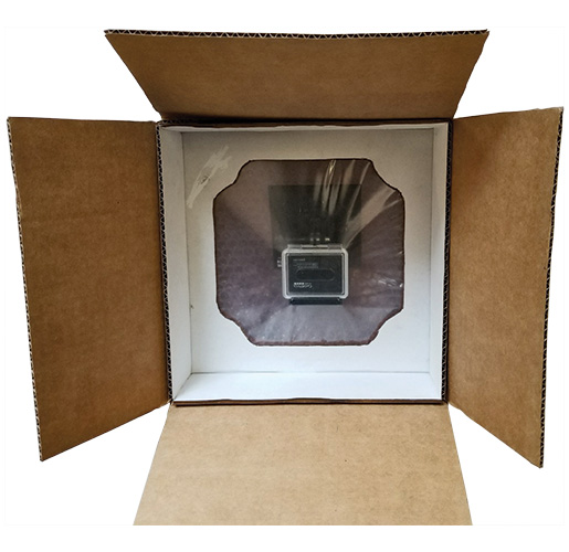
LRC Sustainable Suspension Packaging
brand owner | LRC PRODUCTS, INC.
credits
LARRY ROBERTS
BLUE RIDGE PLASTIC
PRO PACK
This suspension packaging is designed to protect products during shipping. It has a pouch connected to a main platform which is a corrugated tray with a large cutout in the center. Once the pouch is loaded, it tightens around the product like blister pack, and if the container is dropped the product will not come in contact with the edge of the corrugated platform. This package comes in multiple sizes and is ideal for use with electronics, fragile products and glassware.
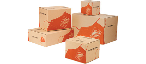
apron shipping boxes
brand owner | THE HOME DEPOT
View more
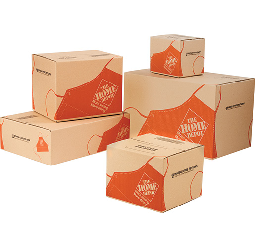
Apron Shipping Boxes
brand owner | THE HOME DEPOT
credits
THE HOME DEPOT
The Home Depot recently redesigned its delivery packaging to incorporate its recognizable orange apron and highlight the many customer service options offered in its interconnected retail business. Customers will see the same orange aprons on the packaging delivered to their door that the retail associates wear. The cases will be delivered to any customer receiving products that are ordered online.
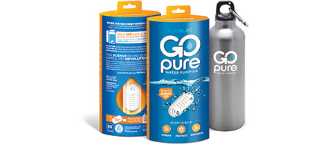
Gopure
brand owner | PURIBLOC
View more
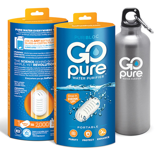
GoPure
brand owner | PURIBLOC
credits
HUGHES DESIGN GROUP
GoPure is the first ever portable water purification technology. GoPure is a highly porous ceramic that attracts impurities and releases valuable trace minerals. It works continuously to keep water clean and fresh. The design aims to create a consumer-facing brand name and package for the innovative product. The front of the package focuses on key product attributes (purify, protect, enhance) to grab the consumer’s attention, and it utilizes the back side to detail key attributes. The blue and orange combination makes the package stand out on retail shelves.
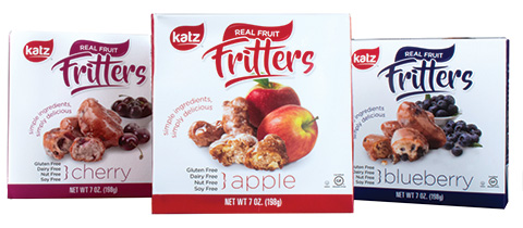
katz
brand owner | KATZ GLUTEN FREE BAKERY
View more
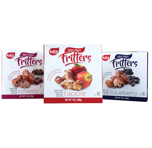
Katz
brand owner | KATZ GLUTEN FREE BAKERY
credits
MCDILL ASSOCIATES
Katz offers gluten-free frozen desserts that a consumer can feel good about eating. It is also a brand that engages its consumers for product feedback and moves swiftly with product development. The packaging for these items shifted the brand’s positioning to create immediate appetite appeal and stand out in the freezer case with a clean look. Another goal was to establish a look for products that have an ingredient focus on fresh fruit to appeal to a broader audience—while not alienating brand loyalists.
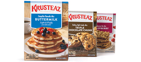
krusteaz
brand owner | CONTINENTAL MILLS
View more

Krusteaz
brand owner | CONTINENTAL MILLS
credits
TETHER
PATTY WITTMANN, FOOD STYLIST
KRUSTEAZ
ANGIE NORWOOD BROWNE PHOTOGRAPHY
Baking, cooking and sharing food is all about connection, yet the baking category is dominated by a handful of food conglomerates with little differentiation. While Krusteaz has been a household name in the West for decades, the brand seeks a spot among legacy and bake-mix brands nationwide. An injection of visual personality and a strong, color-coded brand block helps the brand’s new design stand out on shelf. A refreshed brand badge and instructions improves brand awareness and product navigation. Since appetite appeal is key, the new look also employs mouth-watering photography.
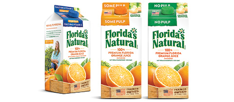
florida's natural
brand owner | FLORIDA'S NATURAL
View more
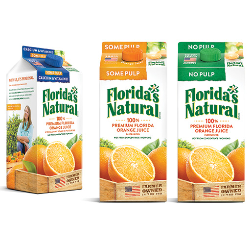
Florida's Natural
brand owner | FLORIDA'S NATURAL
credits
LAM DESIGN
FRANCESCO TONELLI PHOTOGRAPHY
Florida’s Natural juice is farmer-owned and made with 100 percent Florida oranges. To communicate taste appeal and quality, and tell Florida’s Natural story, the packaging’s front panel features luscious oranges nestled in a wooden farmer’s crate stamped with “Farmer Owned in the USA.” The packaging system features a series of four farmer profiles that rotate across the brand’s lineup of 10 SKUs. When the cartons are displayed in the cooler, the front panels were designed so the oranges align across the SKUs creating a brand block with a continuous row of oranges.
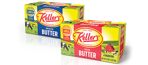
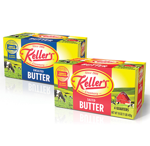
keller's creamery
brand owner | DAIRY FARMERS OF AMERICA
View more
Keller's Creamery
brand owner | DAIRY FARMERS OF AMERICA
credits
DESIGN PARTNERS, INC.
LUNDMARK
The Keller’s Creamery brand has been a mainstay in the Philadelphia region for more than 100 years. Philadelphia consumers perceive it as tastier and creamier than competitive brands. The new packaging seeks to fully leverage Keller’s brand and its Philadelphia heritage while being approachable for new consumers. At the same time, the company wants to communicate fresh butter cues and differentiate itself from national brands. An enhanced brand mark is now front and center, and while still yellow, it is now cleaner and brighter.
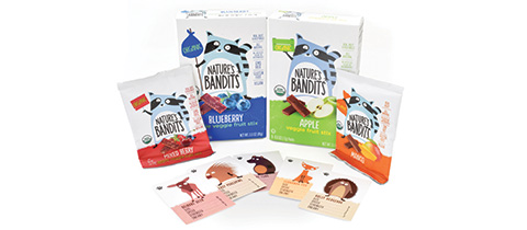
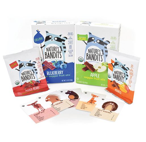
nature's bandits
brand owner | NATURE'S BANDITS LLC
View more
Nature's Bandits
brand owner | NATURE'S BANDITS LLC
credits
FLOOD CREATIVE
Nature's Bandits is an organic fruit and veggie snack created to replace fruit-flavored gummy snacks with minimal nutritional value. This package was created solely to appeal to kids. The organic call-out was very important to ensure consumers know this snack won't compromise healthy choices. The mascot, Ricky Racoon, waves to consumers as soon as the box opens, there is a total of 20 playing cards that can be collected within different boxes. Because the shape of the snack itself is not animal-shaped, the brand decided to bring cute critters into the packaging and cards.
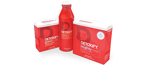
detoxify
brand owner | DETOXIFY
View more
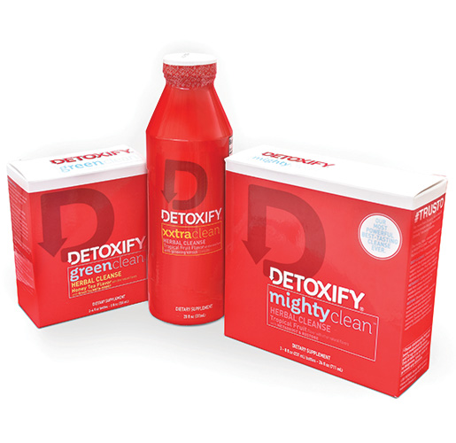
Detoxify
brand owner | DETOXIFY
credits
FLOOD CREATIVE
Detoxify is a line of herbal cleanses designed to help restore a healthy balance by naturally removing toxins. The packaging goals are to display a strong brand mark that shows the key benefit of removing toxins and to stand out from the other herbal cleanses. Knowing that consumers in this space are drawn to brands with bold logos, the company chose to utilize that same look and feel, incorporating red, which strongly resonates with performance athletes.
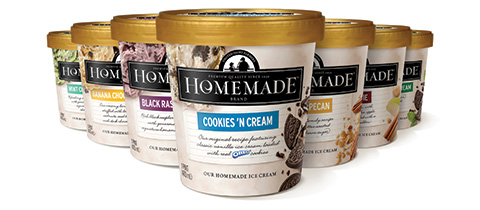
homemade ice cream
brand owner | UNITED DAIRY FARMERS
View more
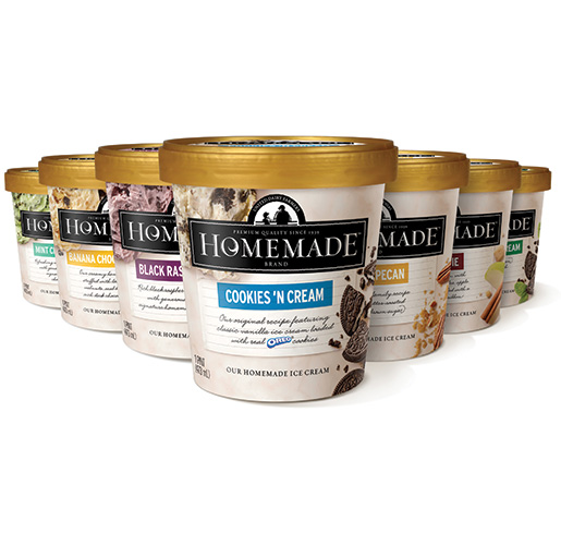
Homemade Ice Cream
brand owner | UNITED DAIRY FARMERS
credits
PERSPECTIVE: BRANDING
Founded in 1939, United Dairy Farmers is a family business making ice cream in the original location. The packaging has been redesigned to better reflect the brand’s high-quality ingredients, craftsmanship and generations of care. It includes an image of a father and son, reflecting the importance of multiple generations’ involvement. The father and son also are looking out over the land, suggesting the future/innovation of the brand/products. A marble background with the ingredients in the background, reflect the homemade nature of the product, connecting to consumers values and needs.
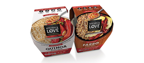
kitchen & love
brand owner | CUCINA AND AMORE INC.
View more
Kitchen & Love
brand owner | CUCINA AND AMORE INC.
credits
PERSPECTIVE: BRANDING
Kitchen & Love brings outstanding tasting, healthy food in a convenient form that is portable, edible hot or cold, and perfect for just about any meal. The structure is a wrap-sleeve over two products: the base (Quinoa or Farro) and the sauce/topping that needs to be poured on top. The new design utilizes the structure to reinforce the moment of consumption. Each design features an overhead shot of the bowl with the two components. Product benefi ts are delivered in a simple-to-digest icon form.
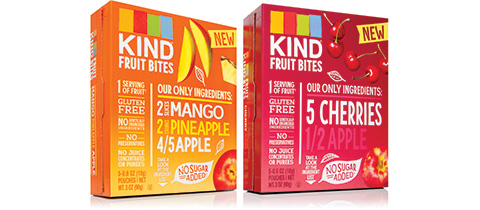
kind fruit bites
brand owner | KIND LLC
View more
Kind Fruit Bites
brand owner | KIND LLC
credits
LITTLE BIG BRANDS
KIND Fruit Bites put real fruit into fruit snacks. KIND has established itself as a brand that is made with ingredients you can see and pronounce. The packaging utilizes call outs that that are playful and natural with hand-drawn elements to act as holding shapes for communication. Real fruit photography is added to depict the fruit pieces. The product is targeted at health-focused parents and young children with an active lifestyle.