
DESIGN GALLERY: Rigid Plastic
View the Rigid Plastic Packaging Products
HOVER & CLICK TO VIEW MORE ABOUT THE PRODUCTS
dixie elixirs
brand owner | DIXIE BRANDS
View more

Dixie Elixirs
brand owner | DIXIE BRANDS
credits
TRICORBRAUN DESIGN AND ENGINEERING
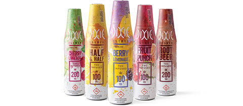
Dixie Elixirs has been an industry leader since 2010, and has been at the forefront of the legal changes in the
cannabis industry. New regulations require tamper evidence, child-resistant closures that re-seal, as well as a dosage
cup. Since no stock packaging existed, a custom design was necessary, which includes the child-resistant closure, an
opaque PET plastic so that users don’t see the product, tamper-evident shrink sleeve and graphics aligned with the
established brand image. Optimizing the cap was key so that the taste and carbonation were not sacrificed.

snuggle scentables
brand owner | THE SUN PRODUCTS CORP.
View more
Snuggle Scentables
brand owner | THE SUN PRODUCTS CORP.
credits
LITTLE BIG BRANDS
THE SUN PRODUCTS CORP.
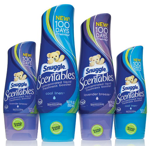
Snuggle Scentables launched in 2017 in the laundry scent booster category, clearly differentiated from the competition as liquid scent booster vs. granular form. The goal was to introduce this concentrated liquid booster to the market in a fun and approachable way, ensuring the graphics align with the modern look of the bottle and cap. The graphic design connects beautifully with the structure following the curves of the bottle and encourages the consumer’s attention. The ergonomic structure snuggles in the hand and the tactile experience lets the consumer know they are in control.
van der hagen traditional safety razor
brand owner | UNIVERSAL BEAUTY PRODUCTS, INC.
View more
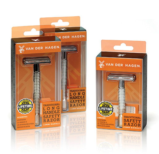
Van der Hagen Traditional Safety Razor
brand owner | UNIVERSAL BEAUTY PRODUCTS, INC.
credits
UNIVERSAL BEAUTY PRODUCTS, INC.
HLP KLEARFOLD STRUCTURAL DESIGN TEAM
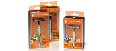
For years, men have been enticed to use the latest expensive cartridge razor, but now there is a significant trend of men switching back to traditional safety razors. When Universal Beauty Products purchased Van der Hagen Enterprises, their safety razors were packaged in opaque paperboard cartons. The paperboard carton did not allow consumers to view the product directly and they were being damaged in spring-loaded merchandizing displays. Universal Beauty chose new transparent packaging to prevent damage and showcase product features like laser-etching on the razor head, and color and finish choices.
safe-t-pet ice melt
brand owner | MORTON SALT
View more
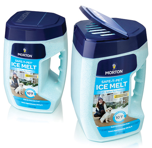
Safe-t-pet Ice Melt
brand owner | MORTON SALT
credits
BERLIN PACKAGING
STUDIO ONE ELEVEN
Numerous research reports and veterinarians indicate salt-based ice melts can be harmful to pets. The Morton Salt Safe- T-Pet product was developed to be a safer option. The three main goals for this package are to increase the product's shelf visibility and benefit messaging, have an ergonomic handle that fits a gloved hand with an easy-pour lid and a refillable vessel, and address structural strength issues. The original container was often crushed during shipping or while stacked in storage. The new container design distributes load more evenly. The container’s closure mirrors the footprint of the package to add stability.
stiks cosmetiks lipstick
brand owner | STIKS COSMETIKS
View more
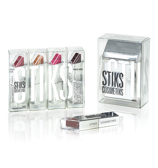
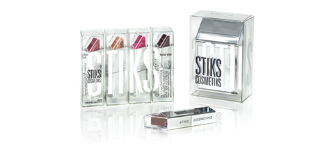
Stiks Cosmetiks Lipstick
brand owner | STIKS COSMETIKS
credits
STIKS COSMETIKS
HLP KLEARFOLD STRUCTURAL DESIGN TEAM
Giving beauty on-the-go a whole new meaning, Stiks Cosmetiks has introduced lipstick that can be applied with one hand, and in under five seconds. Stiks developed a sophisticated and non-traditional rectangular lipstick case with a highly reflective metallic silver finish. The case’s flat profile fits better in a back pocket or a wallet. Attached to the top of the base is a clear plastic flip-open cap that provides a direct view of the lipstick color. The distinctive primary package, rectangular profile, and the ability to apply with one hand, makes this product a standout entry in the lipstick category.
brummel & brown organic buttery spread
brand owner | UNILEVER
View more
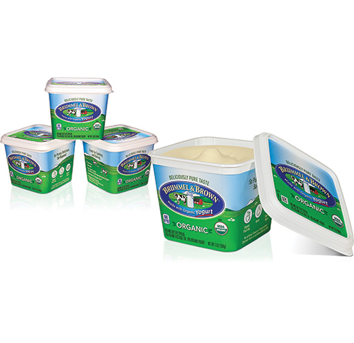
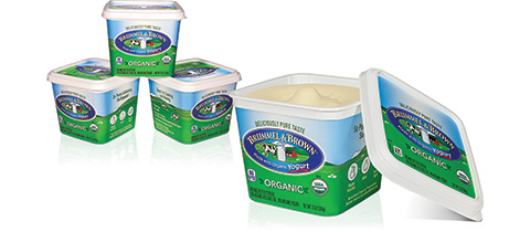
Brummel & Brown Organic Buttery Spread
brand owner | UNILEVER
credits
UNILEVER
TFI ENVISION
Unilever selected TFI Envision, Inc. to develop the packaging graphics for their newest offering: Brummel & Brown Organic Buttery Spread. The design for this product had to maintain the brand look while communicating that this product is for consumers seeking an organic yogurt-based option. The packaging uses the existing iconic logo with the farm scene but wraps the entire package with fresh, green fields and blue skies. The side panels highlight the simple ingredients and the B&B Organic Yogurt Promise.
teas' tea
brand owner | ITO-EN NORTH AMERICA
View more
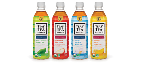
Teas' Tea
brand owner | ITO-EN NORTH AMERICA
credits
CLARKMCDOWALL
ITO-EN NORTH AMERICA
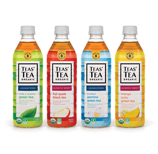
Teas' Tea takes a mindful approach to its pursuit of tea perfection, with purpose behind every meticulous step in the manufacturing process which artfully maintains the integrity of the tea leaf and the earth as a whole. In its packaging, Teas’ Tea wanted to optimize its brand mark, descriptor and tagline to strengthen its presence while refreshing the overall packaging look and feel. The label language emphasizes organics and explains points of differentiation. Macro photography has been used to show detail and quality, reinforcing flavor and freshness.
performix iridium
brand owner | CORR JENSEN
View more
Performix Iridium
brand owner | CORR JENSEN
credits
TRICORBRAUN DESIGN AND ENGINEERING
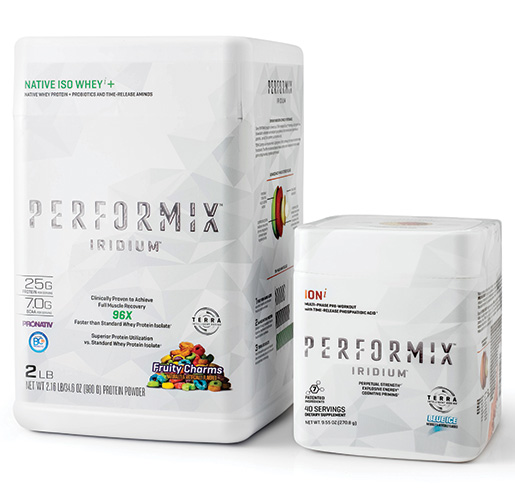
Performix Iridium is a premium protein option for consumers in the sports nutrition category. Achieving easy container access while disrupting the round containers commonly used in the category was the packaging objective. Eye-catching embossing of the Performix brand on the square tubs enhances the brand message. The go-to-market timeline was tight, and a solution was needed that could be produced quickly. The tubs use a custom “gas cap” 120mm closure, compatible with the contract filler's manufacturing capabilities.
bolthouse farms organic dressing
brand owner | BOLTHOUSE FARMS
View more
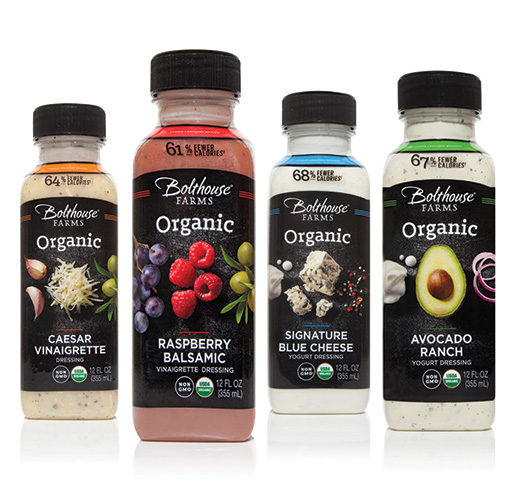
Bolthouse Farms Organic Dressing
brand owner | BOLTHOUSE FARMS
credits
LITTLE BIG BRANDS
ARISTO PHOTOGRAPHY
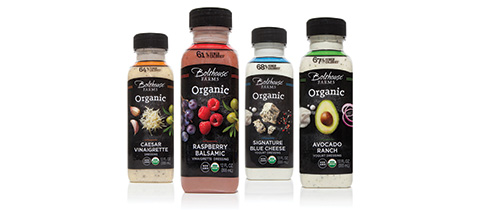
Bolthouse Farms introduces a new line of premium organic dressing with even more appealing ingredients. The packaging is designed to highlight the ingredients and to communicate that the brand is from true farmers and food lovers. This bottle mimics the brands' original structure but showcases the ingredients with overhead photography shown on a minimalist background. Simple typography allows the ingredients to stand out.
wholesome! agave syrup
brand owner | WHOLESOME!
View more

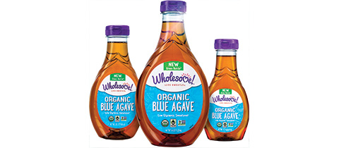
Wholesome! Agave Syrup
brand owner | WHOLESOME!
credits
BERLIN PACKAGING
STUDIO ONE ELEVEN
Wholesome! is a company with a passion for environmental responsibility. To support their
environmental ethos, Wholesome! wanted to transition its seven-bottle Organic Blue Agave line into
recyclable “green” bottles. They also wanted to redesign their bottles to move from petroleum-based
plastic to 30 percent plant-based PET without disrupting existing fulfillment and distribution lines,
as well as downstream logistics for its customers. Hidden ribs were built into the label panel to ensure
strength and a smooth label. This adds rigidity to the bottle and makes the labeling more efficient.
bodyarmor superwater
brand owner | BA SPORTS NUTRITION, LLC
View more
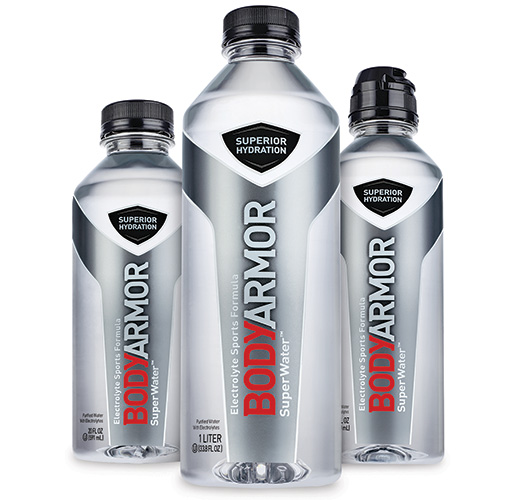
Bodyarmor Superwater
brand owner | BA SPORTS NUTRITION, LLC
credits
FLOOD CREATIVE
BROOK AND WHITTLE
ZUCKERMAN HONICKMAN
BodyArmor SuperWater was formulated for athletes as an additional hydration solution to BodyArmor SuperDrinks. Flood Creative designed a bottle and label that would maintain the design integrity of the base SuperDrink line but embody the attributes of a hard-working water. It needed to fit into an athletes hand and lifestyle. The bottle uses the signature armor-and-shield shape, highlighted in silver to showcase the product quality. It has a wide-mouth opening for faster and easier hydration.
darty
brand owner | HARVEST HILL
View more
Darty
brand owner | HARVEST HILL
credits
THE BIONDO GROUP
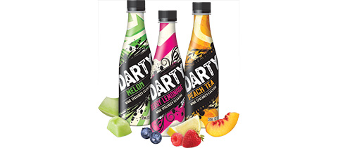
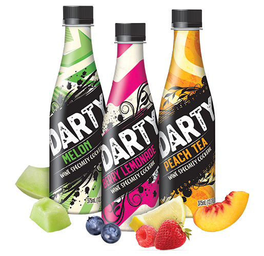
Harvest Hill’s DARTY 20-proof wine cocktail was introduced to compete against the new product category of wine coolers and cocktail mixers targeted to a younger audience. The goal was to be disruptive in a cluttered ready-to drink environment. It needed to work in a bin, on-shelf and in a display aisle. The bottles needed to stand-up to larger wine bottles and coolers on shelf, so the graphics had to capture the interest of the target consumer. The structure is a 12.7 oz, shrink-wrapped bottle that is color-coded for each flavor with different street art graphic depictions.
seriously indulgent yogurts
brand owner | THE HAIN CELESTIAL GROUP
View more
Seriously Indulgent Yogurts
brand owner | THE HAIN CELESTIAL GROUP
credits
THE BIONDO GROUP
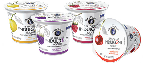
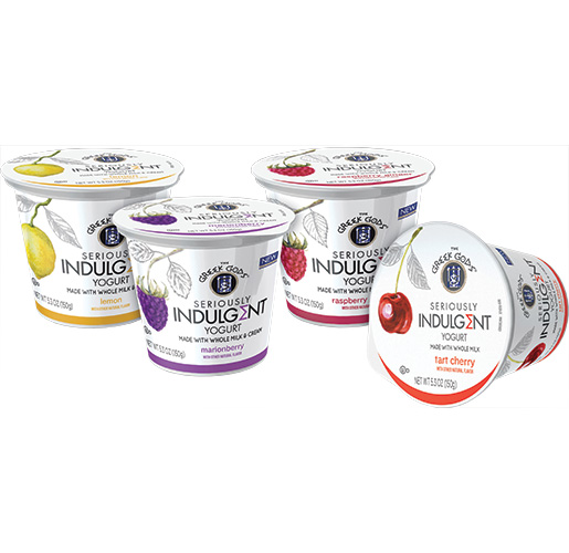
The specialty yogurt category has become increasingly popular recently with consumers. Yogurt consumers are looking for healthy ingredients with a richer, creamier taste experience. Greek Gods’ was interested in expanding its line with new product portfolios with dessert-like yogurts distinctively different from their baseline Greek yogurts. The Seriously Indulgent packaging connects with the consumer with the simplicity of the design communication, a strong descriptive name “Seriously Indulgent,” as well as elegant line and watercolor illustrations.
