Vanity Fair Napkins Aims to Knock the Brand Off Its Pedestal
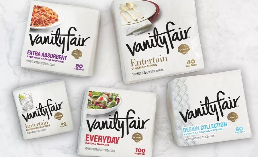
With its elegant, shell-embossed design and sophisticated image carefully cultivated for almost 60 years, the Vanity Fair brand of napkins has a reputation as a product for special occasions. Now, parent company Georgia-Pacific wants consumers to know that Vanity Fair napkins can be part of their everyday lives.
“As our day-to-day customs evolve and become more relaxed than they have been in the past, we want consumers to know Vanity Fair has a product for every need, from napkins to use for more casual, everyday meals to products that provide the perfect complement to even their most formal entertaining occasions,” says Lloyd Lorenzsonn, brand building leader for napkins at Georgia-Pacific. “We were seeking to better connect with our consumers through our packaging and convey the seamless nature of the brand,” he adds.
With the brand balancing its image of elegant vs. everyday, Georgia-Pacific looked to Flood Creative (floodcreativeny.com), the Irvington, NY-based brand design firm to navigate a revolutionary brand and package redesign to help it compete against private label as well as other paper towel choices.
According to Stuart Whitworth, partner/chief creative officer, Flood Creative, “The positioning change and lifestyle connection required a complete overhaul to reflect consumers’ everyday use of the product. We started by making the brand identity more approachable by replacing the formal and almost calligraphic script with a modern, casual black script. It’s still confident but now more personal. The new script combined with the lower case initials and the slight angle at which the brand name is written all come together to reflect more of how we write today. The gold shell is a new icon we created and is now a permanent part of the logo.”
The various products were differentiated with a color palette that extends beyond red and those colors are combined with a simple food or beverage photograph that both captures a moment and also helps with differentiation per SKU on shelf.
“The bolder, more expressive logo creates an effective design asset for the brand as we grow,” says Brian Rice, senior director, packaging design & innovation at Georgia-Pacific. “Flood Creative was able to take a brand rich with emotional, visual and tactile associations and use lifestyle cues to make it much more accessible. It was a step we needed to take in order to maintain our leadership position,” he adds.
The package redesign reinforces the brand’s new ad campaign from Figliulo & Partners, dubbed the “How Lovely” initiative, playing off the elegance equity with an effort that aims to bring a little civility to the chaos of everyday life.
Looking for a reprint of this article?
From high-res PDFs to custom plaques, order your copy today!