Hops Rebrand Represents Past, Present & Future
Since the mega-merger of two industry leaders, the brand changed its name from YCHHOPS (YakimaChief HopUnion Hops) to Yakima Chief Hops, honoring more than 30 years of connecting family hop farms to the world’s finest brewers. With a goal of global leadership and e-commerce, they turned to Seattle-based brand strategy firm, Retail Voodoo (retail-voodoo.com) to help establish a completely new brand strategy.
“We worked directly with them to clarify how they talk about hops, hop farming, their mission and history. This led to a new positioning focused on farming and science. We then helped them build their marketing and global e-commerce programs, and did a complete rebrand — including new tone, voice, packaging, marketing and advertising materials," said David Lemley, founder/chief strategist, Retail Voodoo.
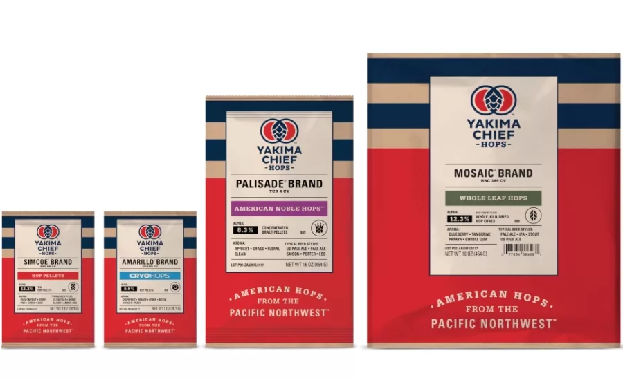
With other hop brands similar in color, hue, typeface and imagery, the design team created a new logo for Yakima Chief Hops that represents the past, present and future of the organization as well as the science of hop growing.
“Additionally, we wanted to celebrate their American heritage and their long standing relationship with the Yakama nation by using an earthy red and blue, that set the stage for a modern, Americana theme: timeless, bold and iconic,” added Lemley. The new tagline reads: American Hops from the Pacific Northwest.
The interlocking rings of the new logo are connected with a hop cone that mirror the company’s core mission of connecting family farms with the world’s finest breweries by supplying the highest-quality hop products as well as the connection of two grower-owned companies.
The hop pellets are available in 1-ounce and 16-ounce packages in varieties such as American Noble Hops and Whole Leaf Hops.
Looking for a reprint of this article?
From high-res PDFs to custom plaques, order your copy today!