Top Fox's Pumpkin Seeds Stand Out in Stores with Revamped Packaging
Jeremy Zobrist’s decades of experience in the food industry have taught him a few lessons. One has been particularly helpful in his role as founder and CEO of Top Fox Snacks: When warranted, ask for help from experts.
Founded in 2019, Top Fox was struggling with sales and looking for something to help boost velocity. “We had been gaining distribution in stores, but were having a hard time getting consumers to put the pouch in their basket,” said Zobrist. “We had no real marketing team, but we felt confident that it was a good product. So I talked to a consultant, who helped us realize that we needed to invest in the packaging.”
Since he lacked branding experience, Zobrist then reached out to Interact Brands to help transform the design. Almost immediately, Fred Hart (formerly of Interact Brands and now an independent brand consultant) and his team at Interact saw an opportunity: Transform Top Fox—which was being sold in the produce section of grocery stores—into a true snacking brand.
Top Fox had an issue: the product was delicious, but it became clear that consumers weren’t quite sure how to eat it. It seemed like something you would add to salads, rather than eat on its own. “The idea of snacking on pumpkin seeds does not come naturally to most people,” said Hart, referring to Top Fox’s flagship product when the redesign was undertaken. “So we had to cue the shift in consumer behavior that we wanted to see.”
In developing the brief, the Interact team looked for inspiration from other brands that had changed consumers’ mindsets in this way. “Think about Bark Thins. They really reframed chocolate as a snacking occasion, and we wanted to do the same with Top Fox,” said Hart. It would be a heavier lift—pumpkin seeds don’t have the same cachet as chocolate—but the brand did have better-for-you credentials on its side.
Pumpkin seeds and sunflower seeds (the latter were being added to Top Fox’s portfolio, along with a combination of the two, called Duos) are nutrient-dense, with plenty of healthy fats and essential minerals. They even have a decent amount of protein, though Hart recognized the balance that needed to be struck. “This is not a protein snack. It’s nice to have, but it’s not core to the proposition. Still, in today’s protein-focused environment, there’s value in accentuating it.”
Healthy or not, it was flavor that would drive consumers to buy Top Fox. The Interact team needed to better highlight how delicious the brand’s myriad flavors (ranging from Chile Lime to Himalayan Salt) really were. “In our initial conversations with Interact, it became clear that we needed to reposition this not as a healthy product, but as a snack product that happened to be healthy,” Zobrist commented.
The Interact team got to work on concepts. Hart was quick to point out what a complete team effort it was, with Andrew Sondheim (design director at Interact Brands) taking on a central role. “I was helping with the overall creative strategy, but Andrew was doing a lot of the work creatively. He developed the intention and thoughtfulness behind the work,” Hart noted. “This was truly a team effort at Interact Brands.”
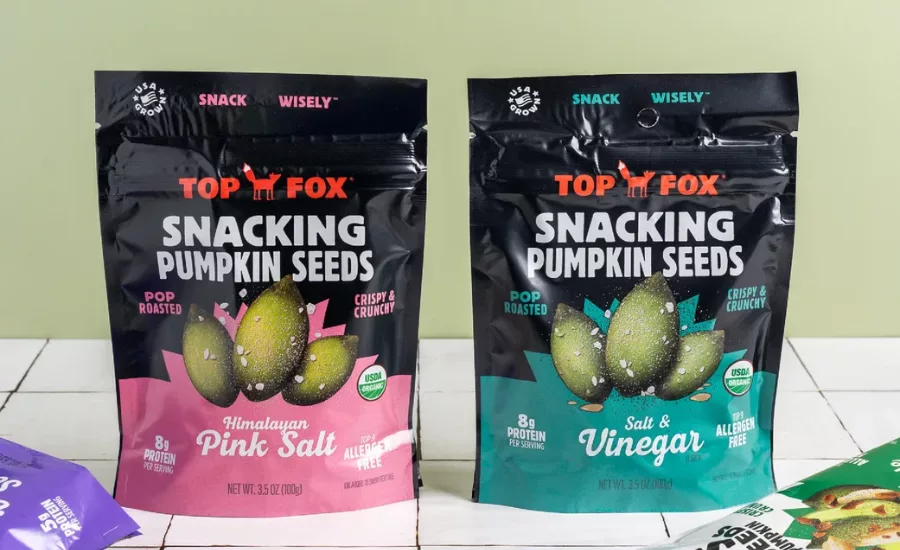
First up was showcasing the product itself. The prior packaging featured a cascade of pumpkin seeds falling from the top (“more quantity than quality,” Hart noted), and Interact decided to make a few seeds the hero, enlarging and centering them on the package. “You can show off the dusting of flavors on the seeds that way, so they don’t look as plain,” Hart said. Interact had success with a similar approach for previous Designalytics Effectiveness Award winner, Boulder Canyon, opting for images of a few large, textured chips rather than a whole bowl. “It really drives appetite appeal when you show it up close,” Hart added. “It creates greater contrast and feels like something you'd actually want to eat.”
The brand couldn’t be subtle with its snacking suggestion, so the largest word on the pack is now “snacking” for both the pumpkin and sunflower seed SKUs (slightly smaller, but still prominent, on the Duos varieties). “When you’re trying to prompt a new behavior, it helps to be a little more explicit,” noted Hart. In addition, a tagline—”Snack wisely”— is unmissable on top of the design and helps solidify the product’s snacking credentials.
Other claims and descriptors were placed strategically around the package, including an allergen-free claim (indicating it’s good for kids), a “USA Grown” badge, and the important protein callout. “Pop roasted” remained in the new design, but with a helpful “crispy and crunchy” claim to help better communicate the texture. “The product does eat differently than more dense seed products, and ‘pop roasted’ insinuates a certain cooking process and texture. ‘Crispy and crunchy’ just describes what the actual experience of eating pop-roasted seeds is like.”
When it came to color, it was important to evolve rather than replace. “Top Fox didn’t need an all-new brand,” said Hart. “So we used the color block from the original packaging but added a healthy amount of flavor color to counterbalance it.” Each product variety had its own color—Duos packages are white, sunflower seeds are tan, pumpkin seeds remain in their original black—and the flavors within each of these variants have eye-catching colors of their own to help with line navigation (e.g., pink for Himalayan Salt, bright green for Chile Lime, etc.).
While the agency was at it, they subtly upgraded the brand mark as well. They added a white tuft to the fox’s tail, and changed the previous handwriting font to more commanding, insistent block lettering. Interact felt the logo should be as confident as the rest of the pack. “These are bold snacks. They’re flavorful. So we brought the typography along for the ride,” Hart said.
The results speak for themselves. In Designalytics’ testing of the two designs, consumers preferred the new look by a considerable margin, 69% to 31%. Not surprisingly, sales soared—in the six months following the launch of the new design, Top Fox’s sales increased by 54% compared to the same period during the prior year.
Suddenly, those pouches were flying off the shelves, and Zobrist believes that his decision to redesign was the catalyst. “This was more than a packaging investment, it was an advertising investment as well,” he said. “It helps to have a good product, but if you don't have great packaging, you’re not going to get a chance with consumers. So what I learned was this: Packaging sells.”
This article was provided by Designalytics. For more information, please visit https://www.designalytics.com/.
Looking for a reprint of this article?
From high-res PDFs to custom plaques, order your copy today!