In-Store Special: Top to Bottom, Structure Helps Brands Stand Out
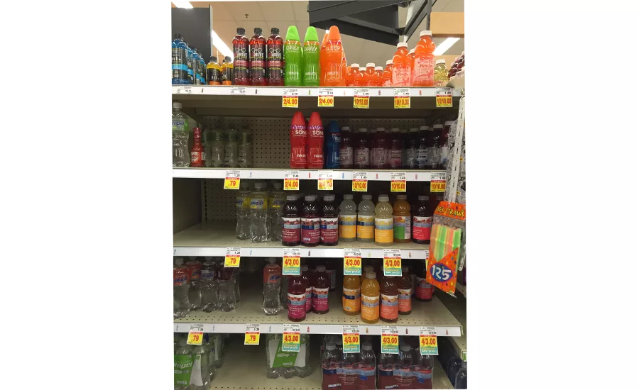
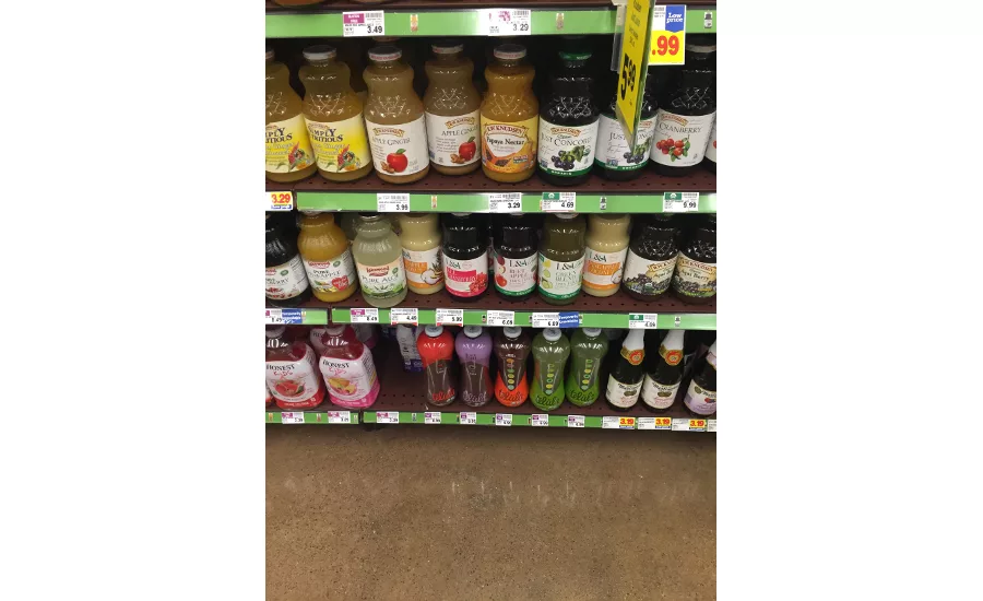
Recently, while I was wandering the beverage aisles examining packaging, two structures in specific stuck out to me. Interestingly, one—the Neuro line of drinks—was placed on the top shelf, and the other—Telula juices—occupied the bottom shelf.
All brands would love to be placed directly in customers' line of sight. But when your idea of prime positioning is the middle shelf or an end cap, and your product is placed up high or down low, are you out of luck in catching customers' eyes? With the right package design, definitely not.
HOW YOUR BRAND IS SPOTTED AT SHELF
Sight sequence at the shelf happens in the following order: Color is always recognized first, shape is second, symbols third, visuals and symbols are next, and lastly, words are read.
It is always recommended brands be aware of their competitor’s colors and then find a dissimilar one to own, so customers can easily find you.
Investing in a unique structural design in packaging is another excellent way to create standout for your brand, especially if you can find a way to break the mold in your category.
DESIGNING A FUNCTIONAL STRUCTURE
Of course, a unique packaging structure means nothing for your brand if it negatively impacts your customers’ experiences with your product. Make sure the choices you make in designing a custom package are centered on function—though that doesn’t mean the package can’t also be beautiful. Also, think of your retailers and the supply chain: Will the package be easy to stock and stay upright? Will packing and shipping become more or less efficient?
Take a look at the case study for Mederma Stretch Marks Therapy’s secondary structure: The brand faced many hurdles with the product including one retail facing and bottom shelf placement surrounded by a disparate array of skincare products all with heavy blocking. It also has a $40 price tag, which is higher than most drugstore products and earns it security devices like Lucite keepers and spiders in some stores.
The brand was able to overcome all these challenges at shelf with its redesigned packaging. Though the package’s shape is not unusual, design agency Little Big Brand first used color, foils, and graphical shape to draw customer eyes, and then incorporated small refinements to the custom structure—such as the curved front flap—to make the single product as standout as possible on the heavily blocked bottom shelf.
Or, consider Carmex's triple-threat packaging: Due to category saturation of competing products, coupled with the small size of the tube, The Goldstein Group designed a variety of new shapes for the blister pack, which command attention on shelf by breaking away from the expected shapes.
THINK OUTSIDE THE USUAL DESIGNS
A unique structure may be just the ticket to help your brand overcome poor shelf placement. Great package art helps, but don’t stop there. Consider creating a custom structure—or an unusual application of a stock package shape—to help your customers find your product on the shelf, whether it is at the top or bottom.
Looking for a reprint of this article?
From high-res PDFs to custom plaques, order your copy today!


