In-Store Special: Current Trends in Baby Packaging
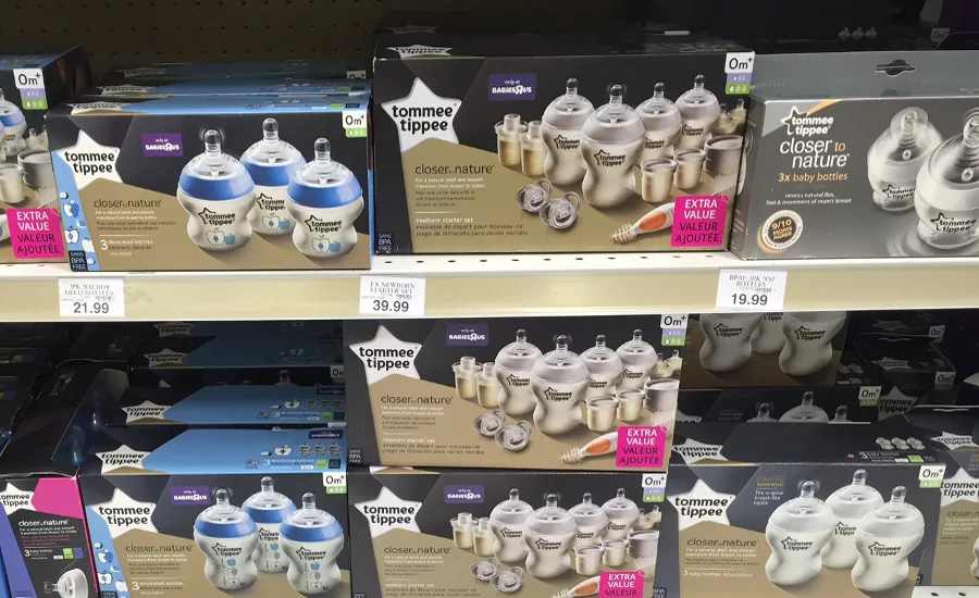
The Tommee Tippee brand is one of the ranges that showcases the box's entire contents so buyers see what they are getting at a glance.
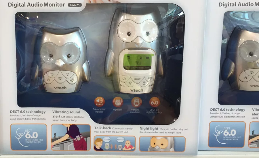
VTech Safe and Sound Digital Audio Baby Monitor shows shoppers product benefits through illustrated icons.
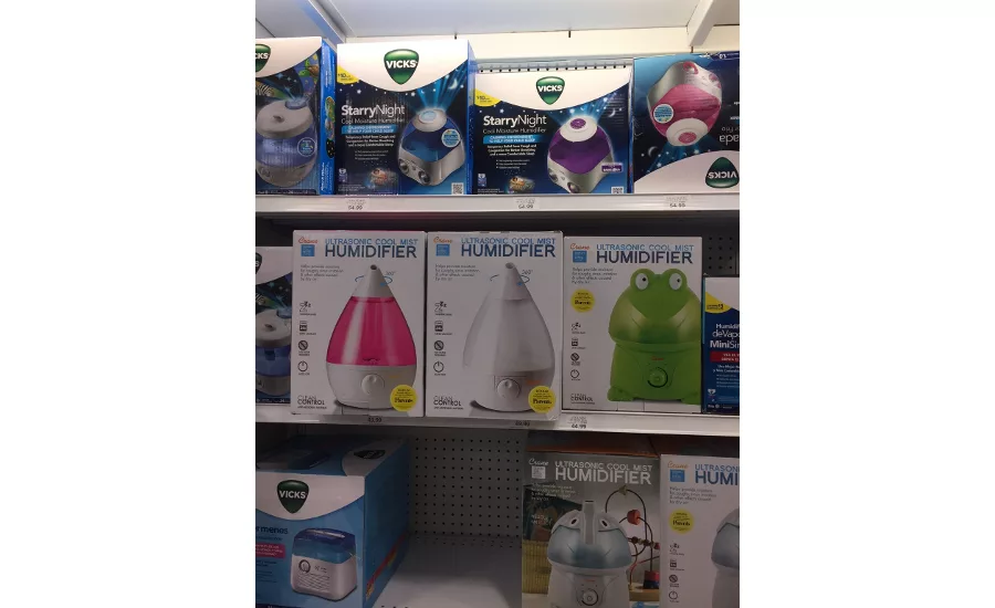
Crane's humidifier packaging is a beacon, helping customers locate the devices from a distance.
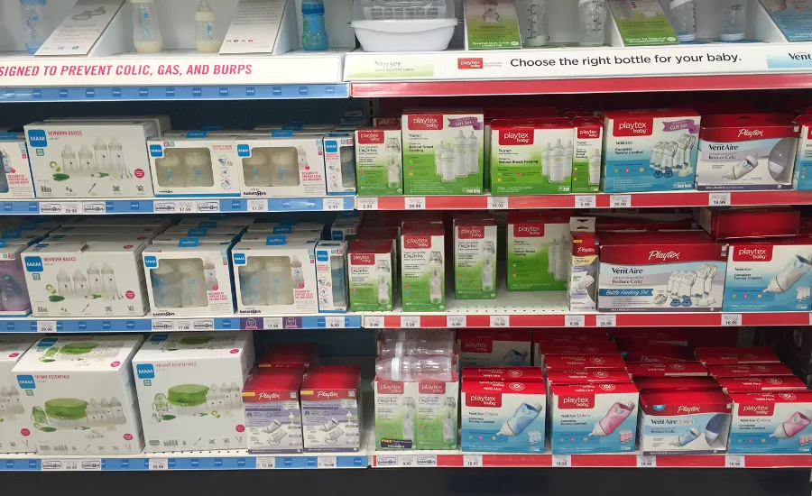
In this case, the nearly all-white packaging for Mam works against the brand when placed next to Playtex's white packaging accentuated with the brand's red.
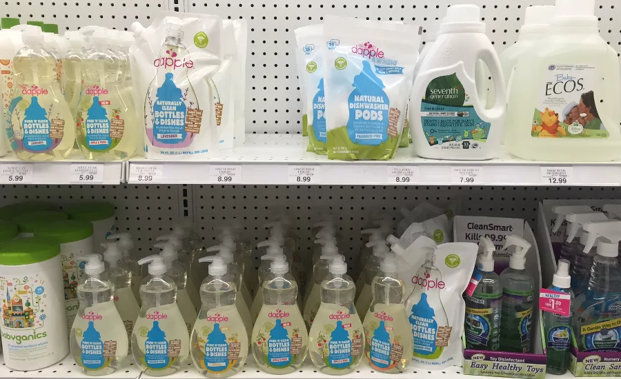
Dapple and Babyganics feature an updated take on natural design cues—outdoor scenes and use of green hint to the product ingredients without being overt.
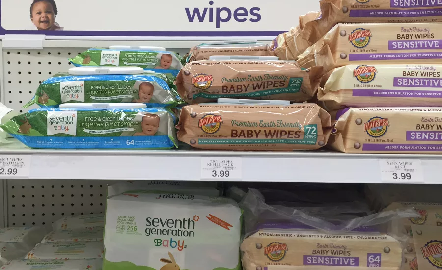
Earth's Best products target eco-conscious moms and dads through strong design cues.
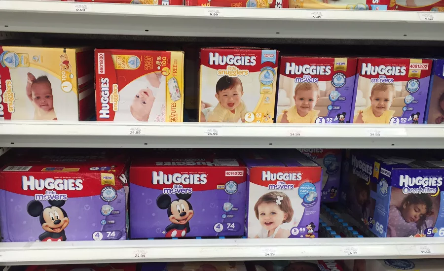
Licensed products are heavily used in the category, especially as children start walking and talking.
For this in-store special, I stopped into Babies"R"Us to see what packaging trends are happening. Several were evident, including:
1. Symbols and images to depict functions and contents. Customers continue to be increasingly strapped for time. Brands and their designers using abbreviated methods of relaying information to customers put themselves a step ahead of the competition.
2. Clean, white packaging helps your brand (except when your competitor is doing it better). Crane's humidifier packaging spotlights the product—its drop shape and frog doing a better job than its elephant version on the shelf below—though even the small amount of white on Vicks breaks up the busyness at shelf and draws attention to the brand.
But when it comes to shelf impact for Playtex and Mam, the Playtex line is the clear winner in catching eyes because of its strategic use of the brand's red to create a color block effect. It's a good example of knowing your competition, because you won't have control over the brands you are placed by. Mam may have fared better in a more cluttered situation, but here, it struggles to pop.
3. Organic and natural either goes hip or "crunchy." Brands like Dapple or Babyganics use an updated take on eco cues, while Earth's Best goes with a woodgrain "crate" designs on its wipes. Neither is better than the other, it just depends on the mom or dad your brand is targeting.
4. Licensing is everywhere. Though evident on almost every stage, nearly across the board, the older the age a product is intended for, the greater the chance of licensing appearing on packaging is. Diapers and training pants especially begin featuring licensed characters once a child is at a place where they begin recognizing and showing interest in characters from movies and shows.
WHAT'S A BRAND TO DO?
If your brand exists in this space, assess your packaging to see if:
- You are offering customers simplified, clear ways to know exactly what they are getting on the front of the pack. Side and back panels can break information down deeper.
- Your use of white will help your brand stand out, not fade into the background.
- You are appealing to your target audience. Who does your brand exist for? Design for them—brands that try to include everyone water down their impact. It's better to alienate some than have a weaker appeal to many.
- You should try a licensed design. Parents use a billion wipes and diapers on their children, and training or changing time is not fun for either parent or child: giving your products something to interest or distract may make you a favorite in the household. Not a fan of licensing? Give your products and packaging their own unique designs, like Flood Creative did on Me4Kidz MediBuddy first aid kit for Target.
By keeping up-to-date with competition and customer preferences, your new packaging designs and redesigns can help make you the chosen brand at shelf.
Looking for a reprint of this article?
From high-res PDFs to custom plaques, order your copy today!


