5 Creative Packaging Design Trends for 2019
Your company’s brand identity is everything visual about your brand. Packaging is the touchpoint between your brand and your customers. It’s what your customers and prospects see, pick up, hold and take home. Make sure your products don’t get left on the shelves in 2019 because of dated, unattractive packaging design.
To help you, we’ve identified five creative 2019 packaging design trends that are accessible, attractive, and easily adapted for any business.
Let’s take a closer look at each of these trends.
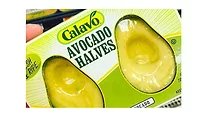
1. Minimalist Packaging
With all of the nostalgia for the brashness and brightness of '80s and '90s, minimal design might come as a relief for the eyes. Do you want to create a lasting, striking impression on consumers? Let your product speak for itself. Reducing a product’s packaging design to its essence is a powerful way to truly hone your brand.
Minimal packaging design allows the integrity of your product to shine through. It can provide a break for consumer eyes weary of bright, cluttered packaging adorned with outrageous or ornate design work. This design style can also bolster a brand’s personality.
2. Sustainable Packaging
With more and more focus on the impact of packaging waste, it’s more important than ever that designers and companies think green. It’s not just the right thing to do - it’s also good for business. A Nielsen study found that 66 percent of global consumers said they would pay more for sustainable brands.
Many studies on the buying habits of millennials found a preference for sustainable products as well. A different Nielsen study found that 3 out of 4 millennials and 72 percent of Gen Z polled would pay more for a product with sustainable packaging.
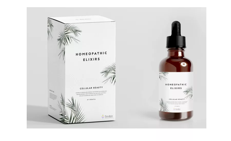
3. Soft Neutrals, Pastels, and Patterns
After a design trend hits, there’s often an opposing trend that seems to surface soon after. Call it reactionary, evolutionary, or simply how trends change and progress.
In the past few years, we’ve seen a pattern in graphic design trends that incorporates bright colors, loud patterns, and in your face graphics.
These designs are colorful, but they don’t work for every business. Fortunately, the recent shift to bold, brightly colored designs has its own counterpart trend. The 2019 trend to incorporate neutral colors, pastels, and patterns are like a salve for overtired consumer eyes.
The versatility of this softer trend has been embraced by a wide variety of businesses. Cell phone cases, intimates, even our beloved coffee packaging – businesses in every marketplace have found a way to adopt a neutral palette into their packaging.
Packages using these trends speak to our softer side. They create a welcoming feel that can be effective to draw in consumers seeking something more compassionate or considered.
This trend doesn’t mean that packages have to fade into the background or appear more passive. Designers can use pastels and patterns to create visually compelling packages that attract attention.
In fact, most minimalist designs heavily emphasize the company’s name, logo design, and brand as you see in these examples. It’s a good way to put your brand identity - and key messaging - front and center.
If your brand or product benefits from a more subtle or mellow look and feel, incorporating this trend may uncover the packaging zen you’ve been seeking. We expect packages in 2019 will have more of these soothing, gentle color palettes.
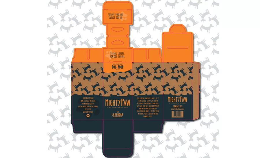
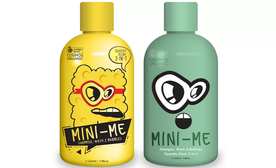
4. Unusual/Playful Package Graphics
Far too many packages have a serious look. You know the ones – their stark, commanding graphics and imposing, stern typefaces impress customers with their obvious sophistication or visual dominance.
An unusual and playful style of packaging works well for some brands, but taking a step outside of a more serious approach can draw attention, too.
Adopting an unusual, playful graphic style in packaging can appeal to consumers looking for a lighthearted experience, an adventure, or something aggressively fun. Knowing your market is important here – you probably wouldn’t want to purchase medical supplies wrapped in neon smiley face adorned packaging.
But if you know your consumers are in it for a good time or a youthful feel, this fun and fancy free trend might be worth playing around with.
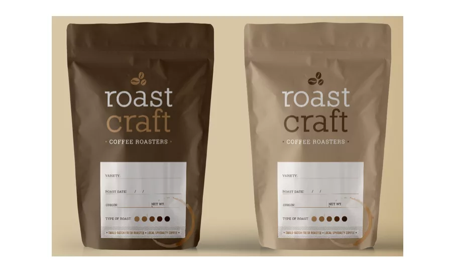
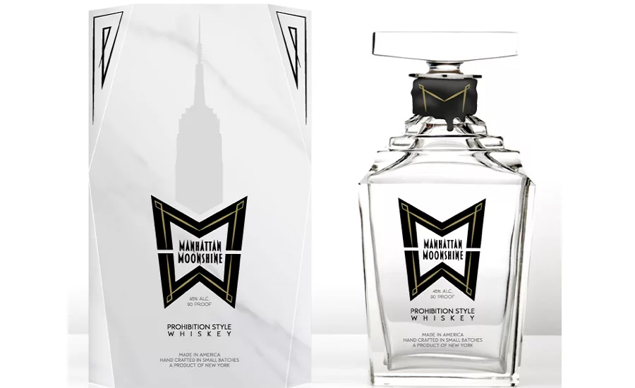
5. Black and White Colors
Designers have used the yin and yang of colors to great effect, and this trend shows no signs of fading to… well, black. There’s something powerful about packages that use white and black. It removes the distraction of color, and instead draws the eye to the shape and form of the design. It also spotlights the copy, which can be advantageous when copy is a critical part of your brand.
There’s also a sophistication to designs using black and white. If you’re not sold on the bright, intense colors in other trends, the simplicity of black and white may be perfect for you.
Looking for a reprint of this article?
From high-res PDFs to custom plaques, order your copy today!