2018 Design Gallery People's Choice Award Winners Announced
BRANDPackaging announced the winners of its 2018 Design Gallery People's Choice awards at the annual Packaging That Sells Conference held in Chicago on October 8-10. The awards recognize the industry's best packaging designs based on how effectively the packaging uses graphics and structure to tell a brand's story.
This year's competition drew 86 submissions across five award categories: Paperboard, Flexible, Rigid Plastic, Glass and Metal. In addition, an overall Editor's Choice was selected out of the nominees from all categories.
Unlike most other design competitions, the Design Gallery awards are chosen by online voting. This year, more than 3,000 votes were cast by BRANDPackaging readers, representing a broad cross section of packaging professionals. Many similar competitions are determined by only a small number of judges.
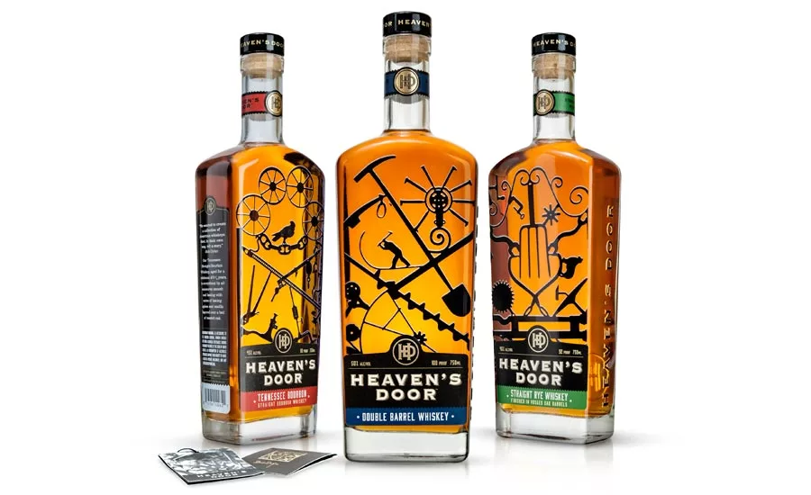
Heaven’s Door Whiskey — co-created by Bob Dylan and named after his 1973 song, Knockin’ on Heaven’s Door — was chosen as the winner for the Glass category award. The custom rounded-shoulder bottle shape is the work of Studio One Eleven, the design and innovation division of Berlin Packaging and is inspired by Dylan’s ironwork gate sculptures created in his studio, Black Buffalo Ironworks, and include objects found on farms and scrapyards across America. The custom "HD" embossed bar top closure, adds a finishing touch that translates to a premium spirit with an artistic soul.
Other category winners include:
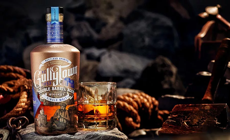
FLEXIBLE: Phenix Label, USA won in the flexible category for creating a tactile sleeve for Restless Spirits Distilling’s GullyTown double barrel aged whiskey. The “storybook” label features a textured copper jacket that is achieved by printing raised UV on the inside of the wrap—when applied to the bottle to create a hammered effect. A custom illustration depicts a scene with the legendary two barrels that helped the workers pass their time. The small river that flows behind the characters is a window to view the spirit.
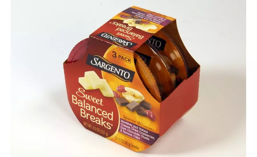
PAPERBOARD: Sweet Balanced Breaks — a platform extension of the Balanced Breaks sub brand — from Sargento addresses consumers' desire to fulfill their sweet cravings with a balanced better-for-you snack. The dual yin-yang design motif conveys visual balance of savory cheese and sweet dried fruits and dark chocolate in one convenient grab-and-go packaging.
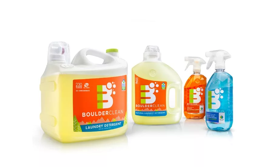
RIGID PLASTIC: Boulder Clean is an eco-friendly company focused on providing top quality, sustainable cleaning products that are not only safer for the home, but for the planet. Instead of using a typical "top-hat" design, Berlin Packaging (berlinpackaging.com) opted for the bell-shaped profile transitions pleasingly into the shoulder of the bottle. The threaded finish uniquely allows the cap to be removed for refilling.
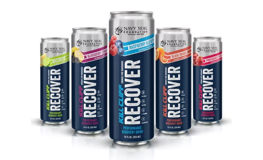
METAL: Kill Cliff was founded by Todd Ehrlich, a U.S. Navy Seal, who saw a need in the market for sports drinks that taste amazing and actually benefit the user. Kill Cliff’s natural ingredients, no sugar, effective product formulations and superior taste separate it from other energy and performance drinks. The goal of the new packaging, created by Berlin Packaging/Studio One Eleven was to effectively communicate the brand difference and to better align with all aspects of fitness.
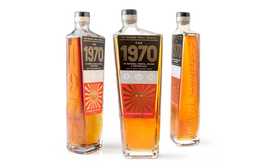
EDITOR’S CHOICE: The 1970 Vodka Cocktail, created by Ikeda Feingold, was chosen as the winner for the Editor’s Choice award. The original, ready-to-drink vodka cocktail comes in a tall, glass bottle with a mix of feminine and masculine design elements that stood out from brown liquors, typically packaged in short bottles. To achieve the look, an offset neck — uncommon for a glass-bottled product — was essential to her vision.
The TricorBraun (tricorbraun.com) team found the right bottle supplier in Italy who could produce the offset neck and handle the intricate embossed elements on the sides of the bottle without fracturing the glass. Given the design’s tapered, flat panels, and heavy thick base the vendor used a semi-automatic process to mold the bottles. The final bottles were hand-labeled and hand-filled which was required due to the unique, stylized shape. “People have been very receptive, and that’s in large part due to the look of the product and its packaging.”
Kristin Joker, BRANDPackaging's editor in chief, praised the excellent packaging designs exhibited in this year’s entries. “When design is done right it looks effortless, but that magic combination of uninhibited creativity and practical functionality is anything but. This year’s winning designs are all examples of creative functionality. In 2018, we saw exceptionally innovative designs that solve the specific needs of today’s consumers.”
Physical samples of the products were displayed at the Packaging That Sells Conference. The December issue of BRANDPackaging will feature many of the top Design Gallery submissions, with descriptions and explanations of the designs. Submissions for the 2019 Design Gallery People’s Choice awards are expected to open in June 2019.
Looking for a reprint of this article?
From high-res PDFs to custom plaques, order your copy today!


