Managing Risk in a Package Redesign: What Can We Learn From Tropicana?
Perception Research Services fights the temptation to “art direct” and, instead, offers a different interpretation of what went wrong and why.

Clearly, a great deal has already been written about Tropicana’s gaffe, in both the mainstream media and on countless blogs. However, much of the commentary has taken the form of “art-directing”, or second-guessing the marketing and design teams.
We’re fighting that temptation and, instead, are offering a somewhat different interpretation of what went wrong and why-and using our experience testing new packaging systems to offer perspective.
We’ll also discuss three interesting packaging issues raised by this case study and suggest several “best practices” that marketers, designers and researchers can follow to avoid similar disasters.
A recap. On January 8th Tropicana North America introduced a revolutionary new look for its flagship Tropicana Pure Premium brand, the market leader with over $700 million in North American sales. This design change was driven by and linked to a new $35 million advertising campaign that prominently featured the new packaging.
In fact, both the advertising and packaging were created by the same agency (Arnell) and, according to a New York Times write-up, were launched jointly as:
“… A historic integrated marketing and advertising campaign…designed to reinforce the brand and product attributes, rejuvenate the category and help consumers rediscover the health benefits they get from drinking America’s iconic orange juice brand.”
The in-market results were immediate and dramatic: Over the first two months, sales of Tropicana Pure Premium plummeted 20 percent, translating to over $30 million in lost revenue. Simultaneously, sales of the brand’s direct competitors (including Minute Maid, Florida’s Natural and private label brands) all increased by double-digits, clearly benefiting from Tropicana’s losses.
In addition, there was active criticism in the blogosphere, both from professional design critics and, perhaps more importantly, from bewildered and frustrated customers.
In light of these pressures, Tropicana announced on February 23rd that it would return the “old” packaging to the shelves. To date, the packaging remains in transition-and it’s not yet clear what percentage of the brand’s consumers will eventually return.
As such, it’s impossible to gauge the full impact of this redesign. However, it is safe to estimate that this packaging decision has cost Tropicana at least $50 million, simply by factoring in immediate lost sales, advertising expenses and design, production and distribution costs.
What went wrong? In announcing the move back to Tropicana Pure Premium’s original packaging, a senior Tropicana executive made an interesting point, saying, “We underestimated the deep emotional bond that ‘our most loyal customers’ had with the original packaging…what we didn’t get was the passion that this very loyal small group of consumers have…”
Indeed, this “emotional bond” was highlighted in the media, including a New York Times article with the headline “Tropicana Discovers Some Buyers are Passionate about Packaging”.
But is this the right takeaway? Our experience suggests that Tropicana, and the press, got some points right but that they may be misinterpreting the broader issue.
On the one hand, it is certainly wise to focus on core, loyal customers. Across many product categories, we find that a relatively small percentage of shoppers drive a disproportionate percentage of sales.
In orange juice, for example, a parent in a large household may go through several cartons a week-and thus is worth far more to Tropicana than a once-a-month purchaser. “Revolutionary” packaging changes need to retain the loyalty of these heaviest users, or they will offset any gains among a new target audience.
There’s also no question that people have an emotional connection with some brands, and that there are visual cues (colors, shapes, symbols, icons, etc.) linked to these brands. Indeed, effective packaging leverages these cues to provide brand recognition/reassurance and to trigger loyal users’ positive connections with the brand.
However, it’s somewhat misguided to simply conclude that core loyal customers have a “passion” for a brand’s packaging and are angered or threatened by change. We’ve found that the powerful negative “emotion” that drives sales declines is typically not a resistance to the idea of a packaging change-or even disappointment with the aesthetics of a brand’s new look. Instead, it comes when shoppers are confused or frustrated at the shelf.
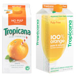
This frustration typically takes one of two forms. The first is brand confusion, which typically happens when multiple “equity” elements are changed at once. In the case of Tropicana, the new design removed a familiar visual icon (the straw), changed the main visual (an orange) and, perhaps most importantly, changed the logo and branding emphasis.
Looking at the package, it’s easy to see how some shoppers may have seen the “100% Orange brand, from Tropicana” and wondered if it was still the Tropicana Pure Premium that they knew and trusted.
In addition to fundamental design changes, the new Tropicana packaging dramatically reduced the role of color-coding and moved the primary flavor or form descriptor (No Pulp, etc.) to the top of the packaging, where it was often obscured in the larger shelf context.
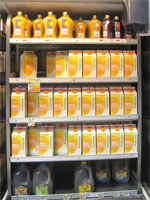
In a complex category with many different offerings, this created significant frustration at the shelf, as perhaps best expressed by one angry blogger, “Do any of these people actually shop for orange juice? Because I do and these new cartons stink…”.
Of course, the reality is that most shoppers don’t take the time to voice their frustrations: They simply choose another brand and walk away. In fact, across hundreds of brands and product categories, we’ve seen that shoppability concerns are the most powerful driver of packaging-related sales declines.
Can “revolutionary” changes work? For many marketers, the primary takeaway from Tropicana’s experience appears to be that companies should not make major changes to their packaging. We’ve heard several familiar refrains over the past several months: “Pack testing always favors current packaging,” “There is always a sales decline with a new pack,” “Shoppers hate revolutionary changes” or “Revolutionary changes never test well”.
But our broader experience directly contradicts some of these assertions and provides a more nuanced view on others. In fact, across hundreds of packaging studies, we’ve actually found an almost perfect bell curve, in which roughly 50 percent of proposed packaging systems outperform current packaging.
While an existing packaging system may have built-in advantages on some dimensions (due to familiarity), this is not the case when it comes to measures of persuasion, which are most predictive of sales. Thus, the first statement (“Pack testing always favors current packaging”) is simply mistaken.
Similarly, there is limited evidence to suggest that new packaging systems consistently drive significant in-market sales declines. Our in-market validation work suggests that there can be a dip driven by shopper confusion if new systems are rolled out on a “soft” basis, where both the new and old packaging appear on the same shelf. But these declines are transitory and they are never on the scale of the 20 percent decline seen in the Tropicana case.
As for “revolutionary” packaging changes not testing well, it all depends on how one defines the term. If “revolutionary” means an entirely new look that abandons nearly all visual equity elements of a packaging system (as with Tropicana), then the assertion is generally true: Packaging changes that create brand hesitation and shoppability concerns don’t test well (and, as the Tropicana case illustrates, they also don’t do well in-market!)
However, if “revolutionary” is defined somewhat differently, perhaps as a change to one or two primary design elements, then dramatic changes can indeed work. In fact, we’ve seen many cases (such as Herbal Essences and Kraft Salad Dressings) in which significant packaging changes have driven sales.
When the Tropicana case is viewed in this larger context, the primary conclusion is that the Tropicana redesign didn’t fail because it was “revolutionary.” It failed because the redesign effort lost sight of the primary functional considerations of packaging (brand reassurance and shoppability) and, thus, created confusion and frustration at the shelf.
Broader issues and implications. The Tropicana case also raises several broader issues. For one, it brings to light the differences between the disciplines of advertising and packaging. It is notable that the failed Tropicana packaging was created by an advertising agency and that it was designed expressly to integrate with an ad campaign.
In advertising, marketers are focused on creating memorable impressions that will be acted upon later. They typically have more time and latitude to be emotional and perhaps abstract. In packaging, the dynamic is quite different. The shopper is closer to the purchase decision and, thus, is looking for more tangible reassurance about the purchase (branding, variant, key information, etc.). In addition, it all typically happens at a cluttered shelf and within 10 seconds, so clear, direct and more literal communication is critical.
This is not to say that there shouldn’t be a link between packaging and advertising. Indeed, packaging should ideally drive recall of advertising and spark that messaging and positive emotional connection. However, it is far more effective to start with great packaging that works on shelf and then incorporate it within advertising, rather than trying to transplant an ad campaign on a box. Similarly, it’s wise to hire a design agency to redesign packaging, as opposed to an advertising agency, which can be likened to “hiring an electrician to do your plumbing…”
A related issue brought to light by the Tropicana scenario is the need to understand the shopper’s mindset in your respective category.
If we focus on the fundamentals of orange juice, we know that people shop for orange juice habitually and automatically. It is a household staple that is typically purchased weekly. Shoppers are not used to “thinking” at the orange juice shelf, as they might for a more expensive or infrequent item.
We also know that, for multi-serve products like orange juice, shoppers are typically buying for their families and are driven primarily by the desire to avoid making a mistake (e.g., buying something their kids will reject). They are not generally looking for excitement or innovation, as they might with another product or with something they are buying for themselves.
It’s also important to remember that the orange juice category is extraordinarily complex, with a wide variety of variants (e.g., different flavors, pulp levels, ingredient/benefits, etc.). Thus, it can be difficult and overwhelming to shop, with a reasonably high likelihood of buying the wrong product.
When these factors are taken into consideration, orange juice is clearly a category in which continuity and reassurance are paramount, tipping the scales against a radical packaging change. More than likely, a similarly dramatic redesign would have a higher likelihood of success in a category such as candy, which is more experiential and more strongly tilted toward single-serve purchases.
Timing packaging changes. The Tropicana redesign also speaks to the larger issue of when and why packaging changes should take place. In this situation, the redesign was driven by and linked to a brand repositioning, which is certainly typical. However, it was also misguided, as Tropicana shoppers were clearly not ready for this change.
In our experience, we’ve seen very few companies that have disciplined, consumer-driven processes for determining when to make a packaging change. Instead, redesigns are typically driven by competitive activity, by declining sales, by changes in positioning and, perhaps most frequently, by the arrival and (very subjective) opinion of a new marketing person. As a result, some companies wait far too long and fail to keep brands relevant, while others waste resources on unnecessary redesigns.
We also frequently find that changes to packaging are based on misguided assumptions regarding the equities and weaknesses of existing packaging. We’ve been called in at the end of redesign efforts to pre-test new packaging, only to find that existing packaging was far stronger than the brand team realized.
Above all else, the Tropicana redesign has dramatically illustrated the power of packaging. And while this was clearly a negative example, it’s important to remember that this same power can and often does work in a positive direction. The takeaway for marketers should be an even greater respect for packaging and a stronger commitment to leveraging this brand asset with a disciplined process that will ensure that shoppers come along for the ride.
For marketers and designers, the obvious takeaway is to avoid Tropicana’s mistakes. And while there are lessons to be learned on many levels, the need for effective consumer research is clearly one major lesson. To this end, we can offer several important principles:
First, start at the shelf.
Packaging redesigns need to be guided by an understanding of how people shop a given category, including their incoming mindset (“What are they looking for”?) and the visual cues (color, shape, icons, copy, etc.) they use to sort brands and products.
Equally important is an understanding of the “realities” of the retail environment, how shelving, merchandising, competitive tactics, etc., impact they way shoppers encounter packaging at the shelf.
Next, confirm visual equities. Any redesign efforts should be rooted in an awareness of the two to three key design elements that your most loyal consumers use to recognize/identify and positively associate with your brand. It doesn’t mean these elements can or should remain stagnant. In fact, many of the best redesigns evolve and better leverage these assets to make them more powerful and relevant.
We’ve learned that having brand users draw packaging from memory is a very insightful tool for uncovering visual equities, while recognition exercises can be valuable in exploring opportunities for evolving design elements and to understand “how far” shoppers will let us go.
Know your current packaging. A redesign should also be informed by a thorough understanding of the strengths and limitations of existing packaging. Specifically, marketers and designers should enter a redesign with answers to critical questions:
· Is the existing packaging competing effectively?
· Is it consistent with brand strategy?
· Is it contributing positively to brand imagery and competitive preference?
· Are we selling because of – or in spite of – our packaging?
We’ve found that a “best practice” is to test existing packaging against the competition at the outset of major redesign efforts. This provides important information and insight earlier in the process, when it can be used to inform the design.
Simulate the introduction of new packaging systems. Finally, and most importantly, the Tropicana case illustrates the absolute necessity of assessing new packaging systems prior to their introduction. But the research must be done properly. A few focus groups, far removed from the shopping experience, are not enough. Side-by-side “beauty contests” between existing packaging and the redesigned packaging can also provide very misleading findings.
In our experience, the most important principle is that shoppers initially encounter the new packaging on shelf, as though it had been introduced. The most predictive measures of in-market performance are those gathered at the shelf, related to visibility, shoppability and purchase patterns.
In short, effective packaging assessment is primarily a matter of simulating introduction rather than comparing old vs. new packaging-and of documenting what shoppers do, rather than relying solely on what they say.
The authors, Scott Young and Vincenzo Ciummo are with Perception Research Services (www.prsresearch.com), a company that conducts over 700 consumer research studies annually to help marketers develop, assess and improve packaging systems. Scott (syoung@prsresearch.com) is based in U.S. and can be reached at 201.346.1600, while Vincenzo (vciummo@prsresearch.com) is based in Geneva and can be reached at 41.22.793.3480.
Image courtesy of Tropicana Brands
Image courtesy of Tropicana Brands
Clearly, a great deal has already been written about Tropicana’s gaffe, in both the mainstream media and on countless blogs. However, much of the commentary has taken the form of “art-directing”, or second-guessing the marketing and design teams.
We’re fighting that temptation and, instead, are offering a somewhat different interpretation of what went wrong and why-and using our experience testing new packaging systems to offer perspective.
We’ll also discuss three interesting packaging issues raised by this case study and suggest several “best practices” that marketers, designers and researchers can follow to avoid similar disasters.
A recap. On January 8th Tropicana North America introduced a revolutionary new look for its flagship Tropicana Pure Premium brand, the market leader with over $700 million in North American sales. This design change was driven by and linked to a new $35 million advertising campaign that prominently featured the new packaging.
In fact, both the advertising and packaging were created by the same agency (Arnell) and, according to a New York Times write-up, were launched jointly as:
“… A historic integrated marketing and advertising campaign…designed to reinforce the brand and product attributes, rejuvenate the category and help consumers rediscover the health benefits they get from drinking America’s iconic orange juice brand.”
The in-market results were immediate and dramatic: Over the first two months, sales of Tropicana Pure Premium plummeted 20 percent, translating to over $30 million in lost revenue. Simultaneously, sales of the brand’s direct competitors (including Minute Maid, Florida’s Natural and private label brands) all increased by double-digits, clearly benefiting from Tropicana’s losses.
In addition, there was active criticism in the blogosphere, both from professional design critics and, perhaps more importantly, from bewildered and frustrated customers.
In light of these pressures, Tropicana announced on February 23rd that it would return the “old” packaging to the shelves. To date, the packaging remains in transition-and it’s not yet clear what percentage of the brand’s consumers will eventually return.
As such, it’s impossible to gauge the full impact of this redesign. However, it is safe to estimate that this packaging decision has cost Tropicana at least $50 million, simply by factoring in immediate lost sales, advertising expenses and design, production and distribution costs.
What went wrong? In announcing the move back to Tropicana Pure Premium’s original packaging, a senior Tropicana executive made an interesting point, saying, “We underestimated the deep emotional bond that ‘our most loyal customers’ had with the original packaging…what we didn’t get was the passion that this very loyal small group of consumers have…”
Indeed, this “emotional bond” was highlighted in the media, including a New York Times article with the headline “Tropicana Discovers Some Buyers are Passionate about Packaging”.
But is this the right takeaway? Our experience suggests that Tropicana, and the press, got some points right but that they may be misinterpreting the broader issue.
On the one hand, it is certainly wise to focus on core, loyal customers. Across many product categories, we find that a relatively small percentage of shoppers drive a disproportionate percentage of sales.
In orange juice, for example, a parent in a large household may go through several cartons a week-and thus is worth far more to Tropicana than a once-a-month purchaser. “Revolutionary” packaging changes need to retain the loyalty of these heaviest users, or they will offset any gains among a new target audience.
There’s also no question that people have an emotional connection with some brands, and that there are visual cues (colors, shapes, symbols, icons, etc.) linked to these brands. Indeed, effective packaging leverages these cues to provide brand recognition/reassurance and to trigger loyal users’ positive connections with the brand.
However, it’s somewhat misguided to simply conclude that core loyal customers have a “passion” for a brand’s packaging and are angered or threatened by change. We’ve found that the powerful negative “emotion” that drives sales declines is typically not a resistance to the idea of a packaging change-or even disappointment with the aesthetics of a brand’s new look. Instead, it comes when shoppers are confused or frustrated at the shelf.
This frustration typically takes one of two forms. The first is brand confusion, which typically happens when multiple “equity” elements are changed at once. In the case of Tropicana, the new design removed a familiar visual icon (the straw), changed the main visual (an orange) and, perhaps most importantly, changed the logo and branding emphasis.
Looking at the package, it’s easy to see how some shoppers may have seen the “100% Orange brand, from Tropicana” and wondered if it was still the Tropicana Pure Premium that they knew and trusted.
Image courtesy of Tropicana Brands
In addition to fundamental design changes, the new Tropicana packaging dramatically reduced the role of color-coding and moved the primary flavor or form descriptor (No Pulp, etc.) to the top of the packaging, where it was often obscured in the larger shelf context.
In a complex category with many different offerings, this created significant frustration at the shelf, as perhaps best expressed by one angry blogger, “Do any of these people actually shop for orange juice? Because I do and these new cartons stink…”.
Of course, the reality is that most shoppers don’t take the time to voice their frustrations: They simply choose another brand and walk away. In fact, across hundreds of brands and product categories, we’ve seen that shoppability concerns are the most powerful driver of packaging-related sales declines.
Can “revolutionary” changes work? For many marketers, the primary takeaway from Tropicana’s experience appears to be that companies should not make major changes to their packaging. We’ve heard several familiar refrains over the past several months: “Pack testing always favors current packaging,” “There is always a sales decline with a new pack,” “Shoppers hate revolutionary changes” or “Revolutionary changes never test well”.
But our broader experience directly contradicts some of these assertions and provides a more nuanced view on others. In fact, across hundreds of packaging studies, we’ve actually found an almost perfect bell curve, in which roughly 50 percent of proposed packaging systems outperform current packaging.
While an existing packaging system may have built-in advantages on some dimensions (due to familiarity), this is not the case when it comes to measures of persuasion, which are most predictive of sales. Thus, the first statement (“Pack testing always favors current packaging”) is simply mistaken.
Similarly, there is limited evidence to suggest that new packaging systems consistently drive significant in-market sales declines. Our in-market validation work suggests that there can be a dip driven by shopper confusion if new systems are rolled out on a “soft” basis, where both the new and old packaging appear on the same shelf. But these declines are transitory and they are never on the scale of the 20 percent decline seen in the Tropicana case.
As for “revolutionary” packaging changes not testing well, it all depends on how one defines the term. If “revolutionary” means an entirely new look that abandons nearly all visual equity elements of a packaging system (as with Tropicana), then the assertion is generally true: Packaging changes that create brand hesitation and shoppability concerns don’t test well (and, as the Tropicana case illustrates, they also don’t do well in-market!)
However, if “revolutionary” is defined somewhat differently, perhaps as a change to one or two primary design elements, then dramatic changes can indeed work. In fact, we’ve seen many cases (such as Herbal Essences and Kraft Salad Dressings) in which significant packaging changes have driven sales.
When the Tropicana case is viewed in this larger context, the primary conclusion is that the Tropicana redesign didn’t fail because it was “revolutionary.” It failed because the redesign effort lost sight of the primary functional considerations of packaging (brand reassurance and shoppability) and, thus, created confusion and frustration at the shelf.
Broader issues and implications. The Tropicana case also raises several broader issues. For one, it brings to light the differences between the disciplines of advertising and packaging. It is notable that the failed Tropicana packaging was created by an advertising agency and that it was designed expressly to integrate with an ad campaign.
In advertising, marketers are focused on creating memorable impressions that will be acted upon later. They typically have more time and latitude to be emotional and perhaps abstract. In packaging, the dynamic is quite different. The shopper is closer to the purchase decision and, thus, is looking for more tangible reassurance about the purchase (branding, variant, key information, etc.). In addition, it all typically happens at a cluttered shelf and within 10 seconds, so clear, direct and more literal communication is critical.
This is not to say that there shouldn’t be a link between packaging and advertising. Indeed, packaging should ideally drive recall of advertising and spark that messaging and positive emotional connection. However, it is far more effective to start with great packaging that works on shelf and then incorporate it within advertising, rather than trying to transplant an ad campaign on a box. Similarly, it’s wise to hire a design agency to redesign packaging, as opposed to an advertising agency, which can be likened to “hiring an electrician to do your plumbing…”
A related issue brought to light by the Tropicana scenario is the need to understand the shopper’s mindset in your respective category.
If we focus on the fundamentals of orange juice, we know that people shop for orange juice habitually and automatically. It is a household staple that is typically purchased weekly. Shoppers are not used to “thinking” at the orange juice shelf, as they might for a more expensive or infrequent item.
We also know that, for multi-serve products like orange juice, shoppers are typically buying for their families and are driven primarily by the desire to avoid making a mistake (e.g., buying something their kids will reject). They are not generally looking for excitement or innovation, as they might with another product or with something they are buying for themselves.
It’s also important to remember that the orange juice category is extraordinarily complex, with a wide variety of variants (e.g., different flavors, pulp levels, ingredient/benefits, etc.). Thus, it can be difficult and overwhelming to shop, with a reasonably high likelihood of buying the wrong product.
When these factors are taken into consideration, orange juice is clearly a category in which continuity and reassurance are paramount, tipping the scales against a radical packaging change. More than likely, a similarly dramatic redesign would have a higher likelihood of success in a category such as candy, which is more experiential and more strongly tilted toward single-serve purchases.
Timing packaging changes. The Tropicana redesign also speaks to the larger issue of when and why packaging changes should take place. In this situation, the redesign was driven by and linked to a brand repositioning, which is certainly typical. However, it was also misguided, as Tropicana shoppers were clearly not ready for this change.
In our experience, we’ve seen very few companies that have disciplined, consumer-driven processes for determining when to make a packaging change. Instead, redesigns are typically driven by competitive activity, by declining sales, by changes in positioning and, perhaps most frequently, by the arrival and (very subjective) opinion of a new marketing person. As a result, some companies wait far too long and fail to keep brands relevant, while others waste resources on unnecessary redesigns.
We also frequently find that changes to packaging are based on misguided assumptions regarding the equities and weaknesses of existing packaging. We’ve been called in at the end of redesign efforts to pre-test new packaging, only to find that existing packaging was far stronger than the brand team realized.
Above all else, the Tropicana redesign has dramatically illustrated the power of packaging. And while this was clearly a negative example, it’s important to remember that this same power can and often does work in a positive direction. The takeaway for marketers should be an even greater respect for packaging and a stronger commitment to leveraging this brand asset with a disciplined process that will ensure that shoppers come along for the ride.
SIDEBAR:
AVOID BECOMING THE NEXT TROPICANA!For marketers and designers, the obvious takeaway is to avoid Tropicana’s mistakes. And while there are lessons to be learned on many levels, the need for effective consumer research is clearly one major lesson. To this end, we can offer several important principles:
First, start at the shelf.
Packaging redesigns need to be guided by an understanding of how people shop a given category, including their incoming mindset (“What are they looking for”?) and the visual cues (color, shape, icons, copy, etc.) they use to sort brands and products.
Equally important is an understanding of the “realities” of the retail environment, how shelving, merchandising, competitive tactics, etc., impact they way shoppers encounter packaging at the shelf.
Next, confirm visual equities. Any redesign efforts should be rooted in an awareness of the two to three key design elements that your most loyal consumers use to recognize/identify and positively associate with your brand. It doesn’t mean these elements can or should remain stagnant. In fact, many of the best redesigns evolve and better leverage these assets to make them more powerful and relevant.
We’ve learned that having brand users draw packaging from memory is a very insightful tool for uncovering visual equities, while recognition exercises can be valuable in exploring opportunities for evolving design elements and to understand “how far” shoppers will let us go.
Know your current packaging. A redesign should also be informed by a thorough understanding of the strengths and limitations of existing packaging. Specifically, marketers and designers should enter a redesign with answers to critical questions:
· Is the existing packaging competing effectively?
· Is it consistent with brand strategy?
· Is it contributing positively to brand imagery and competitive preference?
· Are we selling because of – or in spite of – our packaging?
We’ve found that a “best practice” is to test existing packaging against the competition at the outset of major redesign efforts. This provides important information and insight earlier in the process, when it can be used to inform the design.
Simulate the introduction of new packaging systems. Finally, and most importantly, the Tropicana case illustrates the absolute necessity of assessing new packaging systems prior to their introduction. But the research must be done properly. A few focus groups, far removed from the shopping experience, are not enough. Side-by-side “beauty contests” between existing packaging and the redesigned packaging can also provide very misleading findings.
In our experience, the most important principle is that shoppers initially encounter the new packaging on shelf, as though it had been introduced. The most predictive measures of in-market performance are those gathered at the shelf, related to visibility, shoppability and purchase patterns.
In short, effective packaging assessment is primarily a matter of simulating introduction rather than comparing old vs. new packaging-and of documenting what shoppers do, rather than relying solely on what they say.
The authors, Scott Young and Vincenzo Ciummo are with Perception Research Services (www.prsresearch.com), a company that conducts over 700 consumer research studies annually to help marketers develop, assess and improve packaging systems. Scott (syoung@prsresearch.com) is based in U.S. and can be reached at 201.346.1600, while Vincenzo (vciummo@prsresearch.com) is based in Geneva and can be reached at 41.22.793.3480.
Looking for a reprint of this article?
From high-res PDFs to custom plaques, order your copy today!


