UK > Yeo Valley Organic
Looking to reaffirm its position as a mainstream, more accessible brand, Yeo Valley Organic redesigned its entire product line, beginning with the yogurt pots.
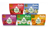
Over the past decade, Yeo Valley Organic has become the number one organic dairy brand in the United Kingdom. Despite its success, the family-owned business was looking to reaffirm its position as a mainstream, more accessible brand. As a result, it redesigned its entire product line, beginning with the yogurt pots. The brand's new logo centers the Yeo Valley name in a milk droplet. The text retains its green color, but the typeface was softened to give it a friendlier, more contemporary feel. Each pot features a photograph of its corresponding fruit on a solid purple, red, blue, orange or green background.
Launch
July 2010
Package Design
Pearlfisher
Looking for a reprint of this article?
From high-res PDFs to custom plaques, order your copy today!


