Strong
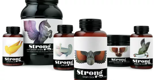
 Pearlfisher created the brand strategy, naming, identity, packaging, retail and digital communications for Strong, a range of high quality complex nutrients. Strong was developed to target health and beauty at a cellular level, for a stronger, more vibrant and younger body. The objective was to create a brand that celebrates the idea of beauty from within. The agency created custom hand-drawn typography for the brand name and commissioned Andy Lyons of Handsome Frank to create bespoke bird illustrations, which bring the product benefits to life in an unexpected and emotive way. Strong is currently sold through The Library, a new training club in London’s Notting Hill, and will be sold through high-end drugstore and online retailers soon. www.pearlfisher.com
Looking for a reprint of this article?
From high-res PDFs to custom plaques, order your copy today!


