Hughes Design Group Reimagines Positioning and Packaging for Wholesome!
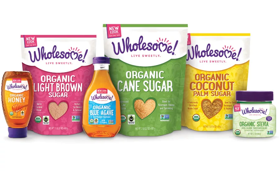
After
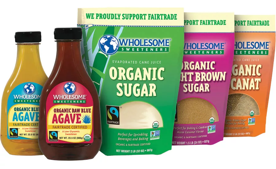
Before
The story: Wholesome!, a leading U.S. brand of organic, Fair Trade and non-GMO sugars and sweeteners, is debuting a new look on shelves across the country. Established in 2001, the Texas-based company is relaunching its more than 50 SKUs with a new name, positioning and packaging by strategic brand packaging agency Hughes Design Group. In addition to the brand re-launch, Wholesome! is releasing an Organic Coconut Palm Syrup and a larger, 24oz bottle of its popular Organic Honey.
The challenge: Though a category leader, the brand, formerly known as Wholesome Sweeteners, faced a number of branding dilemmas, the most critical being its limited brand awareness. Consumer research proved many people thought the brand was a private label brand and, when prompted, struggled to remember the brand name. Ready to expand its target audience and compete against natural and conventional competitors at shelf, Wholesome! needed a strategic brand makeover that would build the strength of the brand.
The solution: Starting at the foundation, Wholesome’s mission of delivering responsibly sourced, high-quality organic products needed to be clearly defined in a brand position.
“We worked closely with our client to reevaluate the brand and strategize the best opportunities for growth in a heavily saturated category,” says Greg Martin, creative director at Hughes Design Group.
Perceived as having artificial products due to the word “sweeteners,” the brand adjusted its name to Wholesome!
“Our brand felt too corporate; it was drowning in a sea of sameness in the category,” says Bobby Patton, vice president of marketing at Wholesome! “We set out to reimagine our brand as distinctive yet approachable.”
After a category audit and further consumer testing, the brand was positioned as joyful, happy and heartfelt. A playful deep purple script was chosen for the identity. The tagline, “Live Sweetly,” reflects Wholesome’s joyful belief in a life full of sweet moments and sweet actions.
Creating a consistent brand architecture that could span all product forms and sizes was key to strengthening brand equity.
“Too often you fall in love with a concept and lose that feeling as you apply it across the brand,” Patton explains. “The Hughes team had the experience with core design application across diverse packaging elements. The team’s balance of creativity and applicability was phenomenal.”
Across every product, the arching logo is housed within a white scalloped shape, a nod to a baker’s apron and traditional chef’s hat. The white creates a strong contrast against the identity and establishes a brand block at shelf. A spirited patterned background was devised and implemented across the entire product line of organic gourmet sugars, syrups, molasses, stevia and honeys to build consistency.
While maintaining the product variety colors for consumer shopability, the Wholesome! color palette was enhanced with fresh, contemporary colors, injecting energy and life into the products.
“We wanted to prove that organic design doesn’t have to be brown and burlap. The new organic style isn’t afraid of color,” explains Martin. “Using a bright palette invites consumers to trial an organic product who otherwise would buy the non-natural alternative.”
Research was completed with consumers across all U.S. regions, confirming the success of the rebranding to increase impact, brand recognition and purchase intention compared to the previous packaging.
“Nine out of ten consumers believe the brand makeover fits our positioning. We couldn’t be happier with the results,” says Patton.
Wholesome! is already looking to broaden its portfolio with additional product offerings in the coming months and years.
---------------
1. The carefully chosen iconography of the pattern inspires usage and ties to the product life cycle. Agave plants and bees represent the organic ingredient sourcing; balloons and candles represent the celebrations associated with baking, and cupcakes, mugs and cookies represent the end use.
2. The heart-shaped window showcases the pure products and symbolizes the love, care and consideration put into the creation of each product.
3. Juxtaposing the bright colors of the products on a matte substrate reinforces the premium packaged feel consumers have come to associate with natural and organic products.
Looking for a reprint of this article?
From high-res PDFs to custom plaques, order your copy today!


