New Packaging a Building Block for Protein Brand
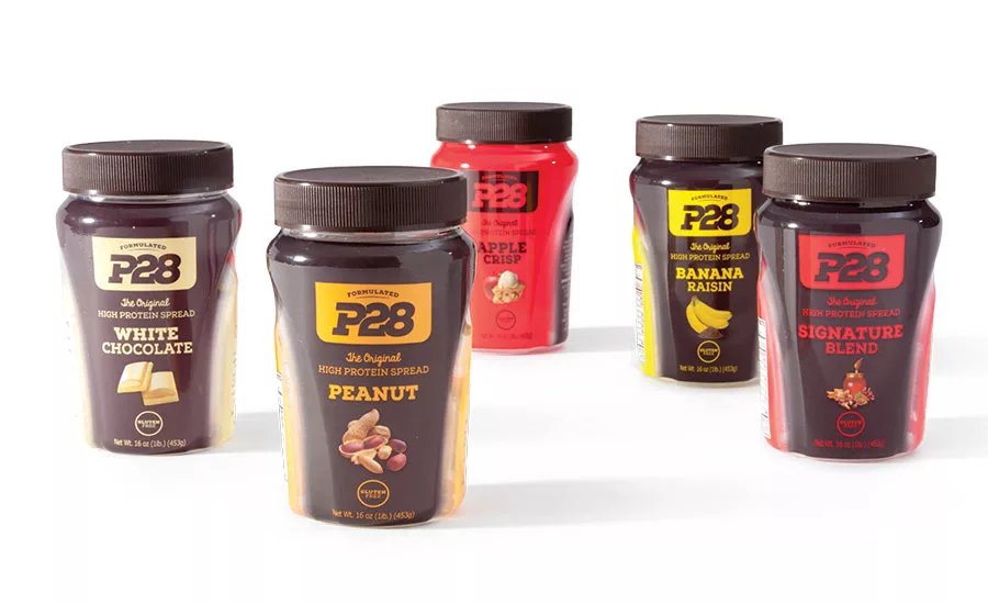
A new, custom shouldered jar and sports-angled design differentiate P28 products from typical peanut butter spreads.
After Redesign
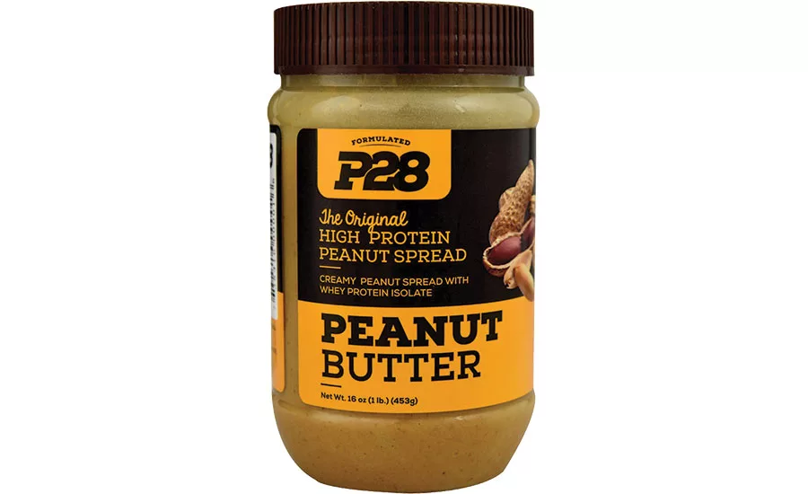
Previous Design
The story
P28 Foods is a high-protein food company founded by three brothers who are third-generation bakers. Mike, Chris and Peter Christou launched the brand after deciding they wanted to get in better shape. When an exercise program didn’t produce the results they were looking for, they turned to their personal trainer, Billy Sullivan, who is also a nutritionist. Being bakers, the siblings didn’t want to give up bread, and Sullivan was interested in their idea of making a healthy option that could be a staple ingredient for weight loss. The four joined forces, and in 2008, they introduced their first bread and the original high-protein spread.
The challenge
Originally, the high-protein spread was packaged in a peanut butter-style jar and wasn’t well differentiated, and it didn’t disrupt the shelf. P28 wants to impact customers with a dedication to providing them with the most delicious and nutritious high-protein food products available, so the brand needed a package redesign and a decoration method to go along with that notion. According to Jeff Prince, director of operations, P28, “We wanted to get away from being just another typical spread jar on the shelf. With P28, we are always looking to change the game. We’re always looking to be original and offer our customers high-quality, innovative products. We wanted that same idea to hold true in our packaging.”
The brand collaborated with TricorBraun Design & Innovation Group to develop new packaging with a strong shelf presence. The group’s primary mission is to design, engineer and manage the development, production and delivery of customized rigid packaging solutions for a wide range of CPG categories.
“We chose TricorBraun because of its game-changing design capabilities, the quality of the group’s work and its top-notch communication,” says Prince.
The solution
The process at TricorBraun began with the discovery phase. This allowed the team to clearly comprehend, define and help P28 realize its vision. Many things were taken into consideration including the brand, competitive landscape, technical restraints and success criteria.
Once past the discovery phase, it was clear that the package needed to be a PET 16-oz jar for the seven SKUS, but according to Prince, “We were searching for something unique, exciting and high quality that screamed ‘Pick me up!’ If consumers picked up the jar just to feel the difference in the structure, we knew this would ultimately lead them to reading about our product and its benefits.”
According to Samantha Juna, package design manager, TricorBraun, “We looked at a variety of shapes, closures and different decoration methods, including labeling versus shrink sleeving the bottle, but the big turning point came when we agreed to play up the sports angle and truly differentiate from a regular peanut butter. We explored surface changes, more pronounced textures and athletic silhouettes. We took inspiration from some of the sports drinks on the market. We essentially left the peanut butter category and went to nutraceutical.”
About the time of reaching design freeze, Molly Fuehrmeyer, graphic design manager, TricorBraun was revamping the current graphics and applying them to the structure for visualization. “The goal was to highlight the attributes of the shape of the bottle. We were confident that a shrink sleeve would be the best decoration method to capture the vignette on the arch,” she says.
“The first approach was to take the original artwork and conservatively make it work with the new structure, but P28 felt that a more playful look was needed while retaining the established SKU colors and the logo positioning.”
The final artwork includes opaque areas where the text is clearly readable: It was important for the flavors—almond butter, signature blend, white chocolate, banana raisin, caramel turtle, peanut butter and apple crisp—to be very visible on shelf. This leads to a vignette that accentuates the shape, and a clear arch reveals how much product is left.
TricorBraun orchestrated the packaging’s design process with multiple outside suppliers. The bottle is manufactured by Pretium; the stock closure is from PANO; and the shrink sleeve is done by Metro Label. The bottles are filled by P28.
Though the brand was already pleased with the packaging outcome, which launched in the summer of 2015, it is always nice to receive outside validation. The package design recently won the PAC Global Leadership Award: Silver in the Food & Beverage Brand Revitalization category.
- The shouldered structure was the first step in showing customers that P28’s product isn’t an ordinary peanut butter. The windowed arch angling downward helps purchasers see when they are running out without removing the lid.
- Bold primary colors accentuate the athletic feel of the package design, giving a nonverbal suggestion of the product’s difference from other spreads.
- Customers don’t appreciate having to search for the flavor variety or finding out they bought the wrong kind. Flavors stand out when depicted with images.
Looking for a reprint of this article?
From high-res PDFs to custom plaques, order your copy today!


