Redesign Is the Remedy for OTC Brands
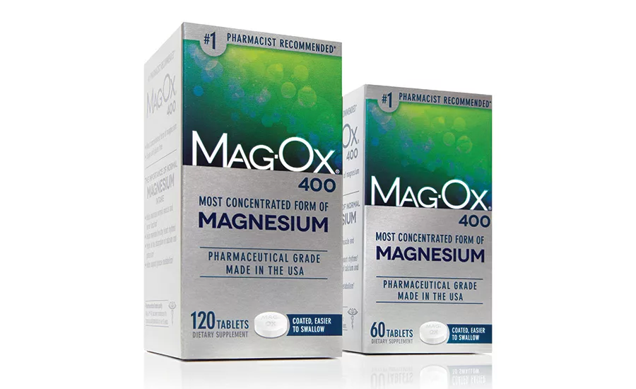
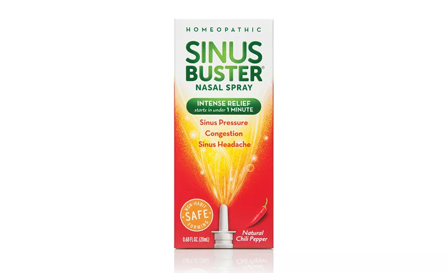
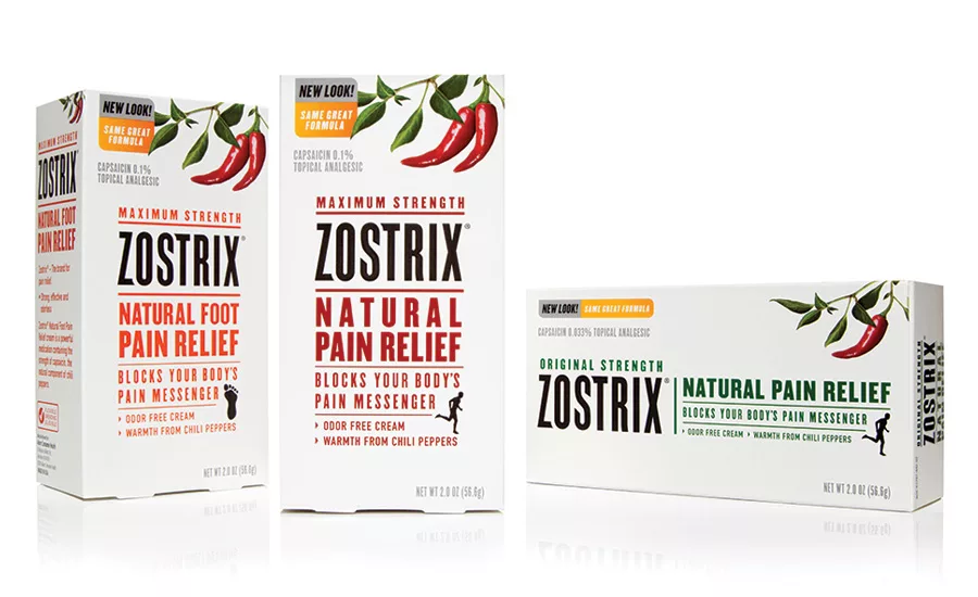
After redesign
After redesign
After redesign
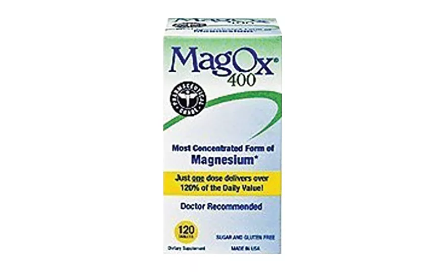
Before redesign
The Story:
Akorn Consumer Health, the over-the-counter division of Akorn, Inc., provides a full line of leading healthcare brands distributed globally. When Akorn Consumer Health made the decision to overhaul three of its consumer brands, the company turned to strategic partner Little Big Brands (LBB).
“We’ve worked with LBB for several years now. The chemistry is there and they are as passionate about our business as we are,” says Scott Chapman, senior vice president and general manager, Akorn Consumer Health. “We challenge each other and make each other better.”
This engagement was a yearlong exercise that included a deep dive into the strategy behind each of the brands, auditing the marketplace and revitalizing the brands at shelf. The new designs began hitting store shelves in the first quarter of 2017.
The Challenge:
Akorn wanted to rebrand three unique products in very different categories, each with its own challenges and opportunities.
MagOx 400 needed to elevate the brand and claim more share in a growing category. The product itself was superior, being the most concentrated form of magnesium in the marketplace. It’s a pharmaceutical-grade product most recommended brand by pharmacists, according to reports in U.S. News and World Report and Pharmacy Times. However, nothing about the current packaging acknowledged that fact.
When it came to Sinus Buster, the biggest challenge (and opportunity) was putting a stake in the ground. A homeopathic nasal spray with with capsaicin (chili powder) as an active ingredient can be polarizing, so positioning the brand correctly and honing in on the target audience was critical.
Zostrix is another product that featured capsaicin as an active ingredient, forcing a decision whether to embrace that or downplay it. On one hand, products with natural active ingredients are more popular than ever, but how could it be played successfully? How could a brand be created that is both natural and extremely powerful? Those are two attributes that rarely pair well.
The Solution:
To get to the right solution for each of these brands, LBB needed to talk to consumers. In some cases, the agency found validation for its initial assumptions. In others, the research and the insights gained helped push the thinking into some exciting strategic areas for the brands.
Of the three, MagOx 400 was the most straightforward brand redesign. Consumers loved the product and understood the benefit, but it visually didn’t live up to the brand promise. To address that, focus was placed on brand design. The packaging was overhauled, starting with a more modern identity. The agency also cleaned up the claims and information so that a shopper could easily identify what differentiates MagOx 400. Next, the decision was made to elevate the brand substantially by upgrading the substrate to a brushed-foil board. It not only provides impact at shelf, it also cues premium very deliberately. Finally, the companies tried to improve the user experience based on the consumer feedback. Akorn decided to coat the product to make it easier to swallow, and called out this benefit in the package design.
For Sinus Buster, the solution was more challenging. The packaging had downplayed the product usage experience and efficacy for fear of scaring consumers. The brand team made a very gutsy decision to abandon mass for niche. The team decided to consciously target heavy sufferers in the category, opening new opportunities for the brand. Instead of being a “me too” in the category, Sinus Buster now owns a very distinct place on shelf. Sinus Buster is for people who are in fierce need of relief. And while that might not be the biggest piece of the pie, it certainly gives the brand a unique reason for being and helps them captures a loyal segment of the market.
Visually, the packaging had to represent the experience. “I remember when we first were awarded the job, we made everyone working on the brand try it, and the result was literally eye opening,” says Pamela Long, director of client services, LBB. “It’s an intense product with equally intense relief. The packaging really strikes that balance. But while we needed to make sure we accurately represented the strength and benefit, it couldn’t feel overwhelming.” It was important that the packaging properly set consumer expectations, so they weren’t caught off-guard after trying the product.
Zostrix took a different approach to representing the strength of natural active ingredients. The focus was on a combination of powerful tools to communicate that efficacy. Consumers were extremely receptive to pain relief products with natural active ingredients, but they all had the same concern: “Will it work?” Once informed in layman’s terms how it worked (by blocking the body’s pain messenger), consumers instantly became more receptive. And that was a bit of an “aha moment” which led to more consumer friendly language on pack.
From a visual perspective, the final design is all about the power of nature, starting with a prominent chili pepper illustration that graces the top of box. The type is powerful and the hierarchy is very strong, leading people cleanly down the pack. The color palette is clean and striking and picks up equities from the previous design.
As each brand was being completed, the agency circled back with consumers as a disaster check that the new packaging would not only be disruptive, but that it would increase purchase intent.
“At the end of the day we love creating beautiful work, but it’s got to sell,” says Long. “Our long-term partnerships with companies like Akorn are a testament to the fact that we take their business objectives very seriously.”
Looking for a reprint of this article?
From high-res PDFs to custom plaques, order your copy today!


