Trends in Luxury Packaging Emphasize Materials, Shapes, Color, Typography & Imagery
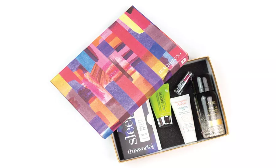
Gift-like packaging ordered online--such as that used by Birchbox--makes the brand seem more upscale.
How does one create luxury? Many beauty brands use packaging to convey prestige and add value to their products. A comparison of leaders in the category reveals similar strategies for materials, shapes, color, typography and imagery. Not surprisingly, certain visual and material cues have become synonymous with luxury. If an established or emerging brand aims to stand out in this crowded space, the brand might decide to go against these canons. In recent years, some new trends have emerged that are redefining what luxury means and looks like.
Materials
It is easy to spot luxury beauty displays. The canon is to use opulence, heraldry, crests and emblems to evoke royalty. Along with that, tends to come metallic packaging—gold, silver, bronze—precious metals imply precious content. The difficulty is that no one brand can stand out amid the glitter.
subtle accents
Recent luxury beauty trends use metallic but in subtler ways. Lisa Franklin’s packaging is mostly white with a large gold monogram that becomes the central graphic of the packaging. Amala also uses white, but with bronze foil stamping and delicate line drawings. Bronze and cork caps throughout the line create unity and flexibility.
soft to the touch
Newer beauty trends use soft touch and matte packaging to emphasize luxury and encourage users to pick up and handle products. Kora organics and Nude have recently increased the tactile experience of their products through soft touch packaging. Prismologie has combined soft touch and foil stamping to create memorable packaging.
Package Shape
Brands go to great lengths to be noticed at retail. In the interest of economy, most brands use stock packaging for their products. Luxury beauty brands strive to go further and can afford the opportunity to design proprietary, custom packaging. Shape is one of the most powerful tools to gain consumer recognition and increase brand recall. If a brand chooses to use a custom mold, it should be truly differentiated.
sleek, organic shapes
Several brands are taking shape to new heights by creating products that function like pieces of art that women can be proud to display in their homes. Japanese beauty brand Shiseido has created a curved, tapered bottle for their serums and moisturizers that is reminiscent of Brancusi sculptures. Lanôme has a similarly tapered profile in its rehydrating toner and anti-aging serum. This form alone expresses luxury and performance.
crystalline shapes
Jewels and facets convey opulence. In contrast to the subtle shapes of Shiseido and Lancôme, some luxury beauty brands are creating complex, crystalline shapes that are memorable. Cle de Peau Beaute has a limited edition cream encased in a beautiful, highly reflective crystal. Swiss brand La Prairie released a premium product, Platinum Rare cellular cream, which sells for more than $1,000. Its crystalline container is itself a work of art.
seamless packages
Another new trend is to create a seamless profile from bottle to cap. The result is a sleek silhouette that suggests luxury. Giorgio Armani uses black caps and bottles in several of its creams and serums. Nars is using the same technique in its skin and makeup products. This is a great way to break from pumps and collars in the standard metallic golds and silvers by incorporating black and white components in a sophisticated manner.
Use of Colors
One of the most memorable details of packaging is color. As mentioned before, the canon for traditional luxury beauty packaging is the use of gold and silver. In addition, white, black and rich jewel tones are often used.
soft tones
It has long been established that luxury beauty brands avoid primary colors and fluorescents. Recently, however, there has been a trend toward pastels and muted tones. Pinks, lavenders, peaches and minty greens are often paired with black type. Cosmedicine, a premium skincare brand, has effectively used muted tones combined with metallic accents to suggest a lavish experience.
ombre
Another new approach is to use color gradients in packaging. Sai-sei, a Japanese bath brand, has used this method to convey hydration, the core benefit of its product. The coloring of the container ranges from a rich teal on the bottom to white, resulting in a beautiful package that is reminiscent of the user’s experience. Skincare brand Tatcha also uses ombre in the packaging for its moisturizers.
ultra transparency
For luxury fragrance and skincare brands, the canon is to have transparency or colored glass. The formulations are clearly visible, conveying elegance and honesty. Recently, beauty brands have added entire ingredient specimens inside clear formulations, highlighting their unique qualities. For example, NARS Monoi Body Glow II beauty oil has a tiare flower suspended in the liquid. The result is a magical effect, suggesting a similar result for the user.
typography
The written word is important, of course, but so is the typeface. In the case of luxury beauty brands, the canon is usually the fancier script, the better. Classic serif or ornate typefaces are also used to imply a timeless, refined product.
whitespace and simplicity
Several brands are avoiding ornate script and going in the opposite direction. Selecting a simple sans serif typeface, set in all capital letters with generous tracking, creates a feeling of airy sophistication. La Prairie, Prismologie and Herbivore Botanicals all use this technique.
Brands can maintain a more open feel to the product by keeping only the essentials on the packaging, with simple names and easily defined benefits. Paring words carefully, brands can choose their most powerful messages and create intrigue. The primary package will have the logo, product name and required information. All media applications would benefit from this method of making every word count.
Imagery
When photographing luxury beauty packaging, the canon is to use highly stylized, dramatic photographs that suggest an escape from the ordinary. Typically, images for luxury brands depict whimsical, hyper-real and surreal settings. These high-cost, high-production photographs are wonderful for traditional media and advertising but nearly impossible to produce at the rapid pace that today’s social media channels demand.
image filters for social
By using consistent filters, background colors, background materials, patterns and lighting techniques, luxury brands are finding ways to document their packaging daily and still assert a distinct point of view to customers. We have noticed the same trends of organic shapes, crystalline shapes, soft tones and gradients making their way into social media backgrounds. This is a great way for established luxury brands to keep their existing, heritage-styled packaging looking fresh. Erno Laszlo uses this method in its daily posts, with images of flowers in the background. Similarly, Tata Harper consistently messages with a white background and the brand’s signature shade of green.
the unboxing experience
Any luxury brand recognizes the importance of the unboxing experience, the process by which the customer opens the box and unveils the product. Heavyweight boxes, set tops, paper liners, special paper inserts and other details have long since been a part of the luxury packaging experience.
shipper unboxing
For today’s digital shoppers, the unboxing experience begins the minute the package arrives at the doorstep. According to Dotcom Distribution’s 2016 E-Commerce Packaging Study, 68 percent of consumers said that branded, gift-like packaging makes the brand seem more upscale, and 50 percent said this same style of packaging would make them more likely to recommend the product to their friends. As a result, traditional brown cardboard boxes are being covered with printed graphics and upgraded materials. Inside, the customer beholds a gift box-within-a-box.
Beauty-box brands like Birch Box have set the trend. Their outer shipping carton is heavily branded with pink on white cardboard. Inside, a gift-like box features unique graphics and patterns each month. The only consistency is the size of the box and the production methodology of four-color printing plus one special production technique, like foil stamping. This inner package contains coordinated tissue paper, a printed card and, of course, the products themselves. However, the joy of receiving the uniquely printed outer box has become part of the thrill. Receivers of Birch Box enjoy the experience so much, they have become a collectible cult.
Discover the White Space
The luxury beauty industry generally adheres to established canons in packaging design. Customers familiar with these trends easily recognize luxury brands at retail. However, innovative brands are beginning to redefine luxury through new trends in design, packaging and media. Variation from the norm can be opulent as well. Remember, part of the code of luxury is rarity. Brands that find the whitespace in the market will discover new opportunities for their products. If they are able to seize the relevant visual opportunities in their product category, they will be poised for success.
Looking for a reprint of this article?
From high-res PDFs to custom plaques, order your copy today!


