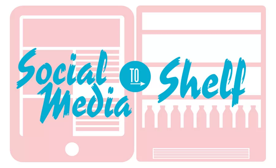
How to Package Online, Lifestyle Phenomena into a Brand Poised for Success on Shelf
Social Media to Shelf
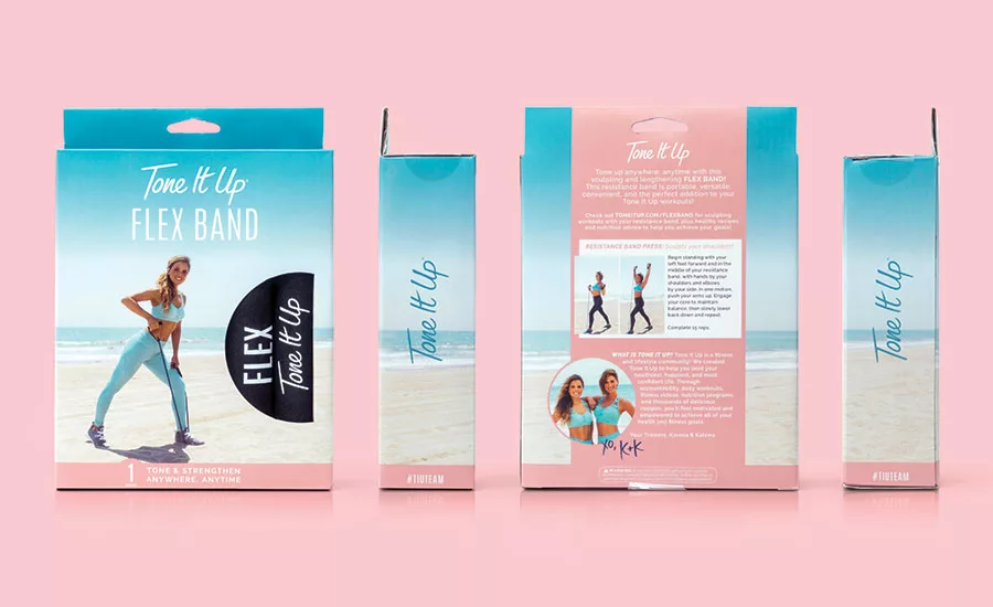
Tone It Up new exercise equipment packaging designed by Kick.
Many of today’s successful new brands are created by upstart innovators and built on engagement with millions online. They catch the eye of big-box retailers looking to translate the online following into in-store traffic and sales.
Tone it Up (TIU) is one of those brands. Co-founders Karena and Katrina, dubbed the “new faces of fitness” engage their followers across all their online platforms daily. Now, they are bringing this online phenomenon to partnerships with retailers and launching a range of TIU-branded products in-store. So, how do you create packaging that harnesses the power of a multi-dimensional, personal, online brand that can translate digital success to shelf? Kick branding and design partnered with TIU to bring this new line of fitness products to Target stores nationwide. Here are a few takeaways from the process:
Capture the brand’s essence
Key to the TIU brand are its founders. They are authentic, fun and easily accessible through multiple social media channels that they utilize to provide workouts, daily motivation and support. Followers feel like they know Katrina and Karena because they’ve created TIU to be a non-intimidating, positive community. The California-vibe with imagery from the sunny beach is inspiring and inviting. TIU’s messaging emanates self-love and they want every woman to live her happiest, healthiest and most confident life.
Use PDP to leverage signature brand elements
In TIU’s case, the signature elements are Karena and Katrina in their familiar California beach setting, ready to train with you. The primary display panel (PDP) showing the co-founders using the products not only visually explains what one should do, but also demonstrates achievable results—and that the process can be fun.
Incorporate the brand’s specialness
The online TIU brand offers followers support and encouragement that’s personal and encouraging. To stay true to the special personality and philosophy of TIU, Kick added workout tips to the back of the packaging written in the casual, friendly voice of “your trainers.”
Build for cohesive flexibility
Quality, durability and presentation are a big part of the online brand, and this had to transfer over to the analog store world as well. Various products ranging in size, form and function need to be built in a system for flexibility in package structures and substrates and how they will be merchandised in-store. Packaging should be designed to work endcap and in-line. Other things to consider: will products hang, sit or stand? Will they be displayed at eye-level, above your head or at your feet? Knowing these details will optimize the package design.
Like with any packaging project, capturing the essence of the brand and letting that lead the creative ideation is key. TIU has a strong following already in place, so identifying precisely what it is that followers see, hear and love every day had to be translated and boiled down to a comprehensive, shoppable experience on shelf. The end result? Every package reinforces the TIU philosophy that every woman lives her happiest, healthiest and most confident life through daily motivation and empowerment.
Do’s & Don’ts
- DON’T use elements of an online brand that feel seasonal or temporary.
- DO build a clean system that is able to adapt to any kind of product over time.
- DON’T make it complicated.
- DO be consistent with logo placement, product name, imagery and colors.
- DON’T hide the product in a box.
- DO give the shopper a window to touch the product.
Looking for a reprint of this article?
From high-res PDFs to custom plaques, order your copy today!


