Riding The Cannabis Wave
From a distant roar to a powerful tsunami, the cannabis wave is crashing into mainstream American culture in 2019, leaving exciting and unexplored opportunities in its wake


With more and more states legalizing recreational cannabis, celebrities from Whoopi Goldberg to Martha Stewart championing the cause, and CBD-infused-everything poised to hit mainstream retail across the country, cannabis is quickly emerging as a profitable and enduring industry.
Building a strong cannabis brand is a formidable challenge. Brands must be nimble and responsive while consistently and thoughtfully addressing legal and regulatory hurdles, uncertain and changing environments, and evolving consumer profiles and behaviors. With strict bans on mainstream advertising, cannabis brands have limitations on how to reach consumers outside of dispensaries, which are currently the only legal point of purchase. For a brand to truly emerge in a dispensary environment—one full of unfamiliar brands and often chaotic and cluttered with devices, products and promises—nothing is more important than a sound brand strategy and strong package design.
Cannabis alone isn’t enough: think bigger
Like any other industry, cannabis brands need to differentiate from one another in order to survive. Simply touting a brand as “the best cannabis company” or making generic promises around “wellness, relaxation and bliss” isn’t enough. Brands need to stand for something big that is rooted in their unique point of view and personality and communicate that with a voice that expresses clearly and consistently who they are in order to make an impression in the unconventional cannabis space.
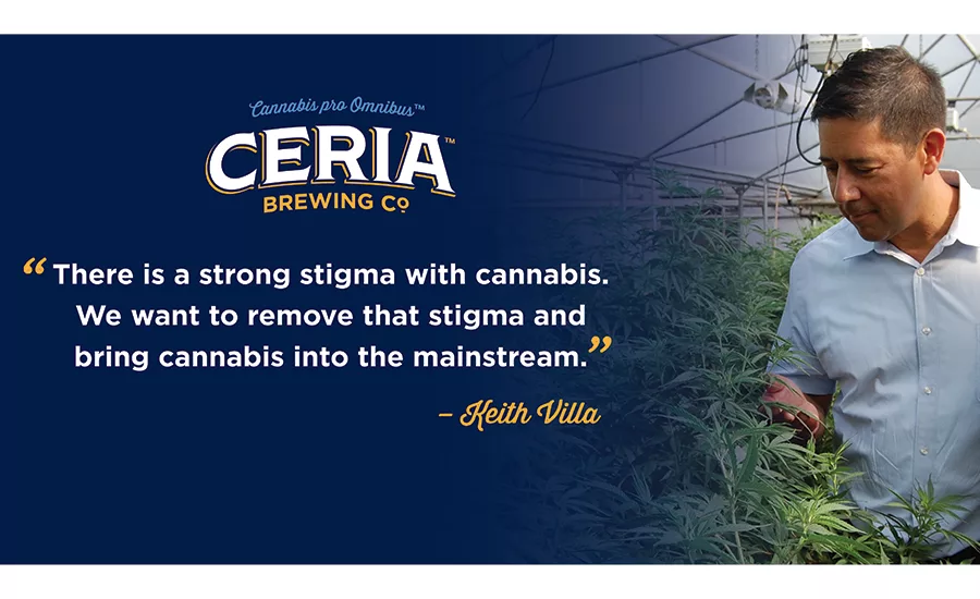
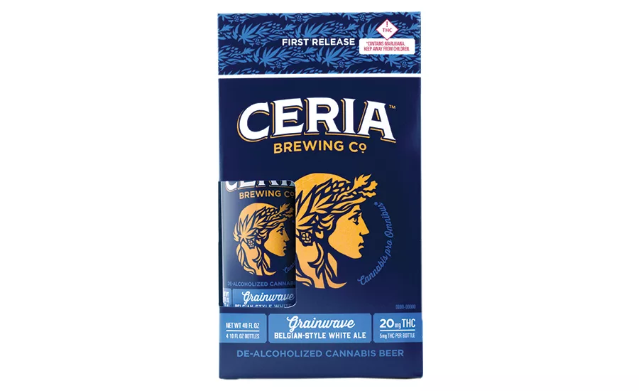
When Blue Moon creator and former brewmaster Keith Villa and his wife Jodi decided to enter the cannabis space, they saw an opportunity to de-stigmatize cannabis. With the brand strategy “Cannabis for All,” they launched a suite of de-alcholized cannabis-infused beers under CERIA Brewing Company–named after Ceres, the ancient and powerful goddess of the harvest. As the guardian of hops, barley and cannabis alike, she was a fitting muse for the name and visual identity of a new cannabis beer. The product is grounded in the familiar analog of our culture’s love of and history with beer, but CERIA is more than a beer alternative. By creating a cannabis experience that looks and tastes like something familiar, CERIA is leading the call to “bring cannabis to the masses.”
Who are the cannabis consumer groups?
(hint: you’re probably in one)
Like the industry itself, today’s cannabis consumer is learning, growing and changing. Yesterday’s stereotype—the lazy, bumbling stoner à la Cheech & Chong—has splintered into a dizzying array of new consumer profiles that include pretty much every adult. Identifying a brand’s target consumer and understanding her unique need states is critical for a successful brand strategy.
In the case of CERIA, the Villas saw an opportunity to capture the “canna-curious” consumer, a term that refers to new and lapsed users entering the legal cannabis market for the first time. For these consumers, shopping at a dispensary or online can be confusing and intimidating. By offering a product modeled on something as familiar as beer, CERIA could rise above the sea of unfamiliar and untested options.
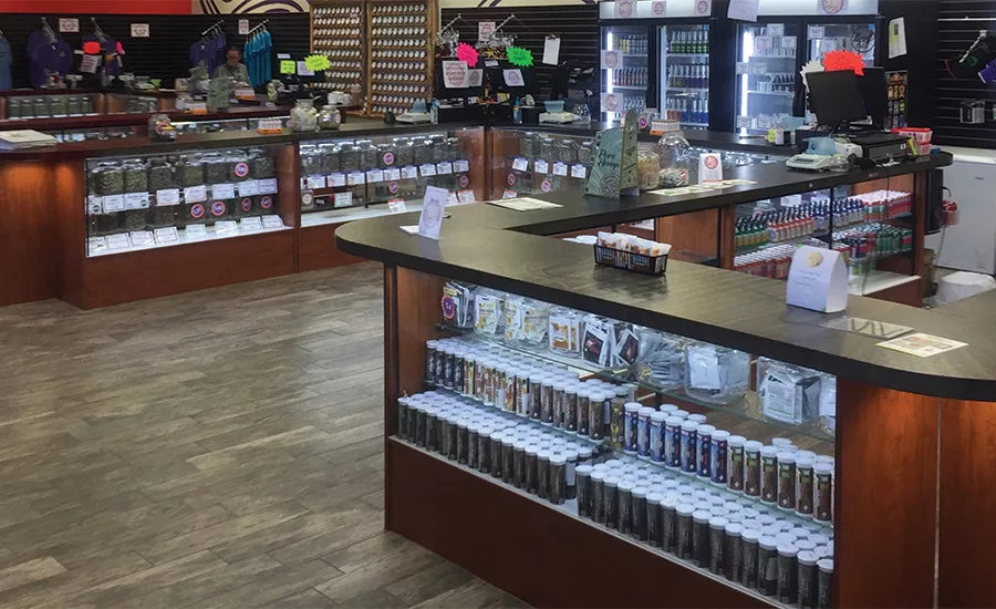
Why cannabis packaging is crucial
In the cannabis industry, package design needs to work especially hard. Not only is the packaging responsible for introducing the brand to the consumer at the dispensary shelf, it must successfully communicate the promise of the experience while working within the confines of strict and ever-changing regulatory requirements. Considering the extensive amount of regulatory information required—much of which varies from state to state—a package or label with a well-developed hierarchy and flexible design system is a must. Doing thorough research into each state’s legal mandatories ahead of design development will prevent frustrating overhauls down the road. A modular design that keeps plenty of open space for product mandatories will help set up the brand for easy expansion into new markets.
When auditing the cannabis landscape, think about consumers. How will they view your brand in a dispensary where layout and product organization may vary by location or have no rhyme nor reason whatsoever? While a key strategic imperative is for packaging to stand out in the retail environment, consider also the consumer’s needs as she consumes the product. Bold and catchy design may attract her in a dispensary, but she may want discretion as she engages with the product in the outside world. This is where the CERIA brand is incredibly effective: In the dispensary, its classic “beer-ness” is a differentiator, while in the outside world that same quality allows it to fit in at traditional beer-drinking occasions and beyond.
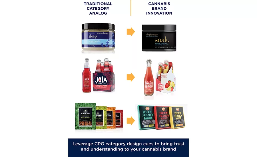
In a young industry fraught with misconceptions and snared in politics, cannabis packaging also needs to address key consumer questions and concerns. How to communicate the strength of the product is one. While THC and CBD are generally measured in milligrams, strains are also valued by percentage. Another question is how to establish understandable terminology for newer and less-experienced consumers. While fanciful names like “Blue Dream” and “Chemdog” are sufficient descriptors for strains in the developed “flower” category (as in the plant in its raw form), newer brands are finding success by conveying the brand experience through sensorial verbs and adjectives such as “create” or “chill.”
For CERIA, the effectiveness of the design strategy was threefold: It maintained alignment with the brand strategy (leveraging the cultural acceptability of beer to reach consumers); it clearly defined the product (whether stored in a cooler or on-shelf); and, by identifying so closely with beer, it differentiated the product from competitors in the cannabis beverage category.
Brand building beyond the package
New brands trying to break through a mature category require a differentiated positioning, a compelling story and a distinctive identity as the cost of entry to even enter a consumer’s consideration set. In an emerging market like cannabis, the competition might not be as fierce (yet), but getting noticed and remembered requires its own unique and creative approaches. Here are a few strategies to build salience in an industry where certain marketing channels like social advertising are restricted.
Give people something to talk about
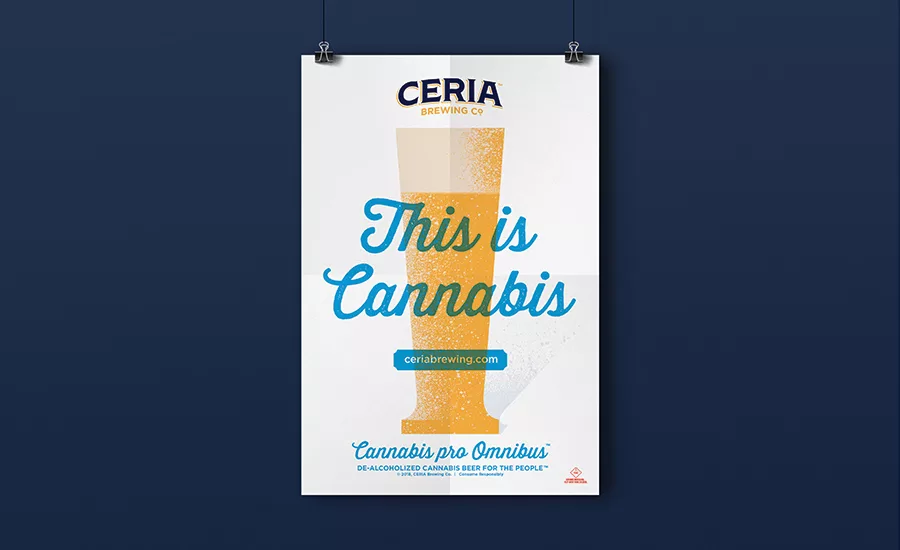
Point-of-purchase materials can draw attention to the brand by violating expected cannabis norms. For example, CERIA’s poster features a pilsner beer glass with a bold “This is Cannabis” statement written across it. The cognitive dissonance leaves consumers wanting more. Thoughtfully branded merchandise reinforces the brand after consumers walk out the door, developing a connection to the product and providing a way to stay top-of-mind with the consumer (and the consumer’s friends).
Befriend your budtenders
The budtender is the gatekeeper to all of a marketer’s potential consumers. Most dispensaries have products on display, but consumers aren’t generally allowed to handle them without assistance. And strict time limits on browsing make learning about products difficult. Establishing relationships with budtenders so they speak knowledgably and enthusiastically about a product is important for boosting brand awareness and developing all-important consumer trust.
Create an experience and start a conversation
Finally, be where consumers are. Social channels are a great place to start conversations and keep them going. Aligning your brand with carefully selected influencers is a way to broaden reach, while engaging with brand evangelists can organically build credibility and relevance. Finally, keep it interesting. Consider developing curated and targeted branded content to establish a customer database. Whatever is done, diversify the outreach, control the message and, of course, always stay on brand.
Looking for a reprint of this article?
From high-res PDFs to custom plaques, order your copy today!


