Brand Packaging: Color Management
The Importance of Color in Consumer Packaging
Cost efficient solutions to common color management problems.

Whatever your brand, your product line will be more appealing if the color is consistent across your entire packaging program. Here are common color issues encountered in packaging design, and how to solve them.
Viewing Conditions
Color management is tricky. The light in which we view an object influences the color we see. If you look at a red apple in the noonday sun (5000 degrees Kelvin) it will be a brighter shade of red than if you view it at sunset (3000K). In an attempt to make color a universal language, some controls needed to be established; 5000K is considered the standard light under which to view color.
If you choose a color swatch in office lighting conditions (soft white fluorescent is 3200K) rather than optimal intensity of 5000K, then you are making an incomplete color choice. What kind of an email would you write missing one third of the keys on your keypad? Invest in a Lightbox and only look at swatches, ink drawdowns, proofs and press sheets in this controlled environment. And be sure to change the bulbs often. Over time, the light waves from bulbs become longer/slower, as the bulbs lose intensity — resulting in proofs having a red tinge.
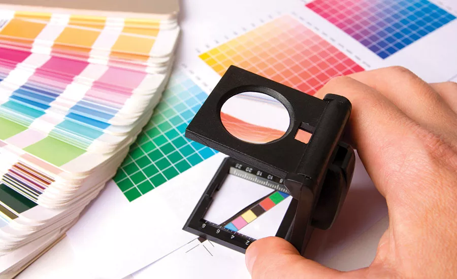
Finding Ink Color
A universal set of controls has also been established in order to make printing colors consistent. The Pantone Matching System (PMS) allows for inexpensive, easy, replicable results, but has its flaws. There are 14 base pigments (pure colors) seen at the front of the book. Varying proportions of these base pigments are then combined and darkened by adding black (as you look down the page) or lightened by adding opaque white (as you look up the page). This system produces muddy, dark colors and muted light colors.
If I were painting a green tree and wanted to paint the tree’s shadow, I wouldn’t add black to the green (as PMS does) in order to darken the shadow color. Instead, I would look across the color wheel and add the color’s complement. In this case, red would be added to the green.
PROBLEM: My designer can’t find a PMS match for the color reference we’re trying to achieve.
SOLUTION: Have your printer supply the color swatch to its ink manufacturer, and have a custom ink created. Chances are that the ink manufacturer will be darkening the color-matched ink formula by using complementary color pigments rather than black ink. The ink will cost slightly more, but you’ll hit your target color — making your packaging stand out on the shelf. Also, printing a double hit of the ink (printing the same color twice) allows for a thicker ink film to be laid down on the paper — and, consequently, a more luminous result.
For color connoisseurs, consider switching to TOYO printing inks. It’s a totally different philosophy of color with a separate swatch book library. Colors are dirtied using the complements, so the dark colors are robust and the light colors are far more varied and interesting than PMS. Because the ink quality is superior to conventional inks, the colors are more stable and less susceptible to changing over time.
Finding the Right Paper
Printing inks are transparent. The brightness of your paper influences the colors you see. A solid PMS printed on a blue white stock (with a brightness of 98 percent) will be 8 percent brighter than the same color printed on a stock with a brightness of 90 percent. The optical brighteners and fluorescents found in many of today’s premium sheets fade quickly.
PROBLEM: With so many printing substrates on the market today, how do I find the right one for my project?
SOLUTION: Resist a flashy blue-white stock that sells at a premium. A workhorse stock such as Invercotea multilayered, laminated sheet made specifically for the demands of the packaging industry folds without cracking, takes foils well. It’s also a balanced white shade, so it won’t fade out in a brightly lit retail setting.
Paper Alternatives
One of the biggest problems faced by the packaging industry has to do with the instability of printing inks. Some PMS formulas contain 98 percent opaque white and only 2 percent color pigment. Opaque white oxides and starts to yellow almost immediately. Compare PMS Cool Grey #1 in your PMS book with Cool Grey #1 straight out of the print can, and they won’t match. The target in your PMS book has shifted from the true ink color. Packaging programs that feature solid print areas of light colors become problematic over time. When it comes time to reprint, do you aim for the ok sheet from the previous run that has now yellowed, or do you disregard the old ok sheet and run the ink to density knowing that it will yellow again over time?
PROBLEM: The color of my packaging is all over the map. Some packages are older than others, and nothing matches at retail.
SOLUTION: Choose a colored, uncoated paper directly from a swatch book. Let the paper manufacturer manage the color consistency. Because the paper is vat-dyed, the color is embedded in the stock, and it’s much less susceptible to changing color over time. I prefer the pop of a foil stamp on a richly colored, uncoated stock to just about anything that can be printed. Or you can custom-make any color of paper if your order is more than 3,000 pounds.
PROBLEM: Finally, the Rijksmuseum museum in Amsterdam recently cleaned Rembrandt’s “The Nightwatch,” and the result was disappointing to viewers because much of the yellowish glow associated with aged canvas was missing.
SOLUTION: They are now blasting a yellow light at it — problem solved.
Looking for a reprint of this article?
From high-res PDFs to custom plaques, order your copy today!


