Market Trends
The Recipe for Success with Plant-Based Beverages
Elmhurst 1925 found success after closing its traditional dairy business and turning to plant-based beverages
Elimination diets, increasing scrutiny over the dairy industry and environmental concerns have all contributed to a monumental shift away from dairy. While some dairies have folded under the change in consumer demand, Henry Schwartz made the bold decision to close the doors to his family’s 95-year-old dairy and shift to completely plant-based alternatives. The market has become increasingly saturated with dairy alternatives since the ’90s, but plant-based beverage pioneer and original Rice Dream creator Dr. Cheryl Mitchell and converted dairyman Henry Schwartz joined forces on something unique.
The Path to Plant-Based
A majority of other plant milks on the market today still follow a permutation of the first successful mass-market brand of non-dairy milk, Rice Dream. With mostly water and only a small amount of the actual ingredient, they require a concoction of gums and emulsifiers to bind the liquid together. Twenty years ago, it was a feat just to make a plant-based liquid worthy of pouring over cereal, which is what made Rice Dream such a breakthrough success. But Mitchell anticipated the rise in demand for cleaner labels and whole foods. This led her to devote two decades to developing the unique HydroRelease™ method, which liberates the nutrients from nuts, grains and seeds simply through water, thus preserving the nutritional profile of the fats, proteins and fibers. The technology then recombines the nutrients into a naturally creamy emulsion without any added gums, emulsifiers or other fillers.
Packaging & Branding
Elmhurst® 1925 products deliver an alternative to dairy with real nutrition. Made with as little as two ingredients, all products boast a velvety texture with up to five times more naturally-occurring protein as other leading brands. The product is aseptically packaged in a sustainable carton, offering shelf stability for six months from the date of manufacture without any added preservatives. The result is a clean, high-quality plant-based milks.
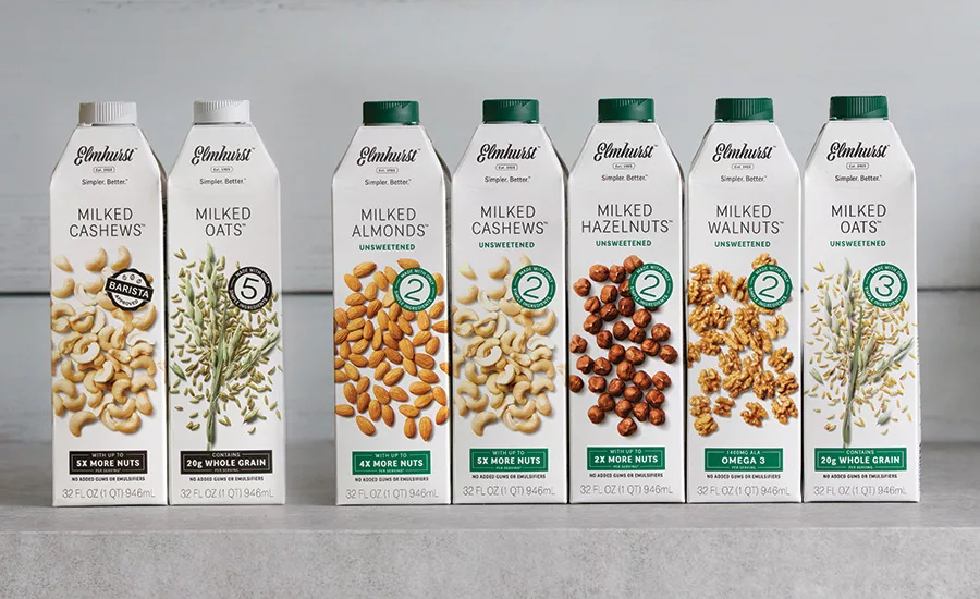
So, how should the branding reflect the product? Simple. Just as Elmhurst’s products focus on the ingredients, so does the packaging. The design is intentionally minimal to highlight the ingredient photography. The largest delineation between the plant milks is based on their source ingredient — whether made from almonds, hazelnuts, cashews, walnuts or the super-trendy oat. The use of typography evokes the luxury of a high-end cosmetic while the logomark script carries a nostalgic aesthetic.
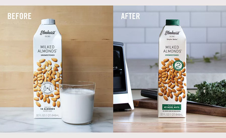
Admittedly, the simplicity in the design is one of the brand’s strongest assets. But the initial packaging was too simple. It hardly said anything about why anyone should pay top dollar for the product. When consumers couldn’t tell the difference between the core line (5 simple ingredients and lightly sweetened) and the unsweetened line (simply 2 ingredients), it was time for a refresh. The first charge was to evolve the packaging to incorporate some of Elmhurst’s premier points of difference — simpler ingredients and more nutrients — as well as introduce a new tagline: Simpler. Better.
In an effort to stay true to the original brand aesthetic, the packaging refresh integrated key selling points into elegantly designed seals and icons. This created a new packaging architecture that both better communicates and delineates between the core line and the unsweetened line. As a largely black and white brand, color is used very sparingly, allowing the ingredients to be the ultimate hero. However, by introducing green into the seals and cap, there is more clarity at shelf between the two lines. And, after launching the refresh in 2018, there has been an uptick in sales and brand loyalty to the green caps.
But the design hasn’t stopped at plant milks. In just barely three years, Elmhurst has expanded their portfolio of plant-based innovation that now spans five categories — plant milks, barista editions, creamers, flavored single-serve oat milks, and lattes.
The first additions to the Elmhurst family include products specially made to perform in coffee — creamers and the Barista Editions — both of which needed a special look. Maintaining the equity of their plant-milk cousins, both the Barista Editions and creamers keep a white, dome-shaped top with the Elmhurst logo. Both product lines share a white-washed wood texture that harmonize with one another. Just like the plant milks, the Barista Editions and creamers still highlight the ingredients in an organic composition, but the graphics do more heavy lifting. While they both are made to perform in coffee, their performance looks a little different. As one may expect, Barista Editions were made to perform to barista-level standards, so the latte art on the front panel had to look professional.
The creamers posed their own challenge. For once, this black-and-white brand needed a little color to work in a category driven by color recognition for flavor cues. To solve this, we turned to inspiration in vintage packaging labels with pin-striped flair. Luckily, just a touch of color went a long way to differentiate between the flavors.
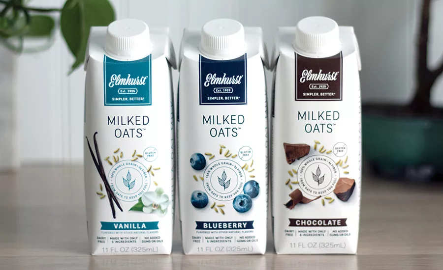
Just as the creamers had to embrace color, the flavored oat milk RTDs needed to differentiate between the chocolate, vanilla, and blueberry options. This new format of packaging posed a challenge in maintaining the consistency across product lines — for the first time, Elmhurst couldn’t live on a white dome top. The solution? Colored tabs at the top of each package that house the logo and differentiated between flavors. While the top may be different, they still very much feel like part of the family with the name Milked Oats™ and an organic composition of flat-lay ingredient propping.
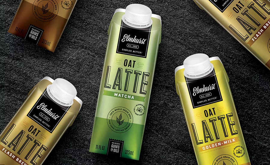
We took a bold step with color on the new Oat Lattes. Packaged in a metallic two-tone color system, these products look dramatically different from any other of the Elmhurst dairy alternatives. As the inverse of their RTD Oat Milk cousins, the lattes are the first Elmhurst product to not highlight ingredients. If we play our cards right, these will become the new status symbol for people who care about the ingredients they put in their body — even on the go.
While some products may feel like a departure from brand equity, across the product portfolio many elements repeat throughout to help tie the brand’s packaging line together. The seal on the barista editions echo the shape on the “barista approved” badge on the original Milked Cashews. Or, the flavor ribbon on the RTD Oat Milks mirrors the flavor band on the creamers. Maintaining the brands simplicity and organic elegance has been extremely important in the design process.
Elmhurst is sold at retailers across the U.S., and online at elmhurst1925.com and Amazon.
Looking for a reprint of this article?
From high-res PDFs to custom plaques, order your copy today!


