
Rodney Strong Vineyards unveils bold new packaging
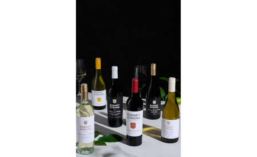
One of Sonoma County’s pioneering wineries, Rodney Strong Vineyards, has revealed a refreshed packaging design. The new packaging look honors the winery’s heritage while connecting with today’s wine consumer through modern design and timeless craftsmanship, it says.
The new label is more than a design update; it marks a strategic evolution for the winery. The refreshed look is rooted in Rodney Strong’s legacy as a trailblazing Sonoma winery, introducing a clean, elevated aesthetic that stands out on the shelf and performs across digital platforms, all while staying true to the authenticity that has defined the winery for decades.
“This new design is a fresh take on Rodney Strong,” said Erica Odden, vice president of marketing, in a statement. “It celebrates where we came from while positioning us for the future — built for both shelf and scroll without compromising the legacy we’ve built.”
With an updated label architecture, the brand’s identity is strengthened across its portfolio. It features refined typography, clearer tiering and bold color cues that increase brand recognition and visual impact. A modern, sophisticated look is the result, signaling quality and approachability while making the wines more engaging in both retail and social settings, the brand says.
Additionally, the refresh elevates the Rodney Strong’s Estate tier with a luxe palette of black, gold and cream accented by foil detailing. This design creates a clear visual bridge between the Reserve tier and reinforces the winery’s “ladder to luxury” and making trade-up intuitive for consumers.
The new packaging is already hitting shelves and will continue to roll out across Rodney Strong’s portfolio throughout the year in retail, restaurant and online channels nationwide.
Looking for a reprint of this article?
From high-res PDFs to custom plaques, order your copy today!