Kids Just Wanna Have Fun
Thanks to rising obesity rates among children, mothers continue to seek out healthy snacks for their kids. But when it comes to what children want, it’s all fun and games.
Ninety-six percent of children ages six to 12 claimed they ate snacks or treats between meals, according to a March 2008 Kids’ Snacking report from Mintel. That means almost every child in the United States is snacking on a regular basis. And though the lines have gotten a little blurred in terms of which snacks are healthy or not, mothers and children are making their choices-and they’re veering toward healthier options.
But aside from reading every nutrition label, how can moms tell which products are healthy? And how can products make special appeals to kids? Here’s where package design has been stepping in.
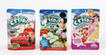
Instead, licensed characters now bring a fun aspect to a range of snack brands-including healthy ones. In fact, when kids were asked “what they really liked” in a snack, 59 percent of Mintel respondents said they wanted snacks featuring their favorite cartoon or movie character on the package.
And while using a licensed character is an easy way to attract children’s attention, “introducing a new character is very difficult,” Goodwin says. When competing with licensed characters in mass retail, he explains, it’s easier for the new character to be overlooked.
However, it’s a different story when it comes to niche retailers. In specialty stores, consumers can find original characters on most children’s food packaging, Goodwin says.
“You’re not competing against mass [retail brands], and the people who are going [to specialty retail stores] aren’t looking for [specific brands or characters],” he says. “They’re just looking for healthy food for their kids.”
Still, licensed characters remain popular among children. But as kids change and grow, so must the characters on packages.
“Kids really are fickle,” says John Stanton, chairman of the food marketing department at St. Joseph’s University. “They might love G.I. Joe this week and they might like someone else next week. It’s kind of hard to monitor kids because … every year there’s a ‘new generation’ of six-year-olds and they’re not the same as the previous year of six-year-olds.”

To do so, many brands feature graphic symbols to represent the healthy claim. For example, when Springetts Brand Design Consultants designed the packaging for The Weetabix Food Co.’s new Oaty bars, which launched in July in the U.K., it developed a system of check marks to show that the product is high in fiber, free from artificial colors and flavors and low in salt.
The use of color also helps consumers to realize when a product is healthy. For instance, the color green is often used to signify health. And light blue is frequently used to suggest less sugar. But, according to Goodwin, it’s not a one-size-fits-all approach.
“Primary colors in any category tend to speak to [the preschooler],” he explains. “[That’s mainly] because you’re still telling the mom that it’s for [her] toddler; you’re not telling the [toddlers] that it’s for them.”
But what about infants, pre-tweens, tweens and young adults?
“The younger your target audience of child, the more you’re going to appeal to mom,” says Goodwin. “At the other end of the spectrum, the older [your target audience], the more you’re going to appeal to the child.”
Depending on the consumer, the category, and even the retail channel, different color groups can be used to better capture consumers’ interest.
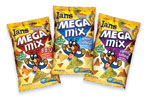
For instance, Goodwin Design Group recently redesigned snack food packaging for Ian’s Natural Foods, sold in specialty stores and some mass retail groceries. Ian’s Go Bars are aimed at mothers, older kids and tweens, while Ian’s Mega Mix was designed to appeal to the whole family. Both products feature a bright yellow background, with typography calling out health benefits and the brand’s signature character, Andy the Otter.
In this case, the color yellow was used across all products because many of them could be found in the freezer section. Using yellow made the brand stand out better in that area of the store. As for Andy the Otter, he was previously used to represent the brand’s Super Fit Kid program, so the designers kept the character but made a few modifications to make him more contemporary.
“Companies are trying to be more helpful to moms by putting some of these snacks in 100-calorie packs,” St. Joseph’s Stanton says. “They can just give the pack to the kids … and then they [can] feel as if they’ve done a better job of monitoring how much the kids eat.”
These single serving snacks are also convenient because they can be easily added to a school lunch.
“There’s nothing wrong with snacking,” Stanton says. “There’s something wrong with too much snacking and there’s something wrong with not enough exercise.”
The key is snacking in moderation-and snacking healthily at that. BP
Where to go for more information…
CONSUMER/MARKET RESEARCH
Mintel International (www.mintel.com)
PACKAGE DESIGN, YOUTH BRANDING
Bill Goodwin at Goodwin Design Group (877.468.6434, www.goodwindesigngroup.com)
PACKAGE DESIGN
Brendan Thorpe at Springetts Brand Design Consultants (www.springetts.co.uk)
FOOD MARKETING
John Stanton, Dept. of Food Marketing at St. Joseph’s University (610.660.1607, http://cfm.sju.edu)
Ninety-six percent of children ages six to 12 claimed they ate snacks or treats between meals, according to a March 2008 Kids’ Snacking report from Mintel. That means almost every child in the United States is snacking on a regular basis. And though the lines have gotten a little blurred in terms of which snacks are healthy or not, mothers and children are making their choices-and they’re veering toward healthier options.
But aside from reading every nutrition label, how can moms tell which products are healthy? And how can products make special appeals to kids? Here’s where package design has been stepping in.
What a character
“In the past, character associations on packaging in food and snacks usually indicated indulgence,” says Bill Goodwin, CEO of Goodwin Design Group, which specializes in youth branding. “But with the advent of what Nickelodeon has done by licensing to produce grocers, and what Disney has done [in licensing only to healthy, kid-focused brands], that’s no longer the case.”Instead, licensed characters now bring a fun aspect to a range of snack brands-including healthy ones. In fact, when kids were asked “what they really liked” in a snack, 59 percent of Mintel respondents said they wanted snacks featuring their favorite cartoon or movie character on the package.
And while using a licensed character is an easy way to attract children’s attention, “introducing a new character is very difficult,” Goodwin says. When competing with licensed characters in mass retail, he explains, it’s easier for the new character to be overlooked.
However, it’s a different story when it comes to niche retailers. In specialty stores, consumers can find original characters on most children’s food packaging, Goodwin says.
“You’re not competing against mass [retail brands], and the people who are going [to specialty retail stores] aren’t looking for [specific brands or characters],” he says. “They’re just looking for healthy food for their kids.”
Still, licensed characters remain popular among children. But as kids change and grow, so must the characters on packages.
“Kids really are fickle,” says John Stanton, chairman of the food marketing department at St. Joseph’s University. “They might love G.I. Joe this week and they might like someone else next week. It’s kind of hard to monitor kids because … every year there’s a ‘new generation’ of six-year-olds and they’re not the same as the previous year of six-year-olds.”
Coloring for an audience
Though kids are attracted to characters on packaging, let’s not forget it’s the parents purchasing these snacks. They want to give their kids snacks they’ll eat (or ask for), but they also want to make sure the snacks are somewhat healthy. And since 62 percent of kids reported enjoying healthy snacks, according to Mintel, the trick is to make the snacks appealing to children and show parents the product’s benefits at the same time.To do so, many brands feature graphic symbols to represent the healthy claim. For example, when Springetts Brand Design Consultants designed the packaging for The Weetabix Food Co.’s new Oaty bars, which launched in July in the U.K., it developed a system of check marks to show that the product is high in fiber, free from artificial colors and flavors and low in salt.
The use of color also helps consumers to realize when a product is healthy. For instance, the color green is often used to signify health. And light blue is frequently used to suggest less sugar. But, according to Goodwin, it’s not a one-size-fits-all approach.
“Primary colors in any category tend to speak to [the preschooler],” he explains. “[That’s mainly] because you’re still telling the mom that it’s for [her] toddler; you’re not telling the [toddlers] that it’s for them.”
But what about infants, pre-tweens, tweens and young adults?
“The younger your target audience of child, the more you’re going to appeal to mom,” says Goodwin. “At the other end of the spectrum, the older [your target audience], the more you’re going to appeal to the child.”
Depending on the consumer, the category, and even the retail channel, different color groups can be used to better capture consumers’ interest.
For instance, Goodwin Design Group recently redesigned snack food packaging for Ian’s Natural Foods, sold in specialty stores and some mass retail groceries. Ian’s Go Bars are aimed at mothers, older kids and tweens, while Ian’s Mega Mix was designed to appeal to the whole family. Both products feature a bright yellow background, with typography calling out health benefits and the brand’s signature character, Andy the Otter.
In this case, the color yellow was used across all products because many of them could be found in the freezer section. Using yellow made the brand stand out better in that area of the store. As for Andy the Otter, he was previously used to represent the brand’s Super Fit Kid program, so the designers kept the character but made a few modifications to make him more contemporary.
Everything in moderation
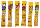
Although statistics reveal that many children like eating healthy foods, it’s no surprise that they also enjoy the not-so-healthy snacks. To conquer this problem, many companies have turned to portion control packaging-a format that first-launched as a solution for adult dieters but has since been repurposed for kids.“Companies are trying to be more helpful to moms by putting some of these snacks in 100-calorie packs,” St. Joseph’s Stanton says. “They can just give the pack to the kids … and then they [can] feel as if they’ve done a better job of monitoring how much the kids eat.”
These single serving snacks are also convenient because they can be easily added to a school lunch.
“There’s nothing wrong with snacking,” Stanton says. “There’s something wrong with too much snacking and there’s something wrong with not enough exercise.”
The key is snacking in moderation-and snacking healthily at that. BP
Where to go for more information…
CONSUMER/MARKET RESEARCH
Mintel International (www.mintel.com)
PACKAGE DESIGN, YOUTH BRANDING
Bill Goodwin at Goodwin Design Group (877.468.6434, www.goodwindesigngroup.com)
PACKAGE DESIGN
Brendan Thorpe at Springetts Brand Design Consultants (www.springetts.co.uk)
FOOD MARKETING
John Stanton, Dept. of Food Marketing at St. Joseph’s University (610.660.1607, http://cfm.sju.edu)
Looking for a reprint of this article?
From high-res PDFs to custom plaques, order your copy today!


