Too Much Choice
The impact of too many choices on shopper behavior and packaging design.
 It’s often said that package design should start with the shopper, but what exactly does that mean? Focus on a specific shopper segment? Highlight a feature that tested well?
We believe that design should focus on the reality of the shopping experience: There are too many choices.
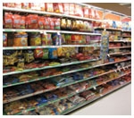
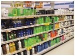
Whether they are in Shanghai, Santiago or San Francisco, shoppers are overwhelmed by 30- and 40-foot product categories, often featuring as many as 200 different choices. From cereal to diapers to motor oil, categories have grown exponentially, fundamentally changing the in-store experience. But what is the impact of “too much choice” on shopping behavior and what are the implications for packaging design?
This creates a major challenge for marketers, designers and researchers. That’s because the way shoppers talk about their experiences is often very different from what they actually do in-store. When people are asked about how they shop, they are very likely to speak to logical factors. For instance, if you ask someone how she selected a cold medicine, she might talk about the importance of a trusted brand, the need to treat specific symptoms and, perhaps, the value of certain safety reassurances.
But when this same shopper comes face to face with stimuli overload in the store, this “decision tree” is often abandoned. In fact, by documenting shopper behavior through in-store eye-tracking technologies, we’ve uncovered several important dynamics:
Unseen is unsold: Shoppers never see more than two-thirds of products on shelf, which means that many brands aren’t purchased because they are never even considered. In categories where there is a constant proliferation of options, shoppers are more likely to buy the first brand they actively consider, rather than compare various brands.
Default to the familiar: People often default to what they’ve always purchased; shoppers “tune out” and don’t bother investigating new options. In fact, our eye tracking videos reveal that most shopping time is spent “searching” for a specific product, as opposed to browsing, comparing products or price checking.
1. Design for visibility: The first and most obvious implication of “too many choices” is to design to break through the clutter. The connection between visibility and purchase levels is strongest for smaller brands with limited shelving. Therefore, these brands (such as Wrigley’s 5 gum), need to create contrast at the shelf, often by “owning” a disruptive color or shape.
For larger brands (such as Colgate or Pampers), this involves creating a “signpost” in what might be a 40-foot-long aisle to pre-empt competition and guide shoppers to their specific four to six-foot sub-section. In this case, designers need to think about how packaging appears coming down the aisle-and how it can create disruption and impact the selection process from 20 feet away.
Regardless of brand size, the bottom line is that you can’t design to the lowest common denominator, to simply “fit in” with a category. Instead, brands need to think of contrast and disruption-and then find ways to provide shoppers with information and to create brand reassurance.
2. Design for shoppability: There is often a disconnect between shoppers’ priorities and the way products are organized and named. Although shoppers typically approach the shelf focused on usage occasion, marketers often organize products by features, benefits and sub-brands.
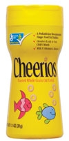
Therefore, we need to create brand architectures that are more aligned with shoppers’ thought processes. For example, products and packaging innovations that speak directly to usage occasions (such as Cheerios toddlers’ packs) are far more intuitive for shoppers and far more likely to be successful.
On the design level, it’s important to understand the role of shapes, colors and graphics within specific categories. For example, green tends to signal mint flavor in the gum category, menthol in the cigarette category and healthy options in food categories. To facilitate shopping in crowded retail environments, it’s best to leverage these category cues, rather than fight them and risk confusion. In fact, packaging changes that confuse shoppers at the shelf (such as the infamous Tropicana redesign of 2009) are the surest route to sales declines.
Large brands also need to strike the right balance between product differentiation and brand continuity across variants. While it’s important to visually differentiate new products from the existing line, shoppers often have difficulty comparing packages that are seemingly too different from one another. Shoppers should be able to pick up two variants, look in the same place on the packaging-and quickly understand the differences between them.
3. Connect emotionally: It’s also more important than ever for brands to connect on an emotional level. Because shoppers face too many choices to sort through them rationally, packaging needs to do more than speak to the intellect. It needs to look and feel more effective, more fun or, perhaps, more feminine than the competition-and to embody the brand’s core positioning in a glance.
Of course, there’s no simple formula for this; objectives and strategies will vary by brand. However, packaging structures can be very powerful in differentiating and signaling core benefits. For example, Softsoap Nutriserum’s new packaging uses its shape to embody innovation and femininity, which has translated to in-market success.
Our recent neuroscience studies (conducted in partnership with EmSense) uncovered that shoppers have strong emotional reactions to design.
In a recent frozen food study, for instance, we saw that removing a character from packaging had a negative impact on shoppers’ emotional connection with the brand. In a beverage study, neuroscience confirmed that a dominant graphic drove positive emotion and cognition: It was a positive “equity element” to be leveraged, rather than “baggage” weighing down the brand.

First and foremost, it means that we can’t rely solely on direct questioning to understand shopper behavior. Instead, we need to begin by observing how shoppers react to packaging and rely on a variety of tools (including eye-tracking and neuroscience) to better understand the “why” behind their reactions.
We also need to improve understanding of the subconscious processes that shoppers use to sort through vast product categories, and to identify and connect with brands. This requires greater investment in “upfront” research to discern the meaning of colors, shapes and symbols within different product categories. It also means uncovering the power of different brand symbols and identifying which design elements drive engagement and emotional connection. In these efforts, the combination of eye-tracking and neuroscience holds considerable promise.
Finally, we must develop, screen and assess packaging options on shelf. Of course, most leading brand marketers have recognized this point (and the limitations of focus groups and web-based surveys), and they have built “the shelf” into packaging validation research.
However, to increase the odds of validation and in-market success, we need to integrate the shelf throughout the design process: We need to begin with store visits to uncover “retail realities,” to view new concepts in context-and include the shelf in design screening.
To accomplish this, many companies will need to shift how they think about shoppers, research and design. They will need to reduce their reliance on shopper feedback and, instead, rely more heavily on behavioral/observational research that tracks what they actually do.
Brands will also need to approach the design process differently, changing which product factors/dimensions are emphasized and altering how decisions are made. In a more competitive and cluttered world, the companies that embrace these changes-and invest in winning at the first moment of truth-will reap the rewards. BP
Scott Young is the president of Perception Research Services (www.prsresearch.com), a company that conducts more than 800 packaging and shopper research studies annually. Scott can be reached at syoung@prsresearch.com or 201.346.1600.
We believe that design should focus on the reality of the shopping experience: There are too many choices.
Whether they are in Shanghai, Santiago or San Francisco, shoppers are overwhelmed by 30- and 40-foot product categories, often featuring as many as 200 different choices. From cereal to diapers to motor oil, categories have grown exponentially, fundamentally changing the in-store experience. But what is the impact of “too much choice” on shopping behavior and what are the implications for packaging design?
What Shoppers Say...and Do
Overwhelming choice has transformed shopping from a rational exercise into an emotional one. Shoppers simply don’t have the time or “mental bandwidth” to actively and logically compare all of their options. Instead, the experience is driven largely by what shoppers end up seeing in the aisle-and the feelings these packages trigger.This creates a major challenge for marketers, designers and researchers. That’s because the way shoppers talk about their experiences is often very different from what they actually do in-store. When people are asked about how they shop, they are very likely to speak to logical factors. For instance, if you ask someone how she selected a cold medicine, she might talk about the importance of a trusted brand, the need to treat specific symptoms and, perhaps, the value of certain safety reassurances.
But when this same shopper comes face to face with stimuli overload in the store, this “decision tree” is often abandoned. In fact, by documenting shopper behavior through in-store eye-tracking technologies, we’ve uncovered several important dynamics:
Unseen is unsold: Shoppers never see more than two-thirds of products on shelf, which means that many brands aren’t purchased because they are never even considered. In categories where there is a constant proliferation of options, shoppers are more likely to buy the first brand they actively consider, rather than compare various brands.
Default to the familiar: People often default to what they’ve always purchased; shoppers “tune out” and don’t bother investigating new options. In fact, our eye tracking videos reveal that most shopping time is spent “searching” for a specific product, as opposed to browsing, comparing products or price checking.
Shopping by feel: The overabundance of choice leads people to shop largely by symbols and intuition, as opposed to words and logic. Shoppers use colors, shapes and icons to navigate vast product categories and to recognize and sort their options. A certain color may signal a specific brand (e.g., green = Fructis), while a shape may intuitively speak to a product form (e.g., upside down = conditioner). These shapes/symbols can also connect on a deeper level. A compelling or familiar graphic, such as the Gerber baby, may provide comfort and reassurance, perhaps by linking to past experience.
Designing For The Shopper
Because of these shopping dynamics, it is essential to use design to break through the clutter and simplify the shopping experience. In our experience, this translates into several guiding principles for packaging development:1. Design for visibility: The first and most obvious implication of “too many choices” is to design to break through the clutter. The connection between visibility and purchase levels is strongest for smaller brands with limited shelving. Therefore, these brands (such as Wrigley’s 5 gum), need to create contrast at the shelf, often by “owning” a disruptive color or shape.
For larger brands (such as Colgate or Pampers), this involves creating a “signpost” in what might be a 40-foot-long aisle to pre-empt competition and guide shoppers to their specific four to six-foot sub-section. In this case, designers need to think about how packaging appears coming down the aisle-and how it can create disruption and impact the selection process from 20 feet away.
Regardless of brand size, the bottom line is that you can’t design to the lowest common denominator, to simply “fit in” with a category. Instead, brands need to think of contrast and disruption-and then find ways to provide shoppers with information and to create brand reassurance.
2. Design for shoppability: There is often a disconnect between shoppers’ priorities and the way products are organized and named. Although shoppers typically approach the shelf focused on usage occasion, marketers often organize products by features, benefits and sub-brands.
Therefore, we need to create brand architectures that are more aligned with shoppers’ thought processes. For example, products and packaging innovations that speak directly to usage occasions (such as Cheerios toddlers’ packs) are far more intuitive for shoppers and far more likely to be successful.
On the design level, it’s important to understand the role of shapes, colors and graphics within specific categories. For example, green tends to signal mint flavor in the gum category, menthol in the cigarette category and healthy options in food categories. To facilitate shopping in crowded retail environments, it’s best to leverage these category cues, rather than fight them and risk confusion. In fact, packaging changes that confuse shoppers at the shelf (such as the infamous Tropicana redesign of 2009) are the surest route to sales declines.
Large brands also need to strike the right balance between product differentiation and brand continuity across variants. While it’s important to visually differentiate new products from the existing line, shoppers often have difficulty comparing packages that are seemingly too different from one another. Shoppers should be able to pick up two variants, look in the same place on the packaging-and quickly understand the differences between them.
3. Connect emotionally: It’s also more important than ever for brands to connect on an emotional level. Because shoppers face too many choices to sort through them rationally, packaging needs to do more than speak to the intellect. It needs to look and feel more effective, more fun or, perhaps, more feminine than the competition-and to embody the brand’s core positioning in a glance.
Of course, there’s no simple formula for this; objectives and strategies will vary by brand. However, packaging structures can be very powerful in differentiating and signaling core benefits. For example, Softsoap Nutriserum’s new packaging uses its shape to embody innovation and femininity, which has translated to in-market success.
Our recent neuroscience studies (conducted in partnership with EmSense) uncovered that shoppers have strong emotional reactions to design.
In a recent frozen food study, for instance, we saw that removing a character from packaging had a negative impact on shoppers’ emotional connection with the brand. In a beverage study, neuroscience confirmed that a dominant graphic drove positive emotion and cognition: It was a positive “equity element” to be leveraged, rather than “baggage” weighing down the brand.
Starting at the Shelf
The overabundance of retail choices also has major implications for how we develop, screen and assess new packaging concepts.First and foremost, it means that we can’t rely solely on direct questioning to understand shopper behavior. Instead, we need to begin by observing how shoppers react to packaging and rely on a variety of tools (including eye-tracking and neuroscience) to better understand the “why” behind their reactions.
We also need to improve understanding of the subconscious processes that shoppers use to sort through vast product categories, and to identify and connect with brands. This requires greater investment in “upfront” research to discern the meaning of colors, shapes and symbols within different product categories. It also means uncovering the power of different brand symbols and identifying which design elements drive engagement and emotional connection. In these efforts, the combination of eye-tracking and neuroscience holds considerable promise.
Finally, we must develop, screen and assess packaging options on shelf. Of course, most leading brand marketers have recognized this point (and the limitations of focus groups and web-based surveys), and they have built “the shelf” into packaging validation research.
However, to increase the odds of validation and in-market success, we need to integrate the shelf throughout the design process: We need to begin with store visits to uncover “retail realities,” to view new concepts in context-and include the shelf in design screening.
Winning in a World of Too Much Choice
Going forward, as products proliferate and categories expand even further, the brands that win in-store will be those that visually dominate and thwart competition; simplify the shopping experience; and emotionally connect with shoppers and consumers.To accomplish this, many companies will need to shift how they think about shoppers, research and design. They will need to reduce their reliance on shopper feedback and, instead, rely more heavily on behavioral/observational research that tracks what they actually do.
Brands will also need to approach the design process differently, changing which product factors/dimensions are emphasized and altering how decisions are made. In a more competitive and cluttered world, the companies that embrace these changes-and invest in winning at the first moment of truth-will reap the rewards. BP
Scott Young is the president of Perception Research Services (www.prsresearch.com), a company that conducts more than 800 packaging and shopper research studies annually. Scott can be reached at syoung@prsresearch.com or 201.346.1600.
Looking for a reprint of this article?
From high-res PDFs to custom plaques, order your copy today!


