Hitting Close to Home
How a local identity enhances the packaging solution.
by Mandy Saven
"Local” and “hyperlocal” are two of the latest buzzwords in product, packaging and creative circles.
The terms refer to an effort to source local materials or manufacture locally, adapt a global packaging solution to a specific country or region or simply embed a locally relevant theme, story or idea into the graphic treatment.
With a local approach, it seems everyone can win. Brands and retailers score eco points by using local materials and production (cutting down on fossil fuels and carbon miles). And consumers ease their social conscience, knowing that they are supporting local businesses and being gentler on the environment.
A local slant also creates a rich relationship with a targeted audience. Shoppers are attracted to products with instantly recognizable origins-and a story that they can sink their teeth into. Buying products like these means consumers are not only investing in a physical item, they are buying into a tale or a culture.
The campaign was based on the concept that all beer from outside the Southern states is essentially an import. The names of the Red Brick products were simplified and visual clues from Southern industrial products were incorporated into the package design. The agency was given a limited ad budget, so it made the packaging the advertising and managed to turn a brand with no recognizable identity into a brand with a rich cultural story.
 Across the pond in the UK, London-based food cooperative and
micro-enterprise Cecil Mansions has launched a range of five “postcode”
chutneys to reflect the tastes, traditions and cultures of different areas in
the city. SW19-the postcode for London’s Wimbledon area-is a chutney made from strawberry, lime
and almond. The addition of strawberry to the recipe recalls the tradition of
eating strawberries and cream at the Wimbledon tennis championships. W1 is a
spicy plum chutney with a kick of ginger, a popular ingredient in London’s Chinatown, which
falls within the postcode. SW17 is a fruity, rich and spicy chutney, inspired
by the cuisine of the Asian community in Tooting, South
London.
Across the pond in the UK, London-based food cooperative and
micro-enterprise Cecil Mansions has launched a range of five “postcode”
chutneys to reflect the tastes, traditions and cultures of different areas in
the city. SW19-the postcode for London’s Wimbledon area-is a chutney made from strawberry, lime
and almond. The addition of strawberry to the recipe recalls the tradition of
eating strawberries and cream at the Wimbledon tennis championships. W1 is a
spicy plum chutney with a kick of ginger, a popular ingredient in London’s Chinatown, which
falls within the postcode. SW17 is a fruity, rich and spicy chutney, inspired
by the cuisine of the Asian community in Tooting, South
London.
 Of course, you don’t get more hyper-local than the local
jail. Take the “micro-enterprise” of a group of entrepreneurial inmates at the
minimum security Hillsborough County Jail in Florida. The group has created a
range of hot sauces, known as Jailhouse Fire, using chili peppers grown at an
on-site allotment. The packaging of the three variants-Original, Smoke and No
Escape-is striking and humorous, as is the product description, Created with
Conviction.
Of course, you don’t get more hyper-local than the local
jail. Take the “micro-enterprise” of a group of entrepreneurial inmates at the
minimum security Hillsborough County Jail in Florida. The group has created a
range of hot sauces, known as Jailhouse Fire, using chili peppers grown at an
on-site allotment. The packaging of the three variants-Original, Smoke and No
Escape-is striking and humorous, as is the product description, Created with
Conviction.
And staying-metaphorically-on the wrong side of the law for a moment, Chicago Commercial & Consumer Brands created a terrific local identity with its Spice Outfit range of gourmet spice blends and meat rubs, inspired by Chicago’s renowned 1920s mob scene.
The packaging features labels that mimic police documents of the time, with each tin depicting a gangster’s mug shot. Product names are partially taken from popular gangster phrases, with flavors including Rib Racket, Soften ’Em Up and With the Fishes. It’s a witty take on the city’s notorious heritage-and one that shows the potential of packaging to create a sense of place.

In fact, there’s an opportunity to adapt any package to local tastes and cultures-even when the packaging form in question is a humble envelope. A recent campaign mailer by global bank HSBC is a good illustration of this idea. To celebrate the Chinese New Year and HSBC’s involvement as a primary sponsor of the Auckland Lantern Festival, the international bank sent its New Zealand customers decorative promotional mailers that detailed its products and services. To match the spirit of the festival, the A4-sized mailer could be torn along perforated lines and converted into a traditional Chinese lantern.
In Japan, the global chocolate brand Kit Kat created an “edible good luck charm,” turning out a playful packaging concept that tapped the local tradition of sending good wishes to students during exam periods. Each box contained Kit Kat chocolates and allowed the sender to fill in a personal message, add the recipient’s address and affix a postage stamp.
 The brand partnered with Japan’s postal service to retail
the boxes in 20,000 Japan Post outlets across the country, with dedicated Kit
Kat retail spaces in select branches, creating an unexpected new sales channel
for the product.
The brand partnered with Japan’s postal service to retail
the boxes in 20,000 Japan Post outlets across the country, with dedicated Kit
Kat retail spaces in select branches, creating an unexpected new sales channel
for the product.
Initially created as a limited-edition item during exam season, the product quickly seized public imagination and sold out across the country within the first month of its release. It is now an ongoing initiative in the region.
The global vodka brand Absolut has also cleverly invented a local identity for itself with its City Series limited editions. Its most recent introduction, Absolut Brooklyn takes its inspiration from the childhood home of filmmaker Spike Lee in the New York borough of Brooklyn. The 1L Absolut bottle features the brownstone row house, 165 Cobble Hill, where Lee grew up.
The stoop is a place where, traditionally, the Brooklyn community comes together. So the image is one that would resonate with New Yorkers-making it a local brand, if only for a season. And, as many Absolut campaigns do, the packaging was used for the print advertisements.
Participants are encouraged to extend the box’s journey by using it to send items to others worldwide. The local history of the box is in fact living history. Within one month of the initiative’s launch, more than 66 percent of online orders from Columbia were being shipped in reused boxes.
Packaging can also be used as a bridge to a brand’s website, to provide further product information and build brand loyalty. Beerenberg, a producer of additive-free preserves and condiments in Australia uses its Provenance Pathway tool to allow customers to explore the ingredients and manufacturing processes of its products. After entering in part of the jar’s barcode and expiration date, users can access the date of production, the name and photo of the cook and a Google map indicating the exact origins of ingredients. Here, technology is used to confirm the brand’s local credentials, so that customers unable to visit its farm shop still have the sense of a local product.
Local businesses need to play to their strengths, by letting their packaging articulate their local relevance and encouraging people to buy locally and sustainably. At the same time, global players should remember that adjusting their packaging to the local market is both culturally sensitive and commercially astute. Whatever the size or category of the brand or retailer, the ‘local’ premium can win the hearts and minds of consumers, and, in turn, make inroads to boost the bottom line.
Mandy Saven is editor of the Global Innovation Report published by GDR Creative Intelligence, a London-based trend analysis consultancy specializing in retail, leisure and hospitality design. Contact Mandy at mandy@gdruk.com.
WHERE TO GO FOR MORE INFORMATION…
Package Design
Red Brick beer: 22squared, www.22squared.com
Jailhouse Fire hot sauce: Pyper Paul + Kenney, www.pyperpaul.com
Spice Outfit: Mondo Vox Creative Group, www.mondovox.com
Kit Kat mail packs: JWT Tokyo, www.jwt.com
Editor's Note
Cecil Mansions, Absolut Brooklyn, Columbia’s A Box Life and Beerenberg packaging was designed in-house.
by Mandy Saven
"Local” and “hyperlocal” are two of the latest buzzwords in product, packaging and creative circles.
The terms refer to an effort to source local materials or manufacture locally, adapt a global packaging solution to a specific country or region or simply embed a locally relevant theme, story or idea into the graphic treatment.
With a local approach, it seems everyone can win. Brands and retailers score eco points by using local materials and production (cutting down on fossil fuels and carbon miles). And consumers ease their social conscience, knowing that they are supporting local businesses and being gentler on the environment.
A local slant also creates a rich relationship with a targeted audience. Shoppers are attracted to products with instantly recognizable origins-and a story that they can sink their teeth into. Buying products like these means consumers are not only investing in a physical item, they are buying into a tale or a culture.
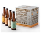
Georgia-based Red Brick Brewing Company plays to its strengths with a “Beer from Around Here”
campaign that uses packaging to articulate its local (Southern) relevance.
Finding a Local Niche
There have been some inspiring and innovative packaging solutions that draw on local cultures and other elements, such as the regional “Beer from around Here” campaign created by U.S. design agency 22squared for the Atlanta-based Red Brick Beer company.The campaign was based on the concept that all beer from outside the Southern states is essentially an import. The names of the Red Brick products were simplified and visual clues from Southern industrial products were incorporated into the package design. The agency was given a limited ad budget, so it made the packaging the advertising and managed to turn a brand with no recognizable identity into a brand with a rich cultural story.
Cecil Mansions’ line of chutneys take a hyperlocal
approach, championing not just the city of London but specific post codes within it. The
W1 flavor contains a kick of ginger, a popular ingredient in London’s
Chinatown, which falls in the zip code.
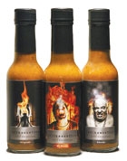
A micro-enterprise of inmates created Jailhouse Fire, a hot
sauce range with ingredients grown on an on-site allotment. The brand name
reflects the products’ hyperlocal origins.
And staying-metaphorically-on the wrong side of the law for a moment, Chicago Commercial & Consumer Brands created a terrific local identity with its Spice Outfit range of gourmet spice blends and meat rubs, inspired by Chicago’s renowned 1920s mob scene.
The packaging features labels that mimic police documents of the time, with each tin depicting a gangster’s mug shot. Product names are partially taken from popular gangster phrases, with flavors including Rib Racket, Soften ’Em Up and With the Fishes. It’s a witty take on the city’s notorious heritage-and one that shows the potential of packaging to create a sense of place.
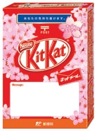
Global brand Kit Kat tapped the local, Japanese tradition of
sending good wishes to students during exams with a mail-able package that
retailed in 20,000 Japanese post offices.
Going 'Glocal'
At the same time, consumers are not immune to the effects of a global brand implementing a local strategy, what some call a “glocal” approach. A promotion to celebrate a local festival or highlight local history will appeal to consumers, even though they are aware that the packaging is fleeting in nature, and not truly local.In fact, there’s an opportunity to adapt any package to local tastes and cultures-even when the packaging form in question is a humble envelope. A recent campaign mailer by global bank HSBC is a good illustration of this idea. To celebrate the Chinese New Year and HSBC’s involvement as a primary sponsor of the Auckland Lantern Festival, the international bank sent its New Zealand customers decorative promotional mailers that detailed its products and services. To match the spirit of the festival, the A4-sized mailer could be torn along perforated lines and converted into a traditional Chinese lantern.
In Japan, the global chocolate brand Kit Kat created an “edible good luck charm,” turning out a playful packaging concept that tapped the local tradition of sending good wishes to students during exam periods. Each box contained Kit Kat chocolates and allowed the sender to fill in a personal message, add the recipient’s address and affix a postage stamp.
Initially created as a limited-edition item during exam season, the product quickly seized public imagination and sold out across the country within the first month of its release. It is now an ongoing initiative in the region.
The global vodka brand Absolut has also cleverly invented a local identity for itself with its City Series limited editions. Its most recent introduction, Absolut Brooklyn takes its inspiration from the childhood home of filmmaker Spike Lee in the New York borough of Brooklyn. The 1L Absolut bottle features the brownstone row house, 165 Cobble Hill, where Lee grew up.
The stoop is a place where, traditionally, the Brooklyn community comes together. So the image is one that would resonate with New Yorkers-making it a local brand, if only for a season. And, as many Absolut campaigns do, the packaging was used for the print advertisements.
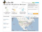
Sportswear retailer Columbia’s “A Box Life” program invites
consumers to upload images and messages that share the local histories of its
shipping cartons.
Techy Tools
Another way of referencing a product as local-and moving away from a graphics-led approach-is to use developing technologies like QR codes. For instance, ‘A Box Life’, a program being tested by U.S. sportswear retailer Columbia, delivers products in reused corrugated boxes featuring QR codes that reveal the containers’ history and messages from previous owners. When captured using a QR-enabled phone, the code directs customers to a website where they can track the box’s journey on a map and access images and anecdotes from previous owners, before adding their own. Customers without QR-enabled devices can still access this information by entering the box’s ID code on the website.Participants are encouraged to extend the box’s journey by using it to send items to others worldwide. The local history of the box is in fact living history. Within one month of the initiative’s launch, more than 66 percent of online orders from Columbia were being shipped in reused boxes.
Packaging can also be used as a bridge to a brand’s website, to provide further product information and build brand loyalty. Beerenberg, a producer of additive-free preserves and condiments in Australia uses its Provenance Pathway tool to allow customers to explore the ingredients and manufacturing processes of its products. After entering in part of the jar’s barcode and expiration date, users can access the date of production, the name and photo of the cook and a Google map indicating the exact origins of ingredients. Here, technology is used to confirm the brand’s local credentials, so that customers unable to visit its farm shop still have the sense of a local product.
Local Roadmap
Over the last five years or so, package design has raised the bar time and again, with creative talent, innovative materials and leading-edge technology coming together to deliver thoughtful solutions. But we shouldn’t let these extraordinary achievements blind us to a less-complicated trump card that may be at a brand or retailer’s disposal: local.Local businesses need to play to their strengths, by letting their packaging articulate their local relevance and encouraging people to buy locally and sustainably. At the same time, global players should remember that adjusting their packaging to the local market is both culturally sensitive and commercially astute. Whatever the size or category of the brand or retailer, the ‘local’ premium can win the hearts and minds of consumers, and, in turn, make inroads to boost the bottom line.
Mandy Saven is editor of the Global Innovation Report published by GDR Creative Intelligence, a London-based trend analysis consultancy specializing in retail, leisure and hospitality design. Contact Mandy at mandy@gdruk.com.
WHERE TO GO FOR MORE INFORMATION…
Package Design
Red Brick beer: 22squared, www.22squared.com
Jailhouse Fire hot sauce: Pyper Paul + Kenney, www.pyperpaul.com
Spice Outfit: Mondo Vox Creative Group, www.mondovox.com
Kit Kat mail packs: JWT Tokyo, www.jwt.com
Editor's Note
Cecil Mansions, Absolut Brooklyn, Columbia’s A Box Life and Beerenberg packaging was designed in-house.
Looking for a reprint of this article?
From high-res PDFs to custom plaques, order your copy today!


