Seagram's Ginger Ale
The story:
Seagram’s is an iconic, well-respected brand with more than 100 years of history and brand equity. So when its parent company, The Coca-Cola Co., asked brand design firm Hatch to help refresh the Seagram’s Ginger Ale line and make it more relevant in today’s world, it was definitely a handle-with-care assignment.
The challenge:
With so many new soft drink options available to consumers, ginger ale has become a product with niche appeal. As people reach their late 30s, they tire of overly sweet beverage concoctions, and if they are going to treat themselves, they often gravitate toward a clean, sophisticated taste. The particular taste profile of Seagram’s Ginger Ale, and particularly the “bite” of ginger ale, is viewed as sophisticated and adult. The challenge was how to update such a venerable brand without losing some of its valuable gravitas.
The solution:
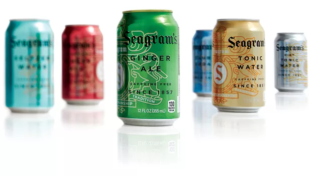
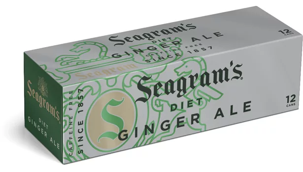
The brand has two iconic elements reaching back to the old world: the Seagram’s crest and word mark. Taking this into consideration, the design team decided to modernize the crest (they simplified it, by reducing it to a single line weight) and then use it in ways that announce that something new is going on. The crest is now more of a friendly element than a crown jewel, with visual treatments such as placing type over it and wrapping it around the corners of paperboard multipack cases.
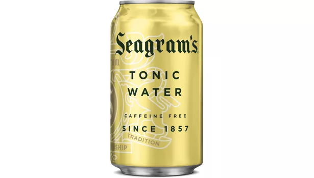
In order to help consumers shop for the three ginger ale flavors (as well as tonic water and club soda, which are traditionally sold alongside the ginger ale), the cans are decorated with crisp, clean metallic versions of the colors consumers associate with the flavors category-wide.
The results:
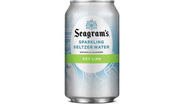
So successful was this complete brand refresh that Coca-Cola applied the same system to the Seagram’s line of sparkling seltzer and, also to a new line of non-traditional, flavored ginger ales sold under the brand name of Seagram’s Zenzero.
Looking for a reprint of this article?
From high-res PDFs to custom plaques, order your copy today!


