USA > Nawgan beverages
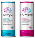
Nawgan beverages were created to help sharpen the mind by supporting memory and thinking. Because this is such a new, and unique, beverage category, the brand’s packaging had to easily communicate what the product was, in a clever way. The name “Nawgan” comes from a combination of the founder’s sons’ names, Dawson and Logan, but also is a reference to “noggin.” The brain graphic on the front of the packaging is made from a maze, which is a classic test of frontal lobe integrity in the brain. Because Nawgan drinks target adults aged 30 and up, the packaging was designed to resemble a serious adult beverage, minus the medicinal look. It comes in a small, 8oz format because the brand found that older adults prefer smaller volumes for functional products.
LAUNCH DATE
January 2010
PACKAGE DESIGN
Propaganda Inc, www.propaganda-inc.com
Looking for a reprint of this article?
From high-res PDFs to custom plaques, order your copy today!


