Multinational > iloveRobots toys
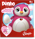
In the busy, bright and colorful toy sector, it’s vital to stand out on shelf. To gain a competitive edge at retail, Bossa Nova Robotics needed to unify its brand and create genre-specific packaging. The previous packaging was segregated, identifying each item by product name, not brand name. As a result, Bossa Nova developed a new logo to appear on all products, and a consistent background color. “We chose the color of a category leader…red,” says Simon Thorneycroft, chief creative officer and co-founder of Perspective: Branding. “Red not only served the practical application of imposing visibility, but can be transformed into the conceptual idea of love (for girls) or power (for boys) depending on its application.” Whether aimed at boys or girls, the packaging features cues reflecting the personality of the robots. And, the packaging makes use of all sides, creating an imaginative world for children.
LAUNCH DATE
Europe/Asia: Summer 2010, USA: Fall 2010
PACKAGE DESIGN
Perspective: Branding, www.perspectivebranding.com
Looking for a reprint of this article?
From high-res PDFs to custom plaques, order your copy today!


