USA > Viva paper towels

AFTER
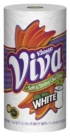
BEFORE
LAUNCH DATE
February 2010
PACKAGE DESIGN
Wallace Church, www.wallacechurch.com
Looking for a reprint of this article?
From high-res PDFs to custom plaques, order your copy today!
Looking for a reprint of this article?
From high-res PDFs to custom plaques, order your copy today!


