Häagen Dazs: A Taste-Full Redesign
Häagen Dazs hadn't updated their packaging in about five years, causing it to fall short of consumer expectations. The brand took this as an opportunity to contemporize its packaging and better call out the products’ benefits.
 The story: Where does the name Häagen Dazs come from? What does it mean? Was the brand created in Europe?Despite its foreign connotation, the name was contrived by the brand’s founder, New Yorker Reuben Mattus. In the early 1920s, Mattus worked for his mother’s ice cream company in the Bronx, selling fruit ice and ice cream pops from a horse-drawn wagon. He launched his own company in 1960, calling it Häagen Dazs to reflect the old-world traditions he embraced. By 1973, the products were available throughout the United States. And in 1983, the brand was purchased by The Pillsbury Co. Today, Häagen Dazs is available in 50 countries.
The challenge: The brand’s current packaging hadn’t been updated in about five years, causing it to fall short of consumer expectations. Häagen Dazs took this as an opportunity to contemporize its packaging and better call out the products’ benefits.
The goal: Häagen Dazs teamed up with Sterling Brands to create a new package design that would improve shoppers’ experience with the brand on-shelf.
“[In addition to] increasing relevancy, we want to make sure that we maintain our positioning as the super premium ice cream,” says Jason Merideth, associate brand manager at Häagen Dazs. “When consumers invite us into their homes and shop us at shelf, we want to make that experience as pleasurable as possible and make it easy for them to find their flavor,” Merideth adds.
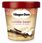
The solution: During consumer research, the team found equity in the brand’s logo and color scheme. As a result, the logo stayed the same, and the gold and burgundy color scheme remained-but they found a new interpretation. The redesigned cartons feature a gold background, instead of the burgundy used on the old packaging, which makes the text easier to read. The gold background is also designed to reflect the texture of the ice cream inside.
Designers also tweaked the banner graphic, moving it from the side of the package to the top. The new graphic incorporates the burgundy color of the lid and offers a contemporary style to the brand, as opposed to the more classic look of the previous design.
One of the most noticeable changes to the packaging is the ingredients photography. The new images are meant to increase appetite appeal and reflect the quality of the product. Taking that idea one step further, the team added a tasting notes section to the back panel of each SKU, which describes the taste experience from start to finish.
The brand’s all-natural benefit is also more prominent now, with “all-natural ice cream” placed front and center, in all caps, beneath the variety name. (Previously, the text was relegated to the bottom of the package, in a much smaller lowercase font.)
The results: The new packaging launched across the brand’s U.S. portfolio in February. Quantitative research by Perception Research Services found that the new packaging improved flavor shoppability by 21 percent. Additional consumer research found that the packaging better communicated that the product inside was all natural. Merideth currently reports a lift in purchase intent, and predicts an increase in volume as well. Plus, he adds that calls into the brand’s consumer hotline have been “overwhelmingly positive."
Where to go for more information…
PACKAGE DESIGN
Sterling Brands, 212.329.4600
SHOPPER RESEARCH
Perception Research Services, 201.346.1600
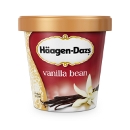
BEFORE
The challenge: The brand’s current packaging hadn’t been updated in about five years, causing it to fall short of consumer expectations. Häagen Dazs took this as an opportunity to contemporize its packaging and better call out the products’ benefits.
The goal: Häagen Dazs teamed up with Sterling Brands to create a new package design that would improve shoppers’ experience with the brand on-shelf.
“[In addition to] increasing relevancy, we want to make sure that we maintain our positioning as the super premium ice cream,” says Jason Merideth, associate brand manager at Häagen Dazs. “When consumers invite us into their homes and shop us at shelf, we want to make that experience as pleasurable as possible and make it easy for them to find their flavor,” Merideth adds.
The solution: During consumer research, the team found equity in the brand’s logo and color scheme. As a result, the logo stayed the same, and the gold and burgundy color scheme remained-but they found a new interpretation. The redesigned cartons feature a gold background, instead of the burgundy used on the old packaging, which makes the text easier to read. The gold background is also designed to reflect the texture of the ice cream inside.
Designers also tweaked the banner graphic, moving it from the side of the package to the top. The new graphic incorporates the burgundy color of the lid and offers a contemporary style to the brand, as opposed to the more classic look of the previous design.
One of the most noticeable changes to the packaging is the ingredients photography. The new images are meant to increase appetite appeal and reflect the quality of the product. Taking that idea one step further, the team added a tasting notes section to the back panel of each SKU, which describes the taste experience from start to finish.
The brand’s all-natural benefit is also more prominent now, with “all-natural ice cream” placed front and center, in all caps, beneath the variety name. (Previously, the text was relegated to the bottom of the package, in a much smaller lowercase font.)
The results: The new packaging launched across the brand’s U.S. portfolio in February. Quantitative research by Perception Research Services found that the new packaging improved flavor shoppability by 21 percent. Additional consumer research found that the packaging better communicated that the product inside was all natural. Merideth currently reports a lift in purchase intent, and predicts an increase in volume as well. Plus, he adds that calls into the brand’s consumer hotline have been “overwhelmingly positive."
Where to go for more information…
PACKAGE DESIGN
Sterling Brands, 212.329.4600
SHOPPER RESEARCH
Perception Research Services, 201.346.1600
Looking for a reprint of this article?
From high-res PDFs to custom plaques, order your copy today!


