Summer's Eve
The feminine hygiene brand uses a redesign to change how women talk about their bodies.
 By Jennifer Welbel
The story: In 1972, C.B. Fleet Company Inc. launched the Summer’s Eve brand with a disposable douche as its sole product. Over the past 40 years, the brand has evolved to offer a complete line of external cleansing and freshening products, including cleansing wash, cleansing cloths, body powder, deodorant spray and more. Today, Summer’s Eve is the number one feminine hygiene brand and has a loyal consumer base.
The challenge: Summer’s Eve has a devoted following with its 40-to-60 year-old audience. However, despite the brand’s success, it was not connecting with today’s women. “What we heard from women was that, while they [loved] and [continued] to buy the brand, it didn’t feel like them,” says Pamela Long, director/client services, Little Big Brands, the firm responsible for the redesign. “It felt like their grandmother…someone 20 years older than them, [and] they wanted something that felt more modern, fresh and contemporary.” As the category leader with a dedicated following, there was a substantial amount of risk in making that change. Nevertheless, Summer’s Eve joined forces with Little Big Brands and Product Ventures to overhaul the brand and make it more aesthetically pleasing, but, at the same time, retain its heritage.
The solution: Before embarking on the redesign, Little Big Brands conducted one-on-one interviews with women to discuss the feminine hygiene category-what they thought about it, their feelings about Summer’s Eve, how they wanted to talk about the topic of vaginal care and more. “When you are talking about a major overhaul, [you have to make] sure that all the steps are taken to talk to women, make sure they are comfortable with what we are doing from a design perspective and, although it’s a big leap, try and work in some of the heritage and the elements that will continue to make them feel comfortable with the brand but doing it in a really fresh and exciting way,” says Long.
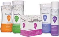
To accomplish this, Little Big Brands began by creating color-coded line work and flower elements (nuances of the brand’s original leaves graphic) along the top of each SKU. “While we didn’t completely abandon everything, we did considerably upgrade the imagery,” says John Nunziato, creative director, Little Big Brands. “We…moved them to a more useable, identifiable and completely ownable illustration style.” Little Big Brands then used a Yoni-the ancient symbol for female genitalia-as the package focal point. “Our symbol now has a very deep, historical meaning to it,” says Nunziato. The Yoni graphic also includes an updated Summer’s Eve logo, rendered in abbreviated form as “SE”. “Before, the ‘Summer’s Eve’ was massive on there, and now we are using the ‘SE’ to help guide people and symbolize the brand,” says Long. “But you aren’t screaming, ‘This is Summer’s Eve’ in your cart.”
Next, Little Big Brands turned its attention to the brand architecture. According to Nunziato, “One of the big problems with the brand was shoppability. They had three pastel color palettes-a pink, light green and a lavender-which really didn’t mean anything from form to SKU.” Therefore, they developed 19 custom colors, including 17 color codes to represent each variety, the logo color and the background color, which were still feminine but also sophisticated.
While Little Big Brands was working on the redesign, Product Ventures spearheaded the structural work. Using its own consumer-driven research (including blog diaries and focus groups), it eliminated the broader, big shouldered bottles and developed sleek, modern looking structures that were functional and worked well for women.
To coincide with the updated design and structure, Summer’s Eve introduced a new website with a frank educational component (e.g., an “ID the V” quiz that asks visitors to identify the five major parts of the vagina), viral and television campaigns, a blog (www.thatsvaginal.com) and more. “When we started talking to women, they really told us to talk about it,” says Long. “It’s a real product, for a real area, and [they wanted us] to talk about it in a real manner.”
The results: Together, Little Big Brands and Product Ventures created a design and structure for Summer’s Eve that is supporting a new brand effort to become more relevant and change how women talk about their bodies. According to Long, “It’s [really]out there, especially for Summer’s Eve.” “This is the brand that had women running on the beach with a ‘not so fresh feeling’, and now…people are being very frank about it.”
The openness is resonating well, particularly with a younger audience. “When we went into the project, the audience was really 40- , 50- and 60-something women,” says Long. “But what we are seeing now is that those 20- and 30-something women are saying, ‘Wow, this is cool; this is something that looks like me and feels like me,’ so it has opened [Summer’s Eve] to a wider audience.”
Little Big Brands, www.littlebigbrands.com
Structure
Product Ventures, ww.productventures.com
AFTER
BEFORE
The story: In 1972, C.B. Fleet Company Inc. launched the Summer’s Eve brand with a disposable douche as its sole product. Over the past 40 years, the brand has evolved to offer a complete line of external cleansing and freshening products, including cleansing wash, cleansing cloths, body powder, deodorant spray and more. Today, Summer’s Eve is the number one feminine hygiene brand and has a loyal consumer base.
The challenge: Summer’s Eve has a devoted following with its 40-to-60 year-old audience. However, despite the brand’s success, it was not connecting with today’s women. “What we heard from women was that, while they [loved] and [continued] to buy the brand, it didn’t feel like them,” says Pamela Long, director/client services, Little Big Brands, the firm responsible for the redesign. “It felt like their grandmother…someone 20 years older than them, [and] they wanted something that felt more modern, fresh and contemporary.” As the category leader with a dedicated following, there was a substantial amount of risk in making that change. Nevertheless, Summer’s Eve joined forces with Little Big Brands and Product Ventures to overhaul the brand and make it more aesthetically pleasing, but, at the same time, retain its heritage.
The solution: Before embarking on the redesign, Little Big Brands conducted one-on-one interviews with women to discuss the feminine hygiene category-what they thought about it, their feelings about Summer’s Eve, how they wanted to talk about the topic of vaginal care and more. “When you are talking about a major overhaul, [you have to make] sure that all the steps are taken to talk to women, make sure they are comfortable with what we are doing from a design perspective and, although it’s a big leap, try and work in some of the heritage and the elements that will continue to make them feel comfortable with the brand but doing it in a really fresh and exciting way,” says Long.
To accomplish this, Little Big Brands began by creating color-coded line work and flower elements (nuances of the brand’s original leaves graphic) along the top of each SKU. “While we didn’t completely abandon everything, we did considerably upgrade the imagery,” says John Nunziato, creative director, Little Big Brands. “We…moved them to a more useable, identifiable and completely ownable illustration style.” Little Big Brands then used a Yoni-the ancient symbol for female genitalia-as the package focal point. “Our symbol now has a very deep, historical meaning to it,” says Nunziato. The Yoni graphic also includes an updated Summer’s Eve logo, rendered in abbreviated form as “SE”. “Before, the ‘Summer’s Eve’ was massive on there, and now we are using the ‘SE’ to help guide people and symbolize the brand,” says Long. “But you aren’t screaming, ‘This is Summer’s Eve’ in your cart.”
Next, Little Big Brands turned its attention to the brand architecture. According to Nunziato, “One of the big problems with the brand was shoppability. They had three pastel color palettes-a pink, light green and a lavender-which really didn’t mean anything from form to SKU.” Therefore, they developed 19 custom colors, including 17 color codes to represent each variety, the logo color and the background color, which were still feminine but also sophisticated.
While Little Big Brands was working on the redesign, Product Ventures spearheaded the structural work. Using its own consumer-driven research (including blog diaries and focus groups), it eliminated the broader, big shouldered bottles and developed sleek, modern looking structures that were functional and worked well for women.
To coincide with the updated design and structure, Summer’s Eve introduced a new website with a frank educational component (e.g., an “ID the V” quiz that asks visitors to identify the five major parts of the vagina), viral and television campaigns, a blog (www.thatsvaginal.com) and more. “When we started talking to women, they really told us to talk about it,” says Long. “It’s a real product, for a real area, and [they wanted us] to talk about it in a real manner.”
The results: Together, Little Big Brands and Product Ventures created a design and structure for Summer’s Eve that is supporting a new brand effort to become more relevant and change how women talk about their bodies. According to Long, “It’s [really]out there, especially for Summer’s Eve.” “This is the brand that had women running on the beach with a ‘not so fresh feeling’, and now…people are being very frank about it.”
The openness is resonating well, particularly with a younger audience. “When we went into the project, the audience was really 40- , 50- and 60-something women,” says Long. “But what we are seeing now is that those 20- and 30-something women are saying, ‘Wow, this is cool; this is something that looks like me and feels like me,’ so it has opened [Summer’s Eve] to a wider audience.”
CREDITS
Package DesignLittle Big Brands, www.littlebigbrands.com
Structure
Product Ventures, ww.productventures.com
Looking for a reprint of this article?
From high-res PDFs to custom plaques, order your copy today!


