Time for a Packaging Change?

To understand how a current packaging system is performing, marketers need to gauge its on-shelf presence (visibility and shopability).
Shoppers’ drawings of packaging (from memory) often reveal the core visual or structural equities that should be leveraged in a pack redesign.
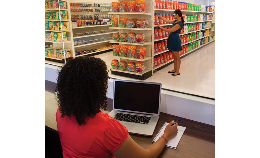
PRS Retail Labs (mini-stores) are an ideal venue to observe shoppers in aisle, understand their “de-coding process” and gauge the on-shelf performance of new design systems.
To guide successful redesigns, it is important to document the “retail realities” that impact how packs actually appear in store.
Packaging is arguably a brand’s most important marketing vehicle. Packages directly impact purchase decisions at shelf, influence satisfaction and usage in the home — and they serve as the embodiment of the brand across all media, from advertising to social media. Yet while marketers regularly benchmark product performance and track the impact and wear-out of their advertising, very few apply a similar discipline to the timing of their packaging decisions. Instead, pack changes are typically reactionary. They often come in response to declining sales, changes by competitors, or concerns expressed by sales teams or consumers in focus groups and online forums. The most common driver of pack changes is the arrival of a new marketing team eager to make its mark quickly via design changes.
To be fair, marketers’ intuition is not always wrong, and certainly, the right packaging changes can be a vital component of larger brand relaunches. However, we’ve also seen that making packaging decisions based on aesthetic judgment can be misguided, as these often are unnecessary changes that waste resources and risk confusing the brand’s existing users — initiatives rooted in misguided assumptions and redesign objectives that solve the wrong problem.
These factors limit success rates in pack redesigns. Of the hundreds of proposed packaging systems that PRS assesses each year, only about 50 percent meet action standards and are recommended for introduction. While this figure confirms it is definitely possible for new designs to outperform current packaging, it also leaves considerable room for improvement. Starting with a clear understanding of your current packaging is the key to driving successful redesigns.
ASKING THE RIGHT QUESTIONS
To make better decisions, marketers need to involve consumers in the process for determining when and why to make a pack change. However, asking these questions directly can backfire because they inadvertently transform people from shoppers into art directors. In their efforts to help, consumers will offer very specific recommendations and/or enthusiastically state preferences when shown a range of options. While these inputs are typically honest and well-intentioned, they rarely correlate closely with purchase decisions at the shelf.
To get more accurate and actionable direction from consumers, marketers need to begin by asking themselves the right questions about their brand’s packaging:
- Is it effective on shelf?
- Does it give my brand a competitive advantage?
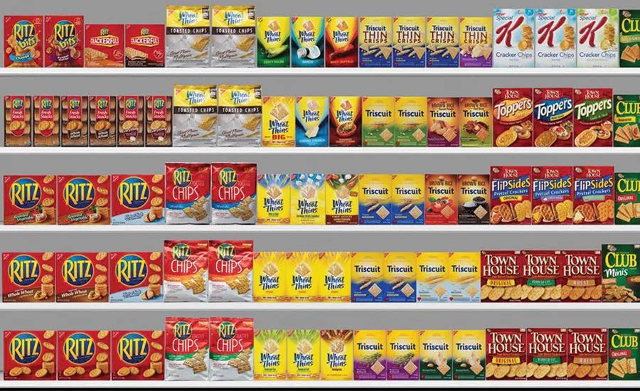
These questions can be answered through a benchmarking study in which current packaging is seen/assessed within its competitive shelf set. To truly understand how a package performs in market, it is important to replicate both shelf clutter and the speed of most shopping trips: The emphasis should be on behavioral measures rather than shoppers’ perceptions or claims. Specifically, we gauge retail visibility (via PRS Eye-Tracking) and shopability (via a series of shopping and product findability exercises). Later, we ask shoppers to react to packaging from several brands to develop a communication profile, uncover what each pack owns within the category and identify areas of competitive advantage. These benchmarking studies can also include usage exercises where people hold and dispense packs to uncover functionality concerns.
The studies help determine whether pack changes are advisable and allow teams to set clear and realistic redesign objectives. The problem is that many companies gather this information at the end of their redesign initiatives, through a “control cell” when testing new designs. On occasion, they invest considerable time pursuing one set of design objectives, only to learn later their underlying hypotheses were wrong.
For example, a leading personal care marketer recently came to us with a redesign aimed at increasing shelf visibility, via a stronger brand mark and a more uniform appearance across sub-brands. However, the benchmarking study of current packaging found that the real problem was shopability: The brand was breaking through clutter quite well, but its extensive product line was confusing and difficult to navigate at shelf. Unless executed very carefully, efforts to further harmonize the brand’s appearance across products and sub-lines were likely to exacerbate the true problem, while “solving” a less pressing issue.
In some cases, it is also important for marketers to answer an additional question about their brand’s current packaging: Is it enhancing brand perceptions?
This issue is particularly important for very strong brands, which dominate their product categories. These leadership brands may “win” over weaker competitors across many dimensions (personality, product expectations, brand/user imagery, etc.) due to their many users and strong incoming perceptions. But an underlying (and very relevant) question remains: Is our brand selling because of — or despite — the packaging?
To accurately gauge the contribution of packaging to brand equity, we need to complement a competitive shelf test with a “name-only” cell, in which shoppers evaluate the same brands while viewing only the names of each brand. By comparing responses across the two sets of consumers (those who see packaging versus those who see name only), we uncover the role of packaging in enhancing shoppers’ interest in a brand. In other words, we isolate the contribution of a brand’s packaging and gauge whether a brand’s appearance helps or hurts its competitive positioning. Over the years, we’ve conducted many “name-only versus packaging” studies across a wide range of CPG categories, and we’ve found out that about 25 percent of current packaging systems significantly enhance brand imagery, and a comparable figure detracts from positioning and competitive advantage.
A recent study in the baking category illustrated a somewhat common pattern. One brand had a significant incoming competitive advantage (“name only”), based on market share and overall brand heritage/strength. However, when shoppers saw the packaging of several brands, they all looked similar, and the leader’s competitive gap narrowed significantly. The implication was clear: While there was nothing wrong with the brand’s current packaging, it wasn’t working hard enough to differentiate. This is often the situation with leading national brands competing with private label/retail brands (and seeking to justify significant price premiums).
GATHERING INSIGHTS TO GUIDE REDESIGNS
In addition to assessing current packaging, “best in class” marketers are also leveraging upfront research to guide redesign efforts. Specifically, they are focusing on the shopper and the store and answering several additional questions:
- What visual cues do shoppers use to navigate the category and quickly identify my brand?
- How does our packaging actually appear in store?
To uncover visual cues and brand equities, we frequently ask shoppers to draw packaging from memory. These drawings reveal subtleties that aren’t expressed verbally, and they do so in a visual format that is particularly instructive to designers. Often, we find that marketers have more latitude to evolve brands than they imagined: Shoppers may have two or three visual elements locked in their minds to identify a brand. Yet while these elements should be respected and leveraged, they do not need to remain stagnant.
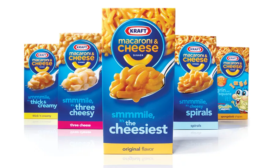
The successful redesign of Kraft Mac n’ Cheese serves as an example. Shopper drawings revealed that the blue and gold colors and the spoon icon were both visual equity elements. These elements served as a foundation for a new design that injected more personality into the product without confusing or alienating current users.
Understanding the shopping experience is also critical to developing packaging that works effectively at the first moment of truth. This starts with uncovering how people shop a product category, including both their decision processes and the visual cues used to quickly sort through the myriad of choices they face in the aisle. We’ve been using PRS Mobile Eye-Tracking to document actual shopping trips and determine exactly what people see as they navigate aisles, sort through options and compare products. In addition, we are increasingly incorporating semiotics within our studies — and finding that meaning of different symbols varies widely by category. For example, the color green signals “natural” in the soda category (Coke Life), while it is a flavor cue (spearmint) in the gum category and a brand cue in frozen foods (Healthy Choice).
We’ve also been visiting stores to document the retail realities (poor lighting, sub-optimal shelving, intrusive signage) that impact how packs appear in store. By incorporating these in-store visuals within design briefs, we can encourage teams to plan ahead and mitigate in-store issues by designing for the worst case scenario at retail.
MOVING RESEARCH FORWARD: THREE BEST PRACTICES
What can companies do to move past management judgment and instill a more disciplined, consumer-driven approach to their pack decisions? In our experience at PRS, we’ve found three best practices to be valuable:
1. Assess current packaging at the outset of each redesign initiative.
An upfront study will confirm or dispel any incoming hypotheses, uncover any limitations of the current packaging and provide designers direction. It will help ensure that the team is clearly aligned on action standards, leading to a more focused and efficient design process. Later, these findings can be used as a control cell and facilitate the execution and analysis of a validation study for new designs.
2. Establish a pack benchmarking program across brands.
Several of our more proactive clients assess current packaging of their major brands on a consistent basis (typically, every two years). These studies are used as a portfolio management tool; they identify which brands need packaging attention and which are performing well. They help ensure that design and marketing resources are focused on the right brands and objectives. We recently introduced a new service (PRS Check-Up) to quickly and inexpensively assess current packaging and facilitate this best practice.
3. Rethink the design brief.
Finally, we’d recommend that marketers start by reconsidering their approach to packaging briefs. Many design briefs are largely a rehash of advertising briefs, dominated by references to target audiences and brand positioning and loaded with generic objectives that may not be relevant to a specific redesign initiative.
To promote better packaging, design briefs need to provide a foundation of learning about current packaging and the shopping process. Recently, we’ve helped clients develop “best in class” briefs that include shopper drawings of design equities, store visuals of retail realities and other insights. These documents help align marketers, designers and researchers as they begin initiatives, to ensure that they fix what’s broken and are positioned for success. We’ve been using PRS Retail Labs (mini-stores) as a venue to observe shoppers in aisle and PRS Mobile Eye-Tracking to document and understand their decoding processes at the shelf as they consider packs and make purchase decisions.
These best practices help companies establish a more systematic and proactive approach to packaging research. They’ve shifted from an overwhelming emphasis of end-of-process new systems validation, to research earlier in the process as a consistent source of inspiration and direction. Brands have been rewarded with more efficient and effective design efforts, leading to higher success rates in validation studies and better packaging in market.
Looking for a reprint of this article?
From high-res PDFs to custom plaques, order your copy today!


