The Most Interesting Redesign in the World

In 1890, Wilhelm Hasse co-founded Moctezuma Brewery in Mexico. Thirteen years later, inspired by the 20th century, the German immigrant created Siglo XX, or Two X’s, which was renamed Dos Equis at the start of the new century.
Fast forward to the 21st century and Dos Equis is one of the top imported Mexican beers in the United States. Since its origins, the brand has bridged the gap between traditional and modern, and its spirit can be proudly seen in its packaging, branding and advertising.
One of Dos Equis’ most successful advertising campaigns, “The Most Interesting Man in the World,” resulted in growing sales figures and increased brand momentum. This, in turn, fueled the need for a brand redesign. To carry out the task, Heineken USA turned to long-time strategic design partner HMSDesign. The creative challenge was to significantly elevate three specific core brand equities: its Mexican heritage, premium nature and quality brand cues.
| "The Most Interesting Man in the World" |
"In refreshing a highly visible brand such as Dos Equis, it is important to consider how to maintain a comfortable relationship with current users while, at the same time, moving the brand image forward to attract a new audience,” says HMSDesign President Hugh Montgomery. “Loyal users need to feel positive about the change and evolution of their brand and, at the same time, the change needs to be big enough to attract the attention of potential new users."
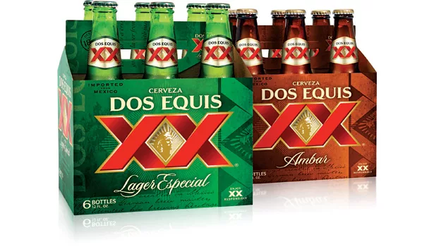
Although HMSDesign has worked with Dos Equis on previous redesigns, the last was in 2008. To maintain its relevance in the ever-changing beer category, this redesign was the most comprehensive, encompassing the brand's logo, cans, bottles and secondary packaging. Adding to this challenge was the current disparity between packaging in the United States and Mexico. Because the brand is successful in both countries, part of the goal of this redesign was to fully align the two cultures around a unified brand. Acceptance in both markets was critical and was considered from the very start.
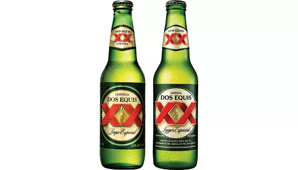
The first and most important step in the design process was to break down the essential equities of the brand and determine their importance. For example, subtle yet impactful improvements were made to the brand mark. The weight and style of the words “Dos Equis” were enhanced for better legibility and modernity. The XX graphics themselves were refined for consistency and visual impact. The gold medallion and rays also received a more premium and sophisticated treatment. Finally, the image of Aztec leader Moctezuma was moved up and turned to face right, or forward, gazing into the future. Together, all of these small improvements elevated the overall brand impression substantially.
In addition, discussion centered around how to portray, verbally and visually, the Dos Equis heritage. In the end, historical cues — an “Imported from Mexico” stamp, “Desde 1897” seal, brief explanation of the brand history and tasting notes — were brought together in both the primary and secondary packaging through a variety of textural devices. However, the refined brand mark was retained in the front and center of every bottle, carrier and box. The layered and varied use of these elements served to reinforce the brand proposition without cluttering or overpowering the brand.
| “significant improvement in purchase intent and overall appeal” |
Finally, production was managed through extensive proofing and color selection to streamline the look of packaging printed in several different locations. All of the processes and limitations were considered to make sure the final result looked as good on the shelf and in consumers’ hands as it did in the boardroom.
Managing a brand refresh such as this requires diligence and alignment on behalf of the design team, brand team, the brewery itself, research organizations and executive leadership. When all these elements work well together, as was the case with Dos Equis, the brand can successfully move forward — not just change for the sake of change. The mandate for going forward with this project was “significant improvement in purchase intent and overall appeal” from groups on both sides of the border. Both of those needs were met for the entire brand lineup.
Through a challenging economic time, Dos Equis has maintained its upward momentum and continues to lead the category. The design results are elegantly modern, yet steeped in historical brand tradition “for those who want to live a more interesting life.”
Looking for a reprint of this article?
From high-res PDFs to custom plaques, order your copy today!


