Rewinding Design to Move A Brand Fast Forward
The Goldstein Group looks at Aqua Net's history to reinvigorate the brand.

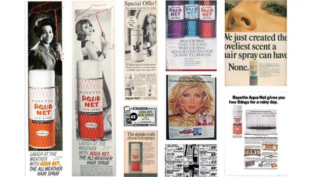
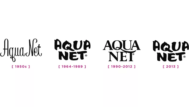
Figure One
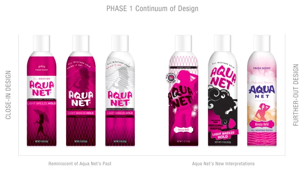
Figure Two
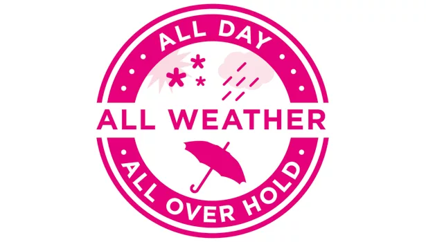
Figure Three
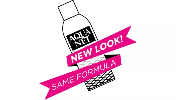
Figure Four
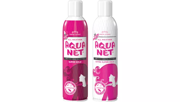
Figure Five
Whether holding a bouffant or beehive, Aqua Net has played a leading role in women’s hairdos since the fabulous fifties. The antidote to a bad hair day, Aqua Net was the go-to brand throughout the 60s, 70s and 80s. The sound of the familiar “hsssssss” gave women confidence that each strand of hair would stay in place through bee-bop or at a sock hop. It has heritage — and according to a Yankelovich study, 58 percent of Americans agree “you can depend upon brands that have been around for a long time to produce good, quality products.”
After it was introduced, Aqua Net grew to be a household name. It was first found on the dressing tables of fine salons and made the leap into retail in the late 1950s. The brand has long held cult status, and its image has been burnished by a bevy of big-hair beauties from Donna Mills to Kim Cattrall; represented on screen in such hits as “When Harry Met Sally” and “Mad Men”; and it continues to flourish on YouTube. Around 2002, with the Broadway revival of “Hairspray,” Aqua Net enjoyed a revival of its own as the brand name once again became top of mind.
As often happens to older, beloved brands, Aqua Net changed owners multiple times, and the brand went through an evolution: a slimmer canister with a simplified, diluted logo and brand impression. It was sold from Fabergé to McGregor to Unilever and lost focus on its core heritage.
After Lornamead Inc. acquired the brand from Unilever in 2006, the company looked for opportunities to reinvigorate the brand.
“The package had lost its personality along the way with its previous owners,” says Randy Sloan, president of Lornamead.
So last year, Sloan and the Lornamead team decided it was time for a makeover and called in The Goldstein Group. Sloan knew how we breathed new life into other heritage brands such as Luden’s, ACT, Bayer and IcyHot and how our package designs improved visibility, desirability and contributed to increased sales. My team of strategists and designers had a firm mandate: “Make the brand relevant and exciting once again, but don’t lose one current consumer!”
“Our core user will continue to be more of a heritage user,” says Sloan. “We’re looking to expand usage with the return of retro styling and nostalgia for the 60s and 70s that can be seen in music, fashion and beauty across a broader audience.”
Given Sloan’s mandate and the desire to extend the brand’s reach to a broader audience, Darcy Bolker, creative director, led the design team through a historical review of the brand and initiated our rigorous Shelf Sight Sequence process. We set our minds to awakening Aqua Net’s glorious past while creating brand relevance for a younger audience without alienating its heritage users.
To generate rediscovery and reappraisal of beloved brands, our strategists and designers at The Goldstein Group gain design insights and brand clues by unearthing and understanding the roots of a brand, much as archeologists uncover ancient treasures. I firmly believe that a brand’s history resonates in users’ minds, and once a strong reason-to-believe is rediscovered and connected to the brand through design elements, a brand will connect in a deeper way to heritage users while capturing new, younger users as well. In this way the brand may recapture the coveted generational pass.
Our discovery process with Aqua Net began by returning to the brand’s conception in the 1950s. We learned the brand had been known as the “All-Weather Hairspray” both on the canister and in the advertising. The product had always had the uncanny ability to hold hairstyles through rain and high humidity. Our investigation also revealed that from 1964 on, the brand’s logo appeared as though it had been spray-painted. We found the iconic logo to be perfect in its past presentation. Figure 1
The Goldstein Group developed a continuum of design directions in Phase 1. Figure 2
Once a creative platform was agreed upon, Bolker and her team began to redesign Aqua Net using our proven Shelf Sight Sequence process which uncovers how brands are seen at retail in five seconds or less.
- Color is always first. TGG retained the brand’s color tones of the last decade to connect with current consumers but freshened them for a modern palate.
- Shapes are next. TGG illustrated a woman with large-volume, big, fabulous hair and brought back the former logo, framing it in white — creating an on-shelf billboard effect.
- Symbols are third. TGG developed a symbol mnemonic with an umbrella and climate cues to communicate the “All-Weather” positioning and brought back the hairnet graphics as the iconic symbol for “hold.”
- Words are last. TGG created a new verbal branding system highlighting the “Professional Hairspray,” and the reason-to-believe was reinforced: “All Day, All Weather, All Over Hold.” Figure 3
Lastly, when changing a brand’s trade-dress, statements such as “New Look! Same Great Hold” are not enough to be seen and noticed. To ensure consumer attention and reassurance that the strong-hold formula remained the same, we attached an image of the prior bottle wrapped in a call-out ribbon. Figure 4
“We made improvements for aesthetic reasons and developed a can that looks more like a salon product,” says Sloan. Figure 5
Sloan is very enthusiastic about Aqua Net’s new design and the diligence and creativity that The Goldstein Group put into the restaging process.
“They’ve been terrific, very smart and creative,” he says. “They identified areas where we could enhance the graphics to create more shelf impact, better communicate the brand’s point of difference and create a brand personality. The Goldstein Group helped us recover the brand’s heritage and made it unique and fun with a modern design.”
And what does the trade think about the new Aqua Net?
“The feedback has been very positive,” says Sloan. “We’re just starting to ship. The retailers recognize Aqua Net’s strong hold and its All-Weather heritage, and they’re happy we’re returning to the longstanding imagery that originally gave the brand its iconic status.”
Looking for a reprint of this article?
From high-res PDFs to custom plaques, order your copy today!


