Retro Smart!

According to a 2010 Yankelovich study, 62 percent of Americans wish that more brands would bring back versions of their product designs as they were offered years ago; and 58 percent of American consumers agree that “you can depend on brands that have been around a long time to produce good quality products.”
That being said, how can you rescue your beloved heritage brand and rekindle the generational past to aid rediscovery and reappraisal on the shelf?
Brand Rescue can be achieved by applying the tools of Rediscovery, Enhancement, Simplification, Communication, Understanding and seeing the brand Envisioned in your consumer’s eye — in short, R.E.S.C.U.E.
The following six brands have one common denominator: rediscovered and realigned hidden equity that builds a cognitive link to our perceived pasts. These examples demonstrate how The Goldstein Group has successfully restaged heritage brands and the proprietary process that it has developed.
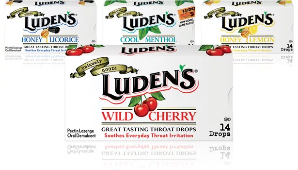
LUDEN’s
Rediscover your brand’s heyday, which holds memorable cues and clues (or visual territories) of a time gone by.
The Goldstein Group conducted Color Crayon Research with category and former brand users to learn what brand identifiers of colors, shapes, symbols and words were remembered, unaided in the consumers mind. This initial research, which was followed by a look at the current carton and bag for emotional probing, informed the team that the white carton with fruit in the middle had equity. In addition, when consumers first saw the carton, they spoke of the wax paper lining and how this ensured freshness and added a feeling of small batch appeal.
When restaging heritage brands, it's also important to always look backward at the brand’s heyday when it was a key performer. With Luden’s, it was the 1930s and 1950s. The firm extrapolated key design elements from these eras and recreated them to become retro-cool today. When Luden’s was unveiled during round two of the research, consumers said, “Oh, this is the way it used to look!” Although it actually never looked like that, the goal of retro-smart is to make it look and feel as it always should have.
Brand Rescue Result
Luden's received a 28 percent year-to-date sales increase.
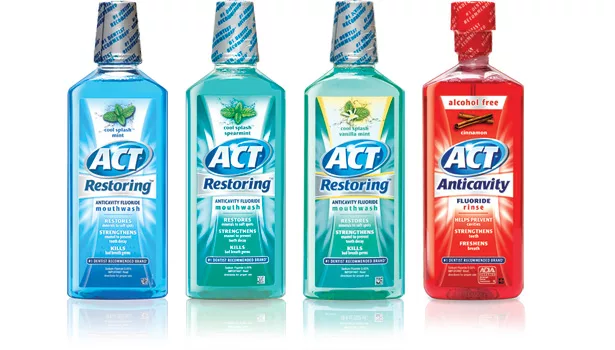
ACT
Enhance your brand with core identifiers that create shelf vibration to allow your brand to be seen, felt and understood in five seconds or less.
ACT mouthwash was stagnant and fragmented on the shelf and looked like every other mouthwash. To enhance the brand, The Goldstein Group first created a key visual that all team members agreed upon. In this instance, it was an activity burst with a glow that was designed to create shelf vibration and help this heritage brand be seen, felt and understood. Next, it was important to fine-tune the brand mark to see how far it could be taken before it was no longer recognizable. This helps to inform how much change can be made to the brand, while also adding interest and dimension to ensure it is prominent and relevant. Once the base was anchored, the team added a large dose of brand renewal into the line extensions with a slight shift in the brand architecture and the usage of specialized foil substrates to provide a reason to pay more against its base offerings. ACT Total Care now is aligned to the base, yet clearly communicates its superior positioning. It can cross-sell between its base and higher-tier performers, providing a choice for both core and new users in the brand franchise.
Brand Rescue Result
ACT mouthwash saw a 31.4 percent sales increase after six months on the shelf.
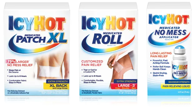
ICYHOT
Simplify your brand to allow its colors, shapes and symbols to serve as its information hierarchy and brand recall.
Consumers crave simplicity today and need to make brand decisions in five seconds or less. Make it easy for them. In the case of ICYHOT, The Goldstein Group removed the words in the iconic swoop. The outdated logo impression of italic letterforms was transformed into Roman letterforms with a soft ethereal glow around the body to communicate healing. The new brand architecture created a copy system of no more than three bullets per SKU, which allowed ICYHOT to be referred to by its previous adage — “the white box with the rainbow letters on it.” This also created a streamlined path for many engaging future line extensions.
Brand Rescue Result
The brand saw multiple successful line extensions built on the underpinning of the refreshed packaging, designed to conquer private label with its clean portrayal of the iconic swoop as a protectable brand asset.
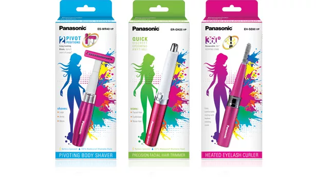
PANASONIC
Communicate that your heritage brand is anchored in longevity, yet is technologically advanced.
We used new on-trend graphics to communicate that this is no longer your grandmother's brand. Because we featured a woman in the package design, it was important that she was portrayed representationally versus literally so she could be perceived as “all women.” We also portrayed her in an aspirational light to communicate how women will look and feel when using the product. In addition, it’s crucial to always own strong brand recall — in this instance, the white box with the blue, green or pink lady on it. Finally, always give your consumer something to talk about with her friends, using colors, shapes and symbols on the packaging to communicate the brand she prefers.
Brand Rescue Result
The redesign retained distribution in all key accounts and allowed the brand to break into new accounts.
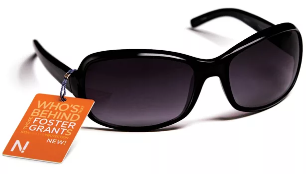
FOSTER GRANT
Understand that your brand’s recall may be verbal and not visual and may include “uncommon brand recall,” such as a spokesperson from your brand’s heyday. If they are relevant, reattach them to your brand.
Conduct research to both see and hear how consumers are speaking about your heritage brand. What taglines and messages are lodged in the recesses and/or forefronts of their minds? In the case of Foster Grant, the famous tagline from the 1950s was remembered only by those 40 years of age and older. For the younger consumers who couldn’t remember the tagline, it still turned out to be highly meaningful. These younger brand targets felt that when hearing “who’s that behind those Foster Grants,” they could envision themselves as a rock star or sports hero. Because of this, The Goldstein Group took these brand assets and powered them into the Foster Grant brand to reignite its target's reason to believe. The new brand mark for Foster Grant is now the famous tagline, memorable from way back and still highly meaningful today.
To aid the decision-making process at the shelf, the firm also created a new segmentation strategy from the 12 segments down to only six. Each segment is color-coded and features a segment symbol on the new hangtags, which also is integrated into a new display that no longer creates the dreaded retail “bump-butt” of having to bend down low to try on the glasses. In addition, a historical review revealed that Raquel Welch was the brand icon of Foster Grant in the ‘50s and is still extremely relevant as a beacon of sex appeal, so she was retained in the redesign.
Brand Rescue Result
Foster Grant was sold after the restage for $565 million and was perceived as a brand — no longer a commodity!
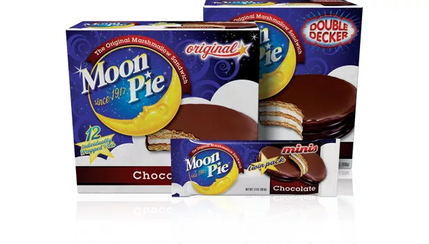
MOON PIE
Envision your heritage brand through The Goldstein Group's proprietary Shelf Sight Sequence lens that focuses on a brand’s colors, shapes and symbols.
Color is how the mind sees brands at retail, and it is your brand’s strongest tool. Color, shapes and symbols are how consumers look for a brand and speak about it. Because Moon Pie was fragmented in its color, the firm selected a dark, indulgent blue as the line color since all competitors were also primarily white and light blue. Next, the brand mark was made into a brand symbol that featured the letterforms wrapped up with the moon. This symbol became the hero of the package because it clearly communicates what is inside while enhancing the appetite appeal. Now, consumers look for “the blue box with the moon and a huge Moon Pie” on it. However, once the core identifiers are recreated, it’s important to protect each one of the brand’s colors, shapes and symbols as the brand assets they will become.
Brand Rescue Result
Moon Pie received a 38 percent year-to-date sales increase.
When engaging in Brand R.E.S.C.U.E., understand that nostalgia transcends demographics. Older consumers “remember when,” and younger consumers think nostalgia is “retro and cool.” The comfort of an analog clock ticking or a rotary phone’s ringing bell can return us to simpler times.
Bringing back an older brand, or restoring the luster to a faded one, will cost significantly less than developing a new product. Restaged brands generally increase market share by 25 percent on average, without new advertising support. At The Goldstein Group, restaging heritage brands is about more than increasing positive feelings for the consumer. It’s also about increasing dollars for the marketer — and in a marketplace with enough competition to elbow your aging brand off the shelf, restaging will breathe new life into your brand.
Looking for a reprint of this article?
From high-res PDFs to custom plaques, order your copy today!


