Learning to Launch a Brand or Product by Example
Get your launch right by learning from already established brands.

Ask a child to state his or her most preferred classroom subject, and you’re bound to hear “recess” as the answer. Don’t lose hope in the future of mankind just yet; this is normal (I alternated between art and recess as favorites throughout elementary, and I turned out fine). Even more, there are some valuable branding lessons to be gleaned from that hallowed break in the school day.
Take that polite playground offering of “you go first,” also known as a minimally veiled attempt to avoid physical harm or the teacher’s punishment — if so-and-so didn’t carry off jumping from the top of the slide too well, you knew not to follow suit. And if he or she met whatever challenge with aplomb, maybe it was something to mimic after all (logical, at least, in our seven-year-old minds).
Brands just starting out need examples on how to handle product launches and lines. By looking at the achievements of established names and examining why they were successful, new brands begin to learn the process of making a launch right for its intended audience.
Thirty years ago, Odwalla’s founders started the beverage (and later food bar) company in a shed. The brand was named after a musical hero who led sunshine people out of a grey haze; fittingly, the company is here to do the same today by shedding some light for beginning brands.
Recently, all of Odwalla’s designs underwent some changes, from the website to the packaging to the delivery trucks, for the first time in six years. Though consumers were getting by with the previous elements, the long-standing brand knew to tweak its creative before it failed to meet the audience’s expectations and needs — improving a brand is vital in remaining relevant with fans.
And obviously, brands need an audience before they can make improvements for one. Brands working on a new line should first choose the specific set of consumers the product is intended for — trying to woo the entire world won’t work. This doesn’t mean you can’t later expand your base by converting consumers to your brand — marketing and advertising may help people realize they need your brand in their lives, even when they previously thought of it as outside their interests — but brands need to start somewhere. Look at the reasons why you created your brand to decide who will find it appealing.
“Audiences are targeted based on many factors — gender, age, household income, family structure and more,” says Irma Shrivastava, vice president of marketing for Odwalla Inc. “For Odwalla, our goal is to align our brand with people who appreciate and share similar values.”
The Calif.-based company works to be “good to the earth,” by lowering water use, reducing waste, switching to an HDPE plastic PlantBottle package made from up to 100 percent plant-based material, and contributing to disaster relief and cancer research, among other endeavors. Consumers who value community, desire healthy lifestyles and share environmental concerns are likely to be drawn to a brand that holds the same beliefs.
“Our fans span all age ranges and demographics. Our consumers are fans because they enjoy the natural and wholesome ingredients we use in our products,” agrees Shrivastava.
Brands are built from the owner’s interests, passions and cares, and these characteristics form a brand’s disposition. Allowing a brand’s traits to be seen helps the audience identify with and personalize the brand in their minds.
“It’s important to reflect these things through design, because design plays a key role in helping consumers make purchasing decisions,” says Shrivastava. “If a design is well-conceived, it’s engaging and informative all at once. The new packaging better reflects the personality of our brand, which creates relevancy and connectedness with our consumers.”
“Odwalla is a brand that has a true commitment to both the quality of its products and to its core values,” says Kate Jain, creative director, Hatch Design San Francisco. “So, our goal was for the packaging to reflect Odwalla’s imaginative and playful personality.”
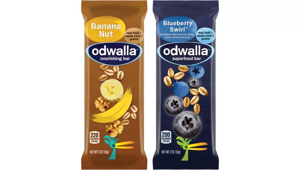
As brands being to design packaging, they will do well to understand what their intended group wants, because those factors will guide what’s on the pack. For Odwalla fans, that means knowing what composes the juices and bars. Odwalla is happy to oblige, as the brand aspires to be transparent in its practices and products.
“It’s important that Odwalla drinkers are easily able to understand what’s in our products,” says Shrivastava. “Our new, bold packaging design makes it immediately apparent to shoppers what’s inside every product. We’ve redesigned the packaging to create a visually engaging, simplified palate that clearly communicates the goodness inside every Odwalla product. A key goal was to update, enhance and streamline the visual cues to make it simpler for people to clearly understand what’s in each beverage or bar.”
Odwalla knew a fresh design would have more benefits for consumers than just better communication, but the company still took care to not alienate its loyal brand lovers with the new look.
“A packaging refresh drives excitement and interest, both from those who are familiar with Odwalla and those who may be trying it for the first time,” says Shrivastava.
“We wanted to create something that was eye-catching, easy to understand and that communicates the key brand benefits of goodness and wholesomeness. But we wanted to ensure it is done in a way that reassures people that these are still the same great Odwalla beverages and bars they know and love. This packaging isn’t a complete departure, but rather a new look that updates the brand in a contemporary way, while preserving the brand’s core values and personality.”
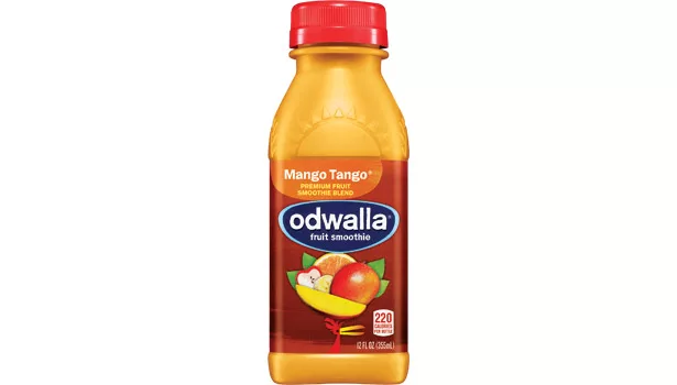
Odwalla and Hatch kept a major design element, the cherished bird icon, from the original package to bolster the audience belief that Odwalla was still Odwalla.
“The bird, which has shifted from the brand logo to a prominent position under the fruit images, reflects Odwalla’s heritage and its whimsical, fun personality,” says Shrivastava.
“The packaging came to life with the combination of real-fruit photography clusters piled playfully atop the brand mascot’s head,” says Jain. “Also, the deep, vibrant rainbow of colors communicates premium cues and beverages packed with delicious combinations of flavors — all very true to the brand’s core.”
Brands can move through a redesign without selling their souls for the sake of art. Hatch found uncomplicated ways to incorporate Odwalla’s values across the package.
“The simplified Odwalla logomark is bold, but it’s also handcrafted and organic, reflecting the true nature of the brand,” says Jain. “The vibrant photography on the label helps depict what is found inside each drink, and the range of rich background colors reflects the brand’s personality, premium nature and also creates a bold backdrop for the fruit imagery.”
“It’s most important to stay true to the brand and the products, but to also create a new look that gives consumers new consideration for purchase,” says Shrivastava. “We expect our refreshed, modern packaging for Odwalla to appeal to both current and prospective consumers.”
While brands can’t always please their entire audience base, following the lead of companies who strive to satisfy their fans will greatly reduce the learning curve in getting a launch or refresh right from the beginning.
Looking for a reprint of this article?
From high-res PDFs to custom plaques, order your copy today!


