Case in Point: Tweezerman's Sharp New Look
The brand uses an image upgrade to refresh its Studio Collection.
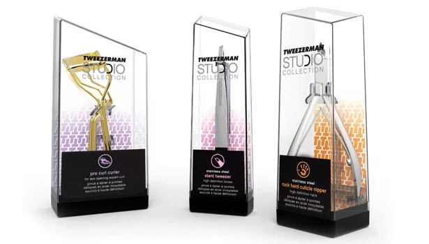
*The package’s slant equates the brand with sharp angles.
*A color-coding system helps consumers further differentiate between products.
*Swerve suspended the implement in the case to keep attention focused on the tool’s professional quality.
The story: Found in the medicine cabinets of many homes, Tweezerman tweezers are known as much for their ability to grasp the smallest of splinters or hairs as they are the brand’s famous lifetime sharpening guarantee. The 35-year-old brand has grown from modest entrepreneurial beginnings into a recognized company with a wide range of beauty tool products. Due to a desire for a more professional appearance for the Studio line and a need to accommodate the strict guidelines of Sephora, Tweezerman’s top retailer, the brand turned to packaging and branding firm Swerve Inc. for a complete overhaul.
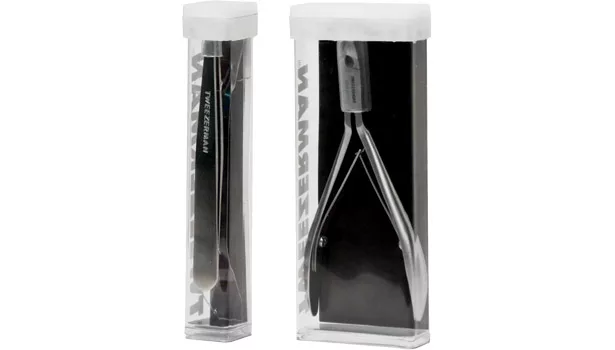
The challenge: The Studio line was housed in a multitude of plastic extrusions of many different lengths and sizes with white injection molded caps, which made easily distinguishing the brand difficult. Adding to the confusion, the packaging closely resembled Sephora’s private label and obscured the product from the consumer’s view. The new packaging would need to streamline the various sizes and formats while fitting in the Sephora display cube, have a simplified and more professional-appearing closure and increase brand recognition — all while reinforcing the product sharpness and cosmetic positioning.
The solution: After a deep examination of the retail stage, Tweezerman’s manufacturing and assembly situation and also an audit of the competition, Swerve came up with several strategic solutions that would allow Tweezerman to reinvigorate the brand and gain maximum efficiencies within the line.
“The Studio Collection needed to be presented as a range of tools with deep-rooted professional credentials,” says Martin Short, partner, Swerve Inc. “Consumers familiar with the Tweezerman brand know the products for the quality of the cut and ground edges, which are particularly visible on its tweezers, nippers and the cutters.”
Swerve took that association and applied it to the redesigned package.
“The breakthrough moment came with the realization that creating an angle within the package — becoming a recognizable icon for the brand — would set the line apart and reinforce the edge cut of the tool as an equity of the brand,” Short continues.
Not only would a change in structure better link the package to the product qualities, it would also fix the previous containers’ issue of hiding the contents from view.
“In most retail situations, packages are displayed such that the consumer looks down on them,” says Short, “and this was causing real problems — the consumers couldn’t see what was in the packages.”
This was particularly true at Sephora, according to Short, the retailer which accounts for 60 percent of Tweezerman’s sales.
“Consumers needed to easily see the product at retail in order to choose which to buy,” he says. “Effective product communication was especially important given the chaotic nature of this category where products are commonly merchandised loose in plastic trays and display boxes. Store brands had moved in on the established brands, and those with more favorable retail positioning were in danger of displacing Tweezerman products.”
“We came up with a package where the angled cut became the top of the package, and the product was suspended inside, allowing the consumer to see the business end of the tool through the enlarged top panel of the pack.”
Swerve worked very closely with Tweezerman’s in-house design team and its molders to develop the look of the two-part package, both structurally and graphically, and engineer the parts so that they would smoothly slide together and then open to reveal the product on a stand-like base.
“The package structure is injection molded polycarbonate with a clear plastic support for the product,” says Short. “The support also houses a small rubber cap for the tweezers. This cap was intentionally removed from the product in the packaging to allow the consumer to see the quality of the tool tip. The case protects the product and can even serve as a keeper case for some consumers.”
The graphics capture a certain amount of the colorful fashion sense inherently connected with the beauty tool segment, and Swerve introduced a color-coding system for the product subsets and a new brand mark.
“The top half of the package features the brand and product line lock-up — the new Studio Collection logo mating with the Tweezerman mark to form a new modern look,” says Short. “The lower half of the package identifies the product and introduces a segment color into the line — pink for tweezers.”
By unifying the packaging, Swerve stabilized the on-shelf product display for Sephora, making the line more shoppable as items are removed, and helped Tweezerman realize production cost savings.
“The parts of the package were engineered to present and protect the products while massively reducing the number of variables in the line — most packages became the same height so that the angle was always presented evenly,” says Short.
“The package really presents the tool as the hero,” Short concludes. “Suspending the tool within the crystal-like case allows the consumer to truly appreciate the precision of the implement’s cut and see the detailing up close. The backdrop and descriptor panel help to frame this presentation and allow the item to shine.”
SWERVE INC.
Looking for a reprint of this article?
From high-res PDFs to custom plaques, order your copy today!


