Zicam's Redesign Is Nothing to Be Sneezed at
The demystified packaging system explains the pre-cold Category to consumers.
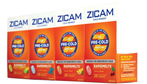
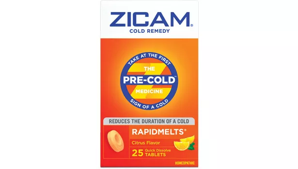
- Beardwood&Co. used a bull’s-eye in the center of the package to unify the line and communicate when the product should be taken: at the first sign a cold may be on its way.
- Consumers want to do what they can to stave off a cold. Zicam’s main benefit statement delivers a message of preparedness. The claim lets buyers feel like they are actively doing their part to get better.
- Zicam lets consumers choose their preferred medicine-taking method, and Beardwood&Co.’s design helps tired, bleary-eyed shoppers be certain of their choice with both a picture and text.
>The Story: We all recognize the beginning signs — a little tickle in the back of the throat, a sniffle and that subtle feeling of fatigue — that moment before a full-blown cold hits. However, for those who just can’t afford to be sick, there is Zicam Cold Remedy, an over-the-counter homeopathic remedy, marketed and sold by Matrixx Initiatives Inc. Unlike symptom-relieving products, Zicam, when taken at the first sign of a cold, claims it can reduce the length of time one feels ill.
>The Challenge: Consumer confusion in the cold aisle required a redesign to make it more approachable, simple and bold. Products need to be easiest to locate and understand when customers are not feeling their best. Zicam partnered with New York City-based Beardwood&Co., specialists in branding and innovation, to redesign the line and establish a category of one.
“We helped define this different segment,” says Julia Beardwood, founder, Beardwood&Co. “But, to be successful, we had to help consumers quickly sort through this myriad of products in the cold aisle and understand what Zicam is and when to take it.” No other product has claimed the pre-cold segment.
>The Solution: Once Beardwood defined the brand personality as proactive, effective and trustworthy, the team went to work on the goal of the redesign: to educate consumers. The first step was to create a Pre-Cold seal in the shape of a bull’s-eye as a unifying element that clearly communicates preparedness and reassurance. The main benefit statement, “Reduces the Duration of a Cold,” is prominently displayed under the bull’s-eye. Beardwood&Co. retained and enhanced Zicam’s equities — the bold orange color, and blue on white brand identity — for a more efficacious and modern feel.
“The Pre-Cold seal is a big advantage for our brand,” says Leslie Molloy, senior vice president, marketing, Zicam LLC. “It positions us as leaders in this category with a strong, central unifying element that has badge value for consumers and empowers them to do something when they feel the first signs of a cold. We are extending this element across all our marketing platforms including online, in-store displays and our advertising campaign.” Created by Grok, an independent advertising and communications company, the television and print ads introduce a new character: The Cold Monster, a big nasty watery-eyed, runny-nosed, congested, wheezy and heavy-breathing beast to personify the full-blown cold.
The redesigned packaging works harder to deliver Zicam’s message. Yet, it is simple and clear because Beardwood&Co. took an infographic approach and focused on absolute essential elements while jettisoning anything extraneous to greatly improve navigation and packaging hierarchy. Complex information is approachable and easy to understand without sacrificing details that consumers need to grab the right product off the shelf.
The Zicam Cold Remedy product line has 15 SKUs including RapidMelt tablets, chewables, lozenges, dissolvable crystals and oral mist. The redesigned packages are currently rolling out nationwide.
> PACKAGE DESIGN BY:
Beardwood&Co.
Looking for a reprint of this article?
From high-res PDFs to custom plaques, order your copy today!


