Hair Care Redesign is Modern and Genderless
Alchemy Oils approached the strategy and design team at Sheridan&Co to work collaboratively in updating its bottle design to be more user friendly and appeal to new audiences, encouraging them to try out hair oiling for the first time. The objective was to explore a more luxurious visual direction that celebrated the brand’s Ayurvedic provenance, pure ingredients and promotion of self-care rituals. More importantly, the new design needed to resonate with both male and female consumers without alienating core consumers.
“Alchemy Oils appeals to a largely millennial audience whose ideas of beauty are far from the superficiality and excess of generations before them. The beauty industry is increasingly being influenced by activists fighting for more diverse representations of people from all cultural backgrounds and sexual persuasions. The acceptance of flaws and idiosyncrasies is becoming an empowering movement. Consumers have moved towards a culture of imperfection, vulnerability and diversity. This is reflected in the rise of messaging promoting an honest self-image. Alchemy Oils’ natural proposition fits well with this ethos; therefore the design solution needed to capture the zeitgeist and engage with an anti-perfectionist mentality of sorts,” says Michael Sheridan, chairman and founder of Sheridan&Co.
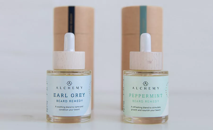
The logo, with its retained typeface, is overlaid on a pastel block coloring label using the existing color palette. For each product, two different shades are used—a soft pastel juxtaposed with a bolder, earthier tone to complement the typography and outer tube packaging labels. Its PETA-certified, vegan and cruelty-free attributes are likewise delineated in a circular, stamp-like formation adjacent to the logo, giving the brand a powerful visual stamp of approval and drawing the eye to a key message.
Hand icons (the hand being the instrument for the Indian Ayurvedic practice of head massage) denote the brand’s essential elements. The outer cardboard packaging is given a premium feel with the gold foil Alchemy logo–a subtle nod to the precious honey-hued nectar encased within the apothecary-style bottle, while the block coloring label also seals the product and communicates key attributes.
Looking for a reprint of this article?
From high-res PDFs to custom plaques, order your copy today!


