Out-of-the-Box Redesign is the Remedy for Maty’s
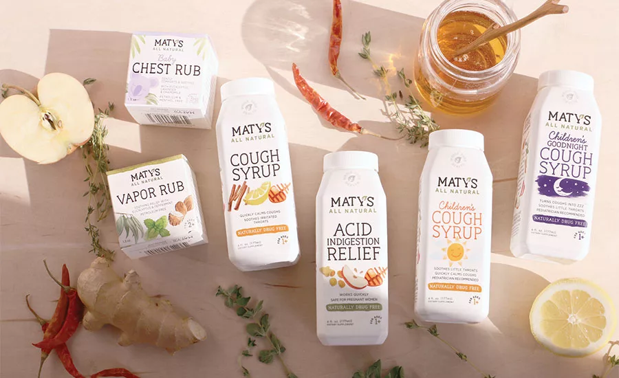
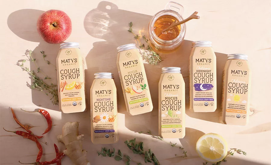
After redesign
To reduce packaging waste, the creative agency Haberman made a design decision to stop using an outer box for Maty’s cough syrup.
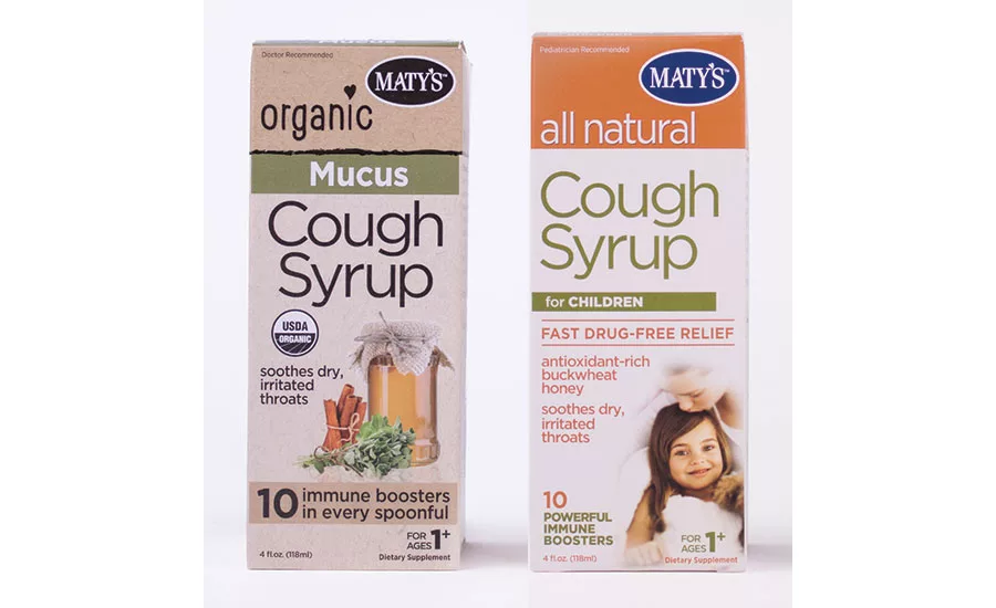
Before redesign
The Story
It was necessity that inspired Carolyn Harrington to create Maty’s, a natural alternative to traditional over-the-counter medicine. The nearly 10-year-old company was named for the daughter of founders Bob and Carolyn Harrington, who sought out holistic remedies to heal Maty after she was born with a condition that left her with a weakened immune system. Frustrated with the over-the-counter medications and their potential side effects, Carolyn began researching natural ways of healing using natural ingredients. As she learned about holistic health, she realized it was crazy that people thought they had to rely on such harsh products to feel better. She began enhancing old-time remedies using whole-food ingredients from her own kitchen. The response to the authentic remedies was amazing, and after sharing them with her friends and family, Carolyn knew she had to share Maty’s—and her story—with the world.
The Challenge
The 10-year-old company reached out to Haberman, a Minneapolis-based creative agency, for a fresh new look and updated packaging in a time of growing retail distribution. Now on shelves at Walmart, CVS, RiteAid and Target, Maty’s competes with conventional brands like Robitussin as well as natural brands like Zarbee’s.
With interest in healthier alternatives soaring, the company wanted to boost brand awareness, capture market share in the natural remedies space and appeal to wellness-minded consumers. That meant standing out—and that meant evolving. “Over-the-counter medicines, as products, have lived in this clean, clinical—even sterile—aesthetic for a long time,” explains Jeff Berg, Haberman’s creative director. “But Maty’s is made with ingredients you can find in your kitchen. And consumers who want real foods and natural products buy things that look natural. So it made sense to us to match Maty’s outside—its packaging—with what’s inside.”
The Solution
The design team set out to create a new logo and packaging that would look right at home in the kitchen cabinet (more so than the medicine cabinet). With the logo, Berg explains, “We wanted this feeling of your grandma’s kitchen mixed with the vibe of a modern leader in natural and organic medicine. The humble, rounded slab serif made it charming and approachable. The subtle arch and warm feel of the mark conveys a feeling of comfort. The packaging was food first. The recipes for Maty’s are an evolution of recipes our great grandmothers might have made from scratch. By illustrating the ingredients, we convey an all-natural but also a folk-like aesthetic. It highlights the food ingredients in each bottle. This look and feel really pops next to the bold reds, blues and oranges of the traditional medicine aisle shelves.”
To help reduce packaging waste, Haberman made a design decision early on to stop using an outer box and move to bottles made from recycled plastic. The simple shape was based on function and reflects the purity of the ingredients. A more decorative bottle would have sent the wrong message. Also missing is the dosing cup. “The wonderful thing about Maty’s is that it’s made with whole-food ingredients you’d find in your own kitchen. There is a suggested dosage but it’s safe to take more. So we didn’t have to worry about dose cups,” says Berg.
By highlighting Maty’s real ingredients in the packaging, Haberman’s designs for more than a dozen products, now on shelves in most areas, reflects the transparency of the brand.
PACKAGE DESIGN
Haberman
Looking for a reprint of this article?
From high-res PDFs to custom plaques, order your copy today!


