Packaging Visuals: Decoded by Consumers 60,000x Faster than Verbal Messaging
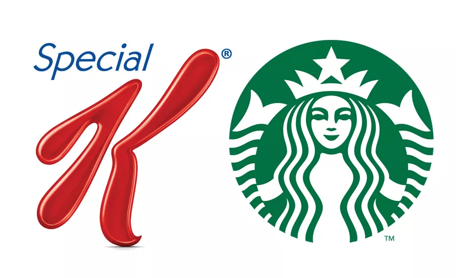
Kellogg’s “K” and Starbucks’ mermaid can stand alone in consumers’ minds, helping them recall the specific brand values that are being represented.
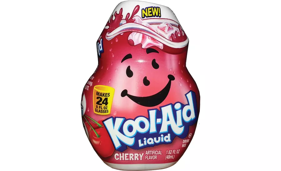
Kool-Aid Liquid Concentrate demonstrates the power of a brand delivering a new product in visually impactful packaging. The pitcher shape and its facial features are ownable to the brand, exuding its playful, archetypal personality.
Disney Playmation’s packaging promises something new and exciting. Fans will hone in on the brand identity with its custom reflective typography and brand icon expressing digital connectivity.
The human brain processes visual information 60,000 times faster than it decodes text — in just a tenth of a second, according to The SAGE Handbook of Political Communication. In addition, up to 93 percent of all human communication is nonverbal, and UCLA psychologist Albert Mehrabian reports that 90 percent of the information that enters the brain is through nonverbal methods. Seventy percent of all human sensory receptors are found within the eye, and in The Human Anatomy & Physiology, Elaine Marieb and Katja Hoehn state that images received by the eyes are processed by 50 percent of the brain.
All of this research taken collectively has huge implications for both consumer product companies and licensed property owners, and it prompts serious questions. Is package design being optimized as a marketing tool with strong visual brand elements? Is there balance between a brand’s visual assets and the right kind and amount of verbal communication? Is there seamless integration among brand visuals, package design architecture and package structure?
Why is all of this so important? It is because consumer interactions with packaging make brands, their values and their promises tangible. That is, if they spot the brands on shelf to begin with, of course.
Regardless of category, there are an overwhelming number of brands that meld together on retail store shelves: same color palettes, similar visuals, same kinds of package structures, and a similar look and feel. What differentiates them? Not much. That alone is a major issue.
Consider the brands that, in seconds, do a great job telling consumers scanning shelves about their company and products, just with visual cues on persuasive packaging. Now think of the statement and the impact that these brands make. Powerful visual imagery doesn’t necessarily refer to a graphic rendering of the product or require a picture of people using it to make an impact. Don’t believe that?
Think of what the big red “K” means on Kellogg’s Special K products, or the red and yellow hot rod flame that signifies the Hot Wheels brand. There’s the emblematic Starbucks mermaid, and Nickelodeon’s splat in signature orange: These icons stand out and are representative of their brands. While paired with a brand logo, additional visuals and verbal brand communication, they can stand alone in consumers’ minds. They have become mnemonic devices that make their brands standouts and highly memorable in a short period of time. Customers need only see these icons to recall the specific brands and values that are being represented.
A well-developed, well-presented visual language tells a story that elicits an emotional response. It stands for the brand in a convincing manner with support from selective verbal brand communication. One must support the other for packaging to be truly effective. The correct combination of visual and verbal communication leads to action being taken by its targeted audience — because those in it have first been visually engaged. A high level of engagement creates an emotional response that is actionable, and that action is purchase.
For this sequence to occur, visual and verbal brand elements must be unique and ownable: unlike anything else in the category. Otherwise, they become just one more commodity in burgeoning categories that are ignored.
DEVELOPING A UNIQUE VISUAL LANGUAGE
When we get brand data from a client, we study it, research the category and work from our own experience to understand the nuances of the brand and the ways in which it might be visually interpreted. We also work from a profile of the targeted consumers to get a sense of what’s most relevant to them where the brand is concerned and how the brand fits into their lifestyles. When we understand where the values of consumers and the brand intersect, we can create an authentic, unique persona for the brand that resonates deeply and fills an emotional need.
Understanding the visual cues that resonate with consumers on an emotional level leads to compelling and recognizable package design that refers back to the brand.
A DISTINCT PERSONALITY
Developing a brand personality is important. Consumers have distinct personalities, and brands must as well. This prompts questions: What kinds of archetypal elements will deliver the personality of the brand visually? Does the brand own a strong signature color or palette, or do we need to create one to fit its persona? What kinds of fonts will fit the brand personality and speak to its fans in a personal manner? How can the package structure and shape refer to the brand? Every visual design element must work with every other component in a synergistic manner.
Launched this summer, Kool-Aid Liquid Concentrate demonstrates the power of a brand delivering a new product in visually impactful packaging. Distinctive package structure in the shape of the 88-year-old brand’s mnemonic “spokespitcher” is immediately recognizable to consumers of all ages: adults who have fond memories of the brand, as well as kids familiar with the drink. The pitcher shape and its facial features are ownable to the brand, exuding its playful, archetypal personality — that of the “everyman.” Kool-Aid has broad-based appeal; it’s a down-to-earth, basic product. Kids of all ages connect with the brand on an emotional level because it promises enjoyment.
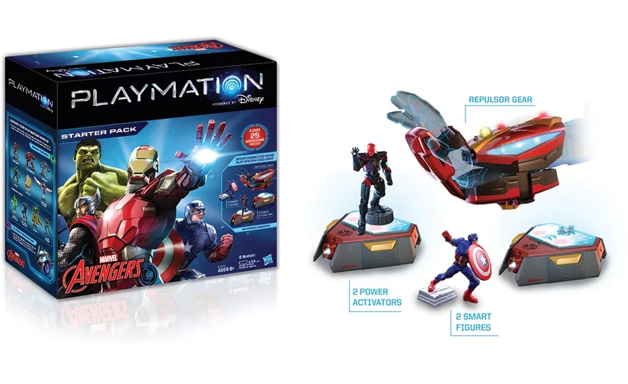
If you don’t have a classic brand, how do you go about creating brand and package design visuals from scratch? What will visually get the message across for an entirely new category in the marketplace? Enter in Disney’s new Playmation, a high-tech game featuring motion-sensor technology and Bluetooth and cloud connectivity to both wearable devices and traditional action figures. In the June press release “Disney Announces Playmation — The Next Step in the Evolution Of Play,” Disney describes its new play system as “the next step in the evolution of play, where digital gets physical and imagination becomes real. The ground-breaking system of toys and wearables uses smart technology to inspire kids to run around and use their imaginations, as they become the hero or heroine of stories from across the Walt Disney Company.”
Why did the entertainment behemoth go in this direction? Disney conducted an online study involving 2,000 families from across the country. Parents want their children to use their imaginations and engage in more active play; kids love high tech.
“The study highlights a major opportunity to meet the needs of both parents and kids with a new way to play,” says Kareem Daniel, senior vice president, strategy and business development, in the release. “Playmation uses technology to make active, physical play even more fun. It puts kids at the center of our stories in a way we’ve never been able to before.”
On pack, Disney has a series of play systems in development, planned around some of its most powerful properties. The first co-branded launch involves Marvel’s Avengers. A starter pack of five connected toys contains a wearable high-tech “repulsor” that kids strap onto their arms, two Power Activators, two Smart Figures, an Avengers superhero and a super villain. Additional Avengers connected toys and an AvengersNet app will be available at launch. Disney Consumer Products’ and Hasbro’s combined creation and manufacturing of Playmation demonstrates the power of joint work and expertise.
Disney Playmation promises something new and exciting with its high-tech logo through the metallically rendered typography style we developed for the identity. The letter “O” is replaced by a key brand icon to convey digital connectivity visually. The brand identity is emblazoned across the front panel of the packaging with the brand communication: “Powered by Disney” right beneath it. The Hulk, Iron Man, Thor and Captain America appear in action poses, ready to save the world from the villains who threaten it. Behind them, the words “Starter Pack” suggest that there are additional pieces available. The Marvel Avengers brand identity appears below the figures on the lower left. On the right side of the front panel are depictions of the pieces included in the play system and the communication: “First 50 missions included” and “No console required.” The Hasbro brand identity appears on the lower right.
The package design system looks and feels different from existing play and gaming systems because the product is unique. But it is the brand identity with its custom reflective typography and brand icon expressing digital connectivity that fans of the brand will hone in on. It conveys the personality of the brand and its archetype: the hero of the future. It invites kids to become part of the adventure as they go on missions with their favorite superheroes. Playmation has all of the makings of a brand that can create legions of dedicated fans. And as ever with great brands, the eyes have it.
Looking for a reprint of this article?
From high-res PDFs to custom plaques, order your copy today!


